The 13 Bridges Challenge, organised by SSAFA (the Armed Forces charity) is taking place on Saturday 24 June (this Saturday) and participants will be walking
More...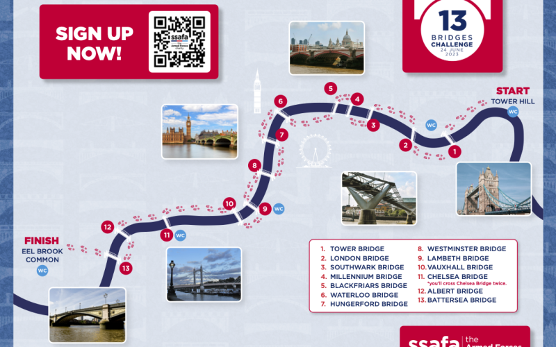
Highlighting the best London maps
The 13 Bridges Challenge, organised by SSAFA (the Armed Forces charity) is taking place on Saturday 24 June (this Saturday) and participants will be walking
More...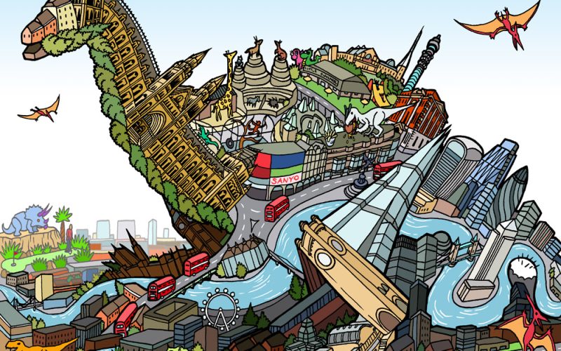
To celebrate the opening of a Jurassic Park pop-up shop at the Natural History Museum in London this week (the popup is to mark 30
More...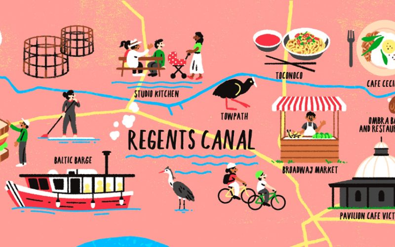
Following on from the colourful map of curry restaurants along the new Elizabeth line, Mapping London spotted this earlier map in the FT Globetrotter series,
More...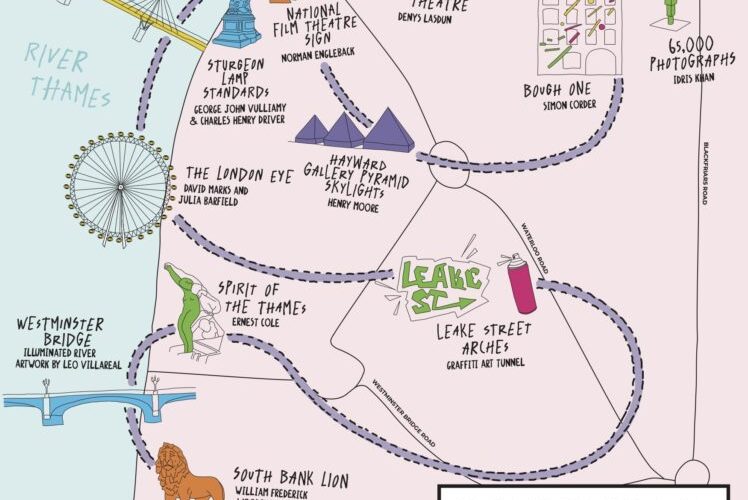
As a complement to the Illuminated River map we featured previously, which shows the central London bridges that are lit up with LED-light-based visualisations, South
More...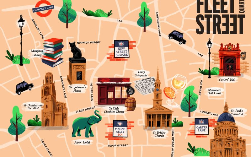
Fleet Street Quarter, a new Business Improvement District set up earlier this year for the western part of the City of London (around Fleet Street,
More...
The FT published an article called “An Indian restaurant crawl along London’s Elizabeth Line” which came illustrated with this rather nice map that shows the
More...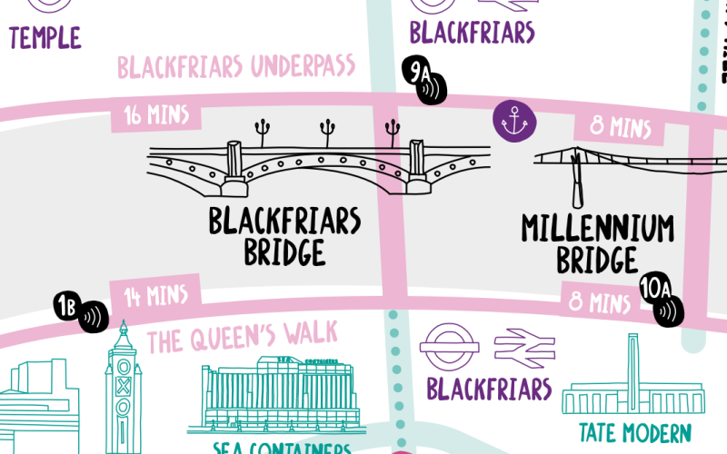
The Illuminated River is a long-term LED light installation on a number of bridges spanning the Thames in central London. At sunset until 2am each
More...
It’s very hot in London today, and tomorrow. It’s best not to be out and about at all, but if you need to be in
More...
The new map is the latest in a long line in attractively packaged, specialist maps from Blue Crow Media which highlight the locations of a
More...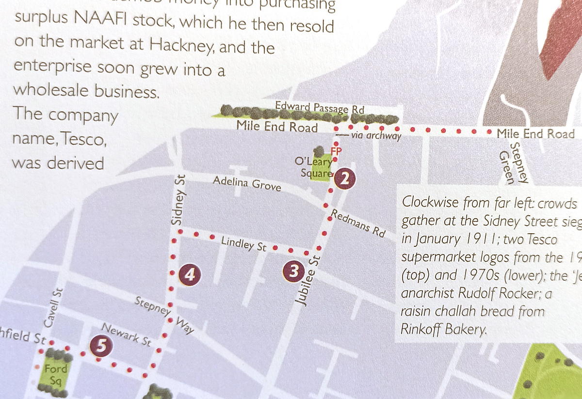
[May 2026 Update: The author has recently created an audio walking guide, Diverse Spitalfields, in conjunction with VoiceMap. It’s based on a walk extracted from
More...
Dex, profilic creator of typographic maps of London , has published Animals of London, in partnership with the London Wildlife Trust (who receive 20% of
More...
We featured TrainTracker, a live circuit board map of where the trains are on the London Underground – with lights representing the train locations –
More...