We love a good custom map for an event, and the London Winter Run has just one – and despite it pretending to be an
More...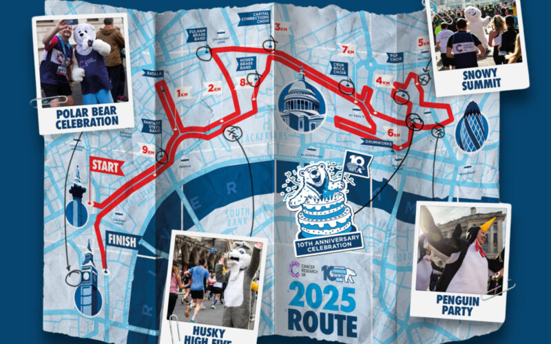
Highlighting the best London maps
We love a good custom map for an event, and the London Winter Run has just one – and despite it pretending to be an
More...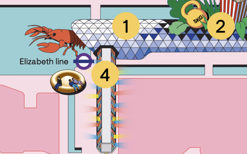
Easter is approaching and its time for some eggs to find – 120 two-foot high ones are in London right now thanks to the Elephant
More...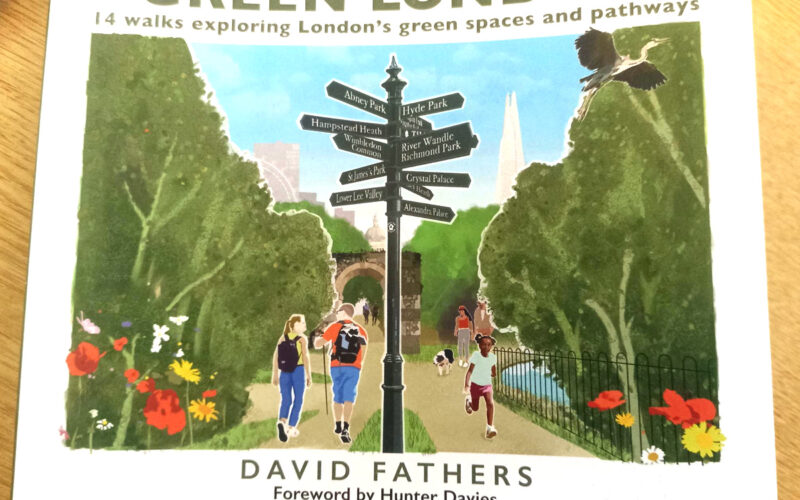
It’s a frosty start to March, but green shoots are finally appearing in the ground. So it’s a great time to introduce a new book,
More...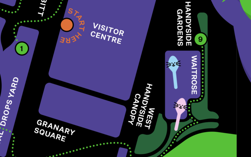
King’s Cross Central, the area behind King’s Cross and St Pancras stations, has launched a monster trail, which is running up to and including Hallowe’en
More...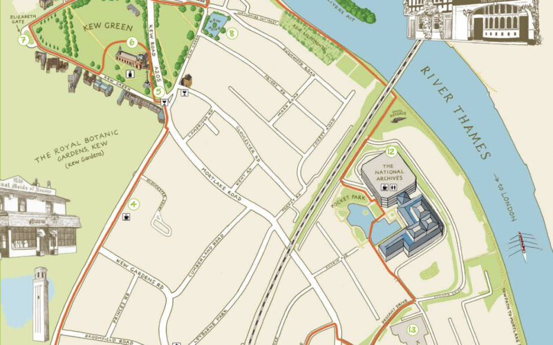
Kew is one of London’s leafy surburban neighbourhoods. Situated on a long curve of the River Thames, ot is of course famous for Kew Gardens,
More...
We’ve long liked temporary “parade” sculpture trails in London – they make exploring a neighbourhood even more interesting, if around the corner is one of
More...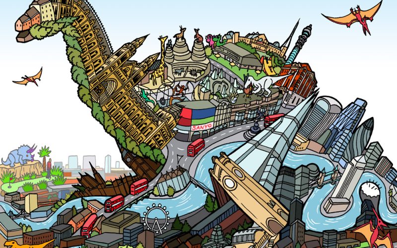
To celebrate the opening of a Jurassic Park pop-up shop at the Natural History Museum in London this week (the popup is to mark 30
More...
Following on from the colourful map of curry restaurants along the new Elizabeth line, Mapping London spotted this earlier map in the FT Globetrotter series,
More...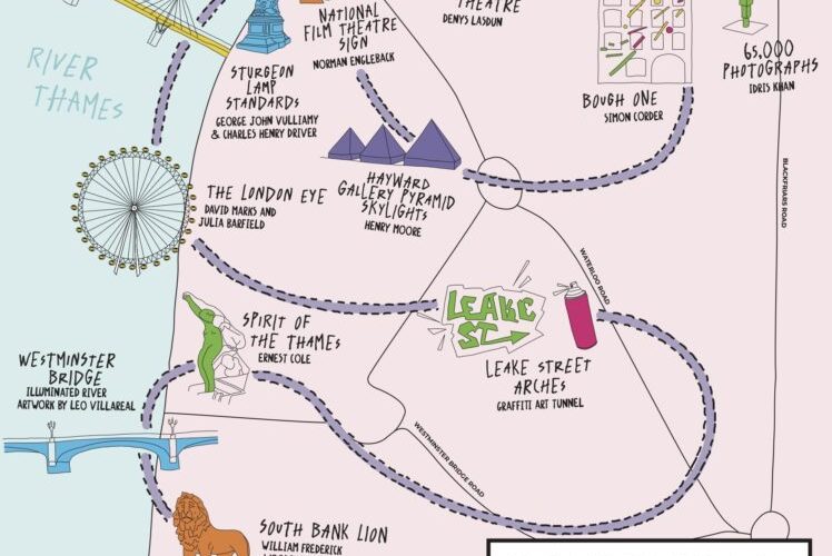
As a complement to the Illuminated River map we featured previously, which shows the central London bridges that are lit up with LED-light-based visualisations, South
More...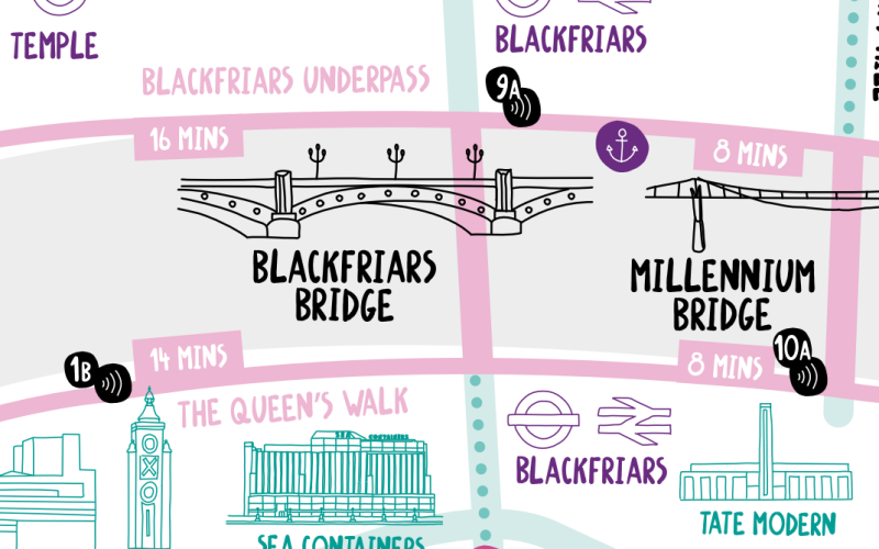
The Illuminated River is a long-term LED light installation on a number of bridges spanning the Thames in central London. At sunset until 2am each
More...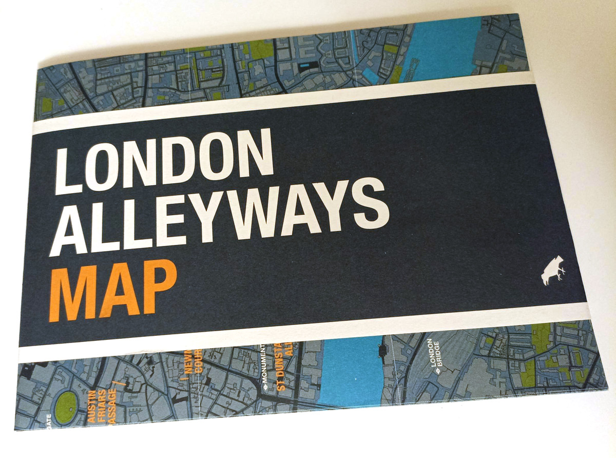
The new map is the latest in a long line in attractively packaged, specialist maps from Blue Crow Media which highlight the locations of a
More...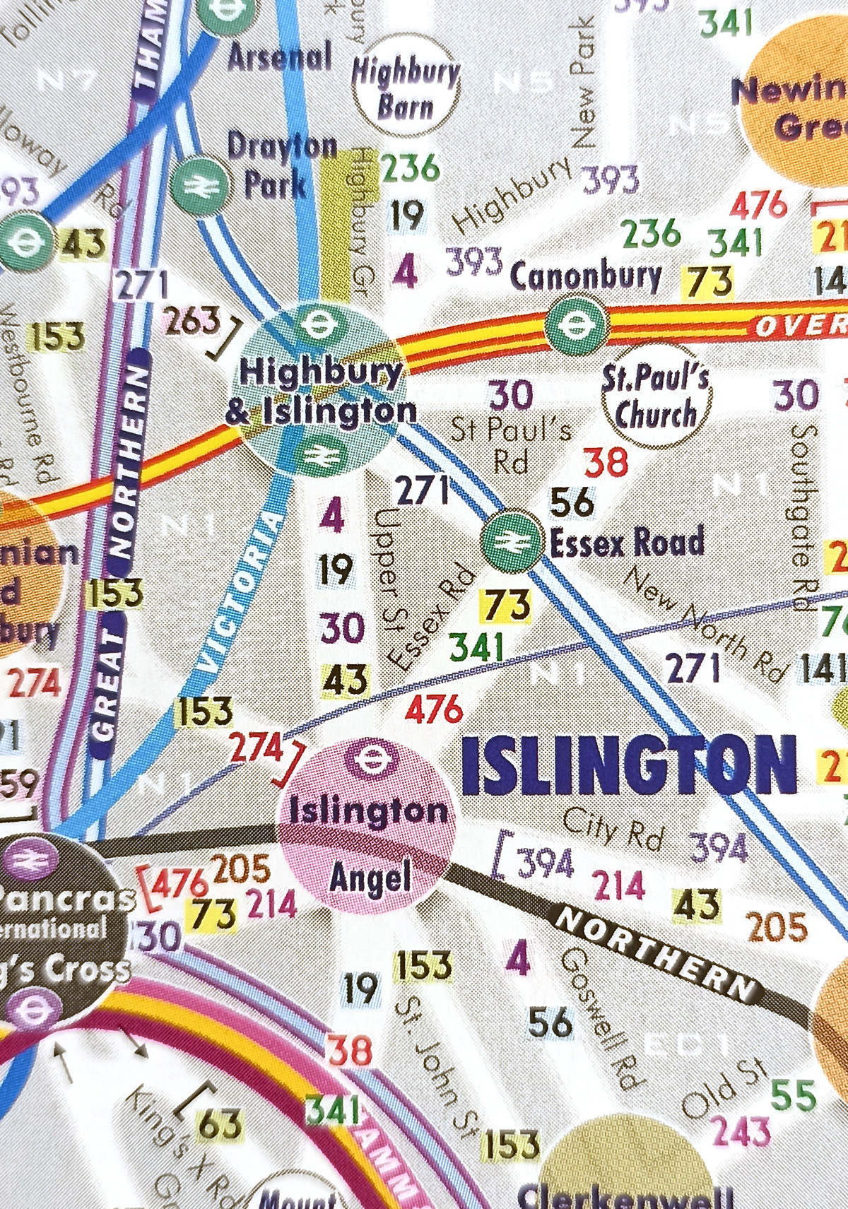
Central London has long been a spatial challenge for tourists and others unfamiliar with it. It’s very big, and most of it isn’t built on
More...