It’s part of human nature to see patterns where none exist. If you stare long enough at the London Underground, strange creatures might start to
More...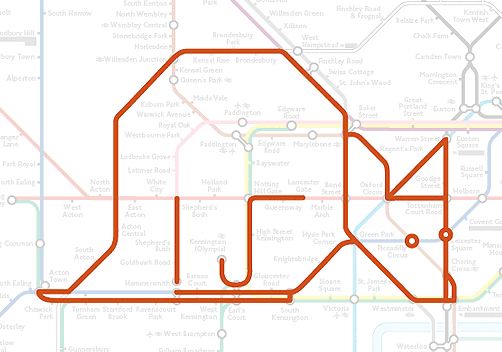
Highlighting the best London maps
It’s part of human nature to see patterns where none exist. If you stare long enough at the London Underground, strange creatures might start to
More...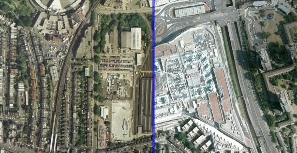
Using the visualisation technique used by ABC Australia and the New York Times to show before/after photographs of the impact of the Japan Tsunami, below
More...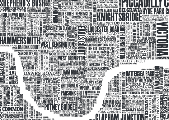
Some of the most popular posts on spatialanalysis are about typographic maps. I thought it would be cool to put together some of my favourite’s
More...
This is another great map animation from our friends in CASA. It is a year old now (almost to the day) but it remains one
More...
The OpenStreetMap project started in London in 2004 and has since grown to be a huge map of the whole world. It can be thought
More...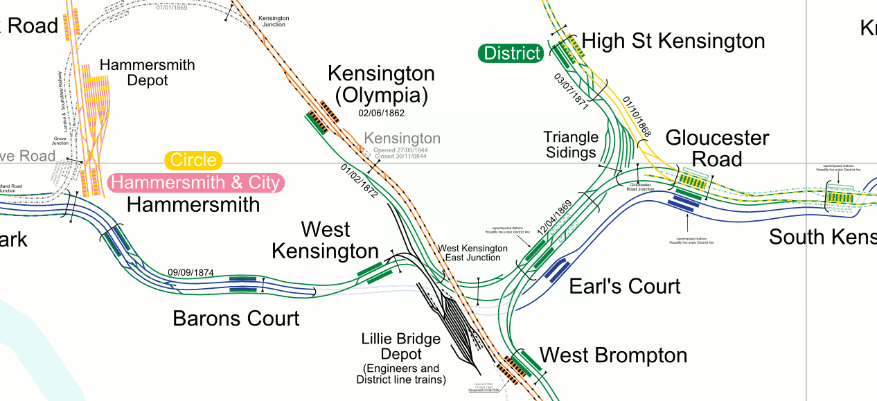
The world is not short of London underground network maps, there is something very appealing about the mix of lines, curves, dashes and circles, all
More...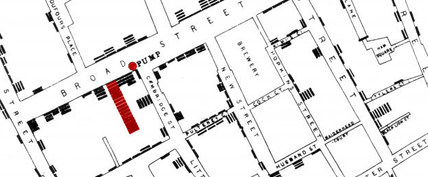
Embedded below is a high resolution version of John Snow’s 1854 map of the Broad Street (now Broadwick Street) cholera outbreak. Widely cited as the
More...Another brilliant visualisation from UCL’s CASA, this time from Anil Bawa-Cavia. It visualises trips made on the London Underground using data gathered from Oyster Cards. Each trail is
More...
Adrian Short, provider of one of the main 3rd-party APIs for the Barclays Cycle Hire scheme in London – the Boris Bikes API – has
More...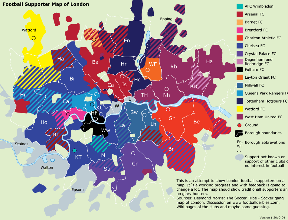
Two interesting maps of football clubs and London: First, Dean of The Londonist has mapped out the various locations of London’s football clubs over time.
More...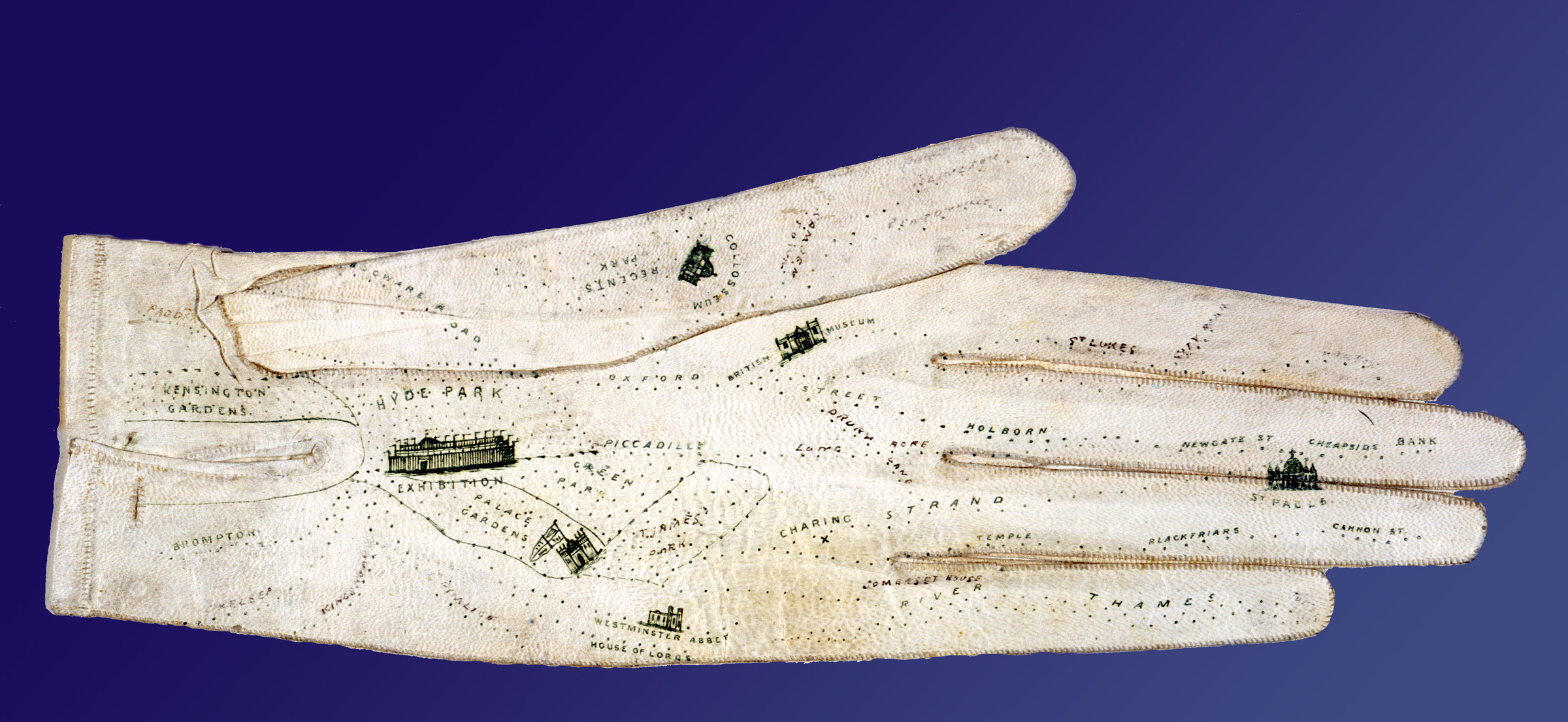
If you lack a sense of direction and resort to writing directions on scraps of paper or the palm of your hand, this glove is
More...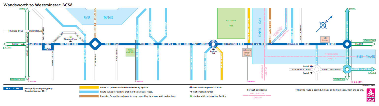
A series of blue cycle lanes, branded signs, junction reprofiles and street furniture changes are gradually being built, creating a “hub and spoke” type network
More...