The sun is out, the days are getting longer. It’s time to get into central London and walk the streets. And how about a Mapping
More...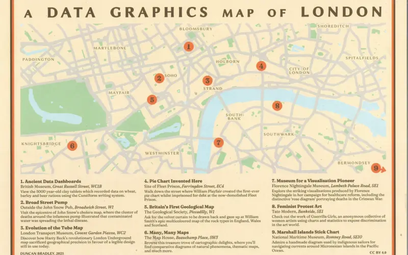
Highlighting the best London maps
The sun is out, the days are getting longer. It’s time to get into central London and walk the streets. And how about a Mapping
More...
It’s very hot in London today, and tomorrow. It’s best not to be out and about at all, but if you need to be in
More...
We featured TrainTracker, a live circuit board map of where the trains are on the London Underground – with lights representing the train locations –
More...
Route Plan Roll is the creation of Dermot Hanney – his concept is to marry a map of safe London road cycle routes, with proper
More...
The bright red JUMP bikes are alas gone from the streets of London, following the takeover of Uber’s JUMP micromobility division by rival Lime. They
More...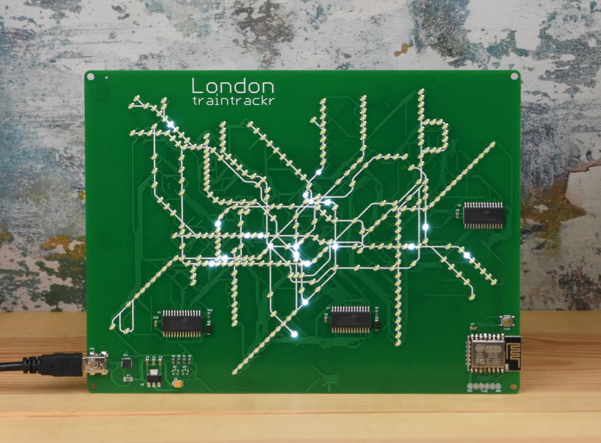
Missing travelling on the London Underground? Now, you can see the trains running, live, on this custom-made circuit board showing thetube network. An array of
More...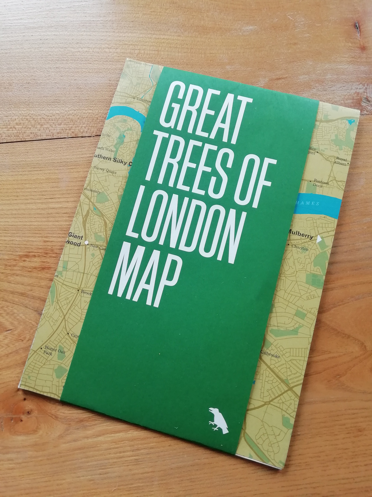
Blue Crow Media, long-time makers of bespoke themed maps of London and other places, have switched from their regular architecture focus and produced a lovely
More...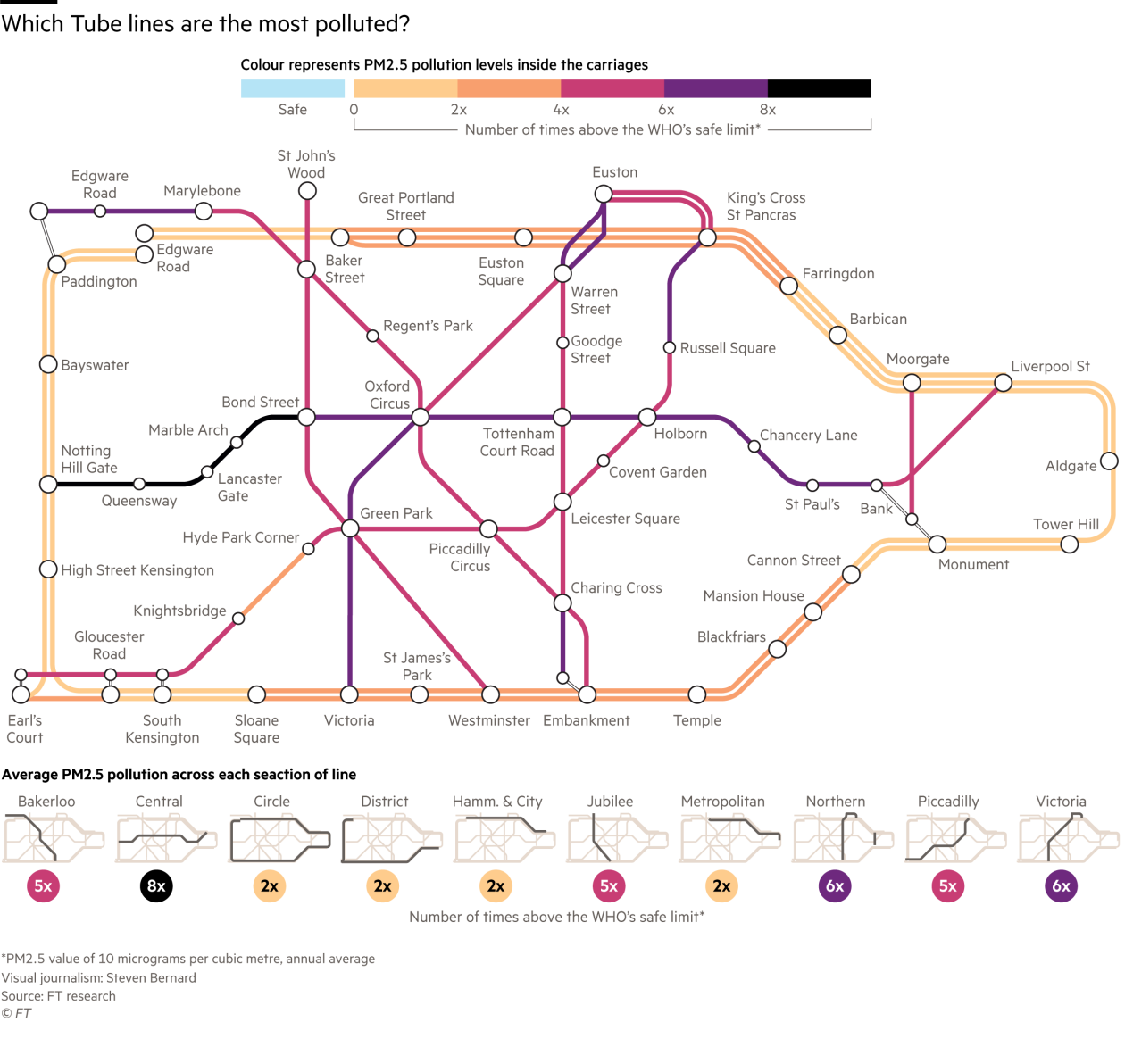
An eye-opening version the Tube Map for central London was published by the FT today (& on Twitter). The graphic, created by Steven Bernard of
More...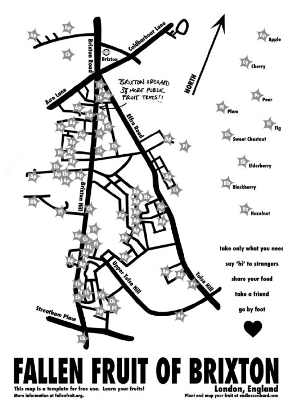
The Fallen Fruit project, by David Allen Burns and Austin Young in the US, allows communities to map publically owned/accessible trees in their neighbourhood which
More...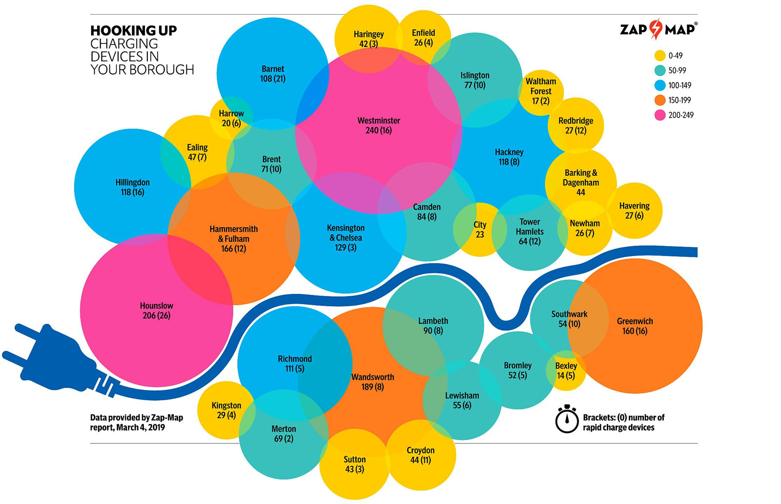
This map, “Hooking Up”, was produced by the Evening Standard newspaper as part of their Future London project, in association with Source London, a service
More...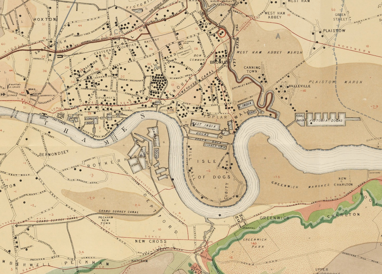
The John Snow Cholera Map is world famous as the map that identified the cause of the disease, and was one of the first epidemiological
More...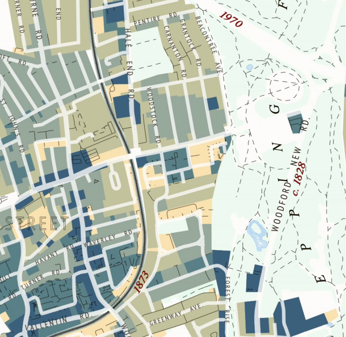
This attractive map of the housing and infrastructure history of Walthamstow and Leyton in north-east London has been created by Scott Davies. Scott used QGIS
More...