The Tube Map is a design classic – the straight lines, even spacing and lack of unnecessary above-ground detail has become a hall-mark of metro
More...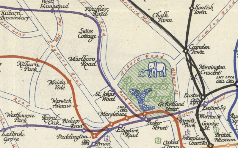
Highlighting the best London maps
The Tube Map is a design classic – the straight lines, even spacing and lack of unnecessary above-ground detail has become a hall-mark of metro
More...
The sun is out, the days are getting longer. It’s time to get into central London and walk the streets. And how about a Mapping
More...
You’ve read the blog, maybe you’ve read the book, now come and hear from the creators. A very special evening of talks will take place
More...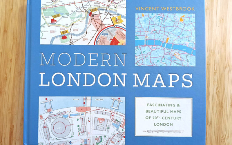
Ever thought we should be a book? Well, Modern London Maps, while unrelated to Mapping London, is probably quite close to the book that we
More...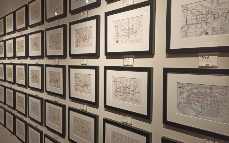
The Map House, a wonderful gallery in Knightsbridge in central London which is itself over 100 years old, has just launched a month-long exhibition specifically
More...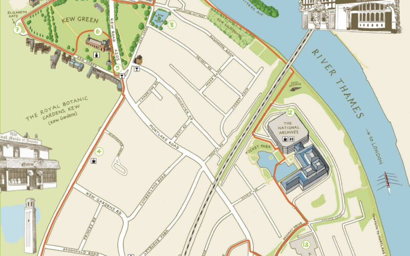
Kew is one of London’s leafy surburban neighbourhoods. Situated on a long curve of the River Thames, ot is of course famous for Kew Gardens,
More...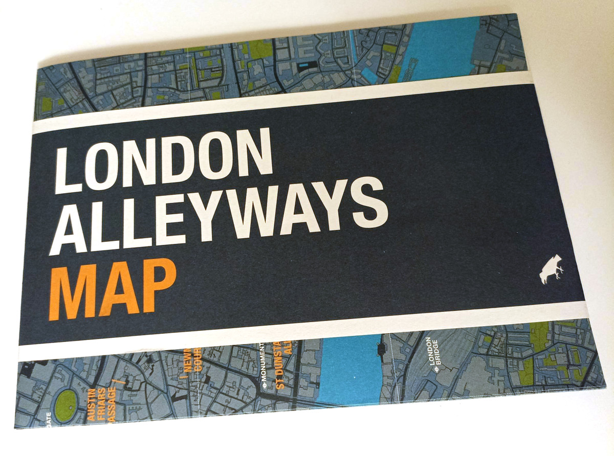
The new map is the latest in a long line in attractively packaged, specialist maps from Blue Crow Media which highlight the locations of a
More...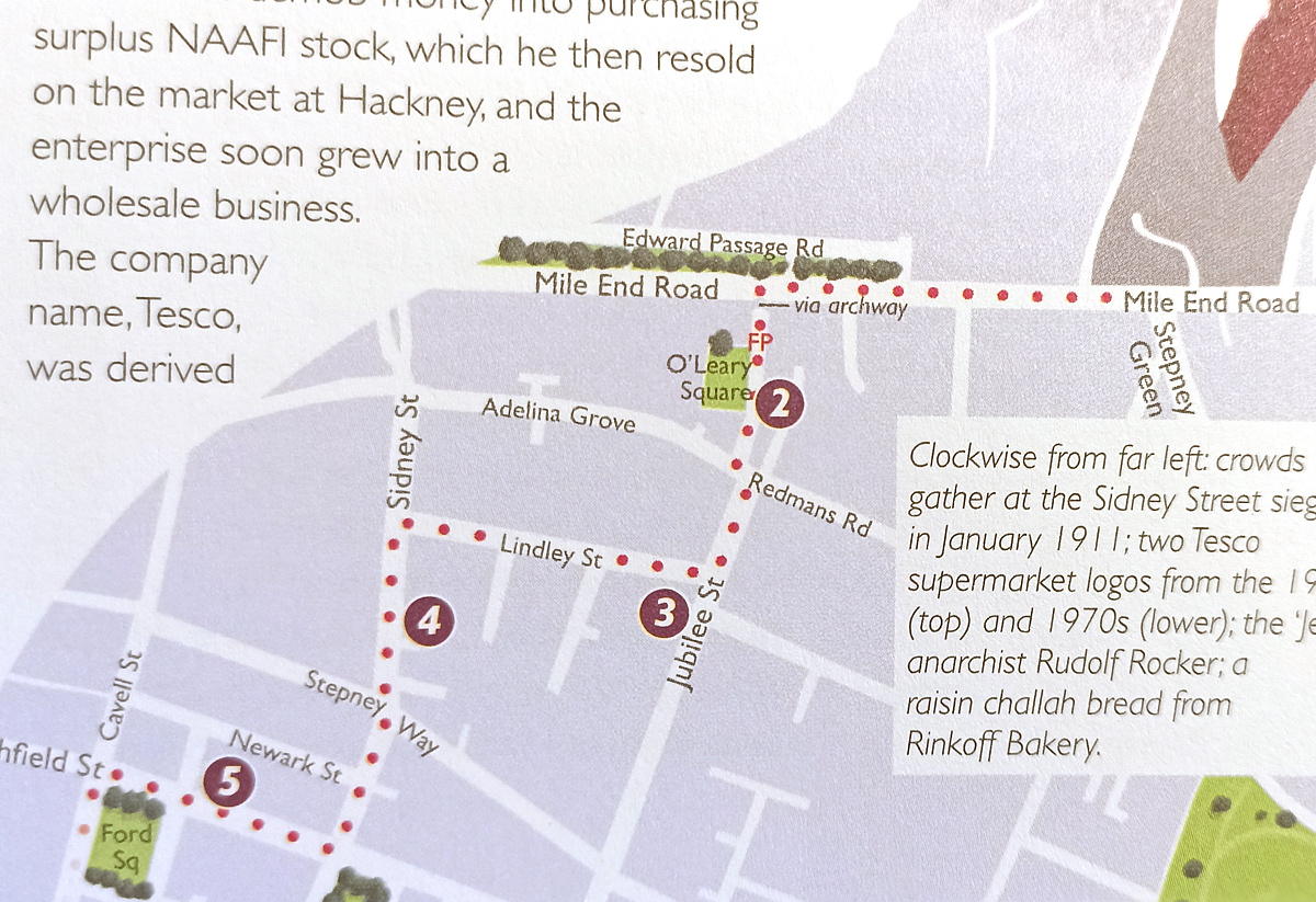
[May 2026 Update: The author has recently created an audio walking guide, Diverse Spitalfields, in conjunction with VoiceMap. It’s based on a walk extracted from
More...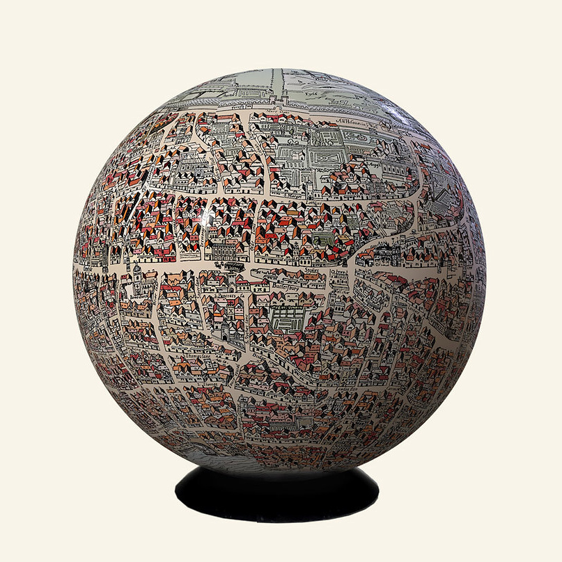
London-based artist and globemaker Julia Forte was featured in one of Mapping London’s earliest posts – way back in 2011 we featured the Map of
More...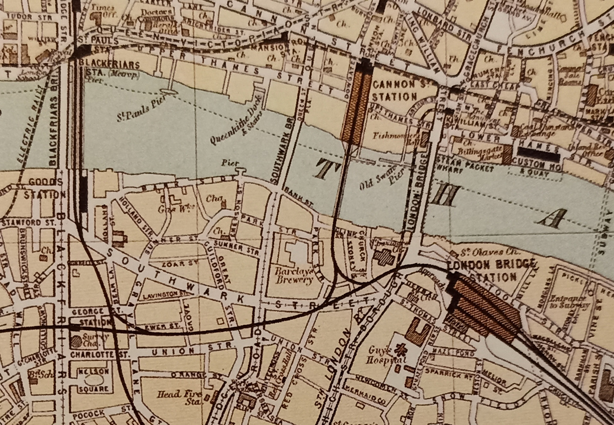
London’s railway terminus stations are major landmarks in the inner city – they form a ring around the city’s core are used by many, these
More...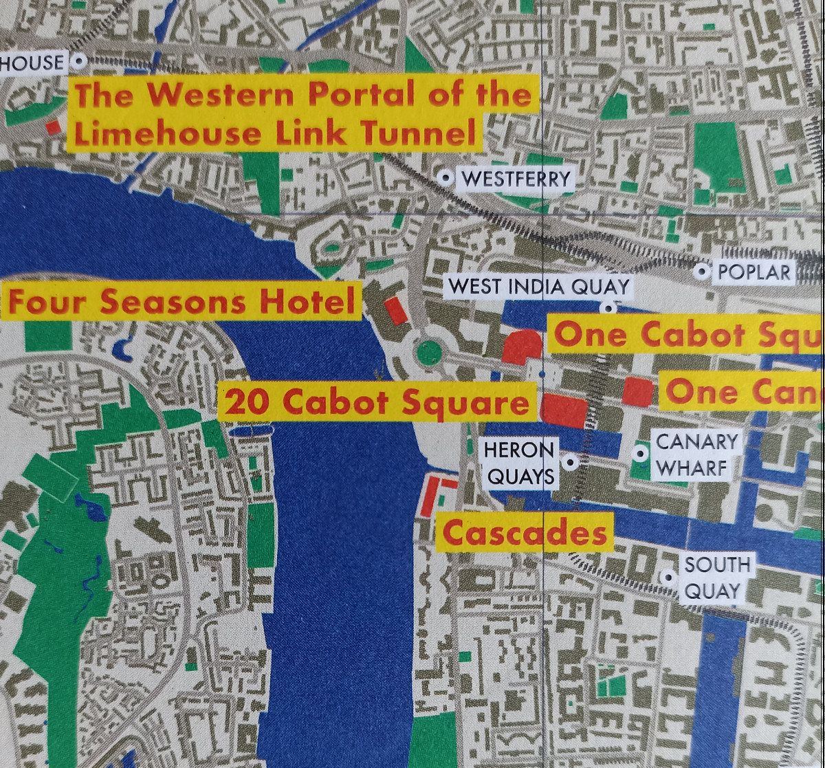
From the desk of Blue Crow Media (we’ve featured several of their maps before) comes this new map of London, focusing on Postmodernism in the
More...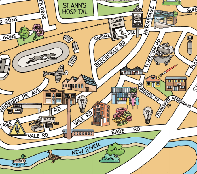
We’ve all had plenty of to explore our local areas, over the last year, with several lockdowns and other movement restrictions meaning that our local
More...