Ever thought we should be a book? Well, Modern London Maps, while unrelated to Mapping London, is probably quite close to the book that we
More...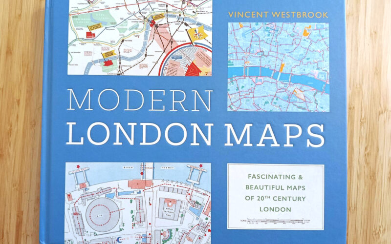
Highlighting the best London maps
Ever thought we should be a book? Well, Modern London Maps, while unrelated to Mapping London, is probably quite close to the book that we
More...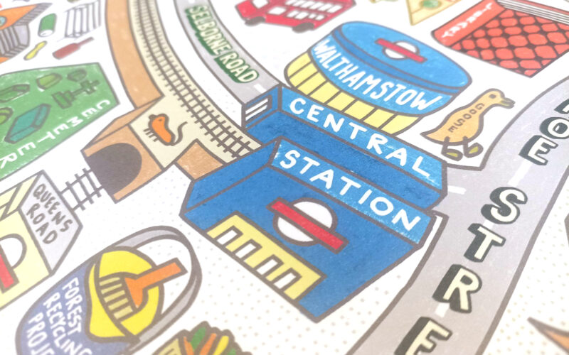
This delightful, colourful piece of cartography, is the first map by illustrator, limerick-creator and Walthamstow resident Angry Dan. The piece is a 60cm x 60cm
More...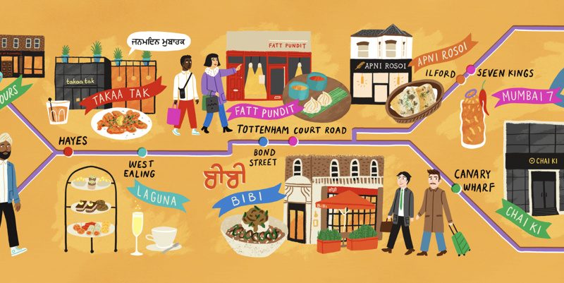
The FT published an article called “An Indian restaurant crawl along London’s Elizabeth Line” which came illustrated with this rather nice map that shows the
More...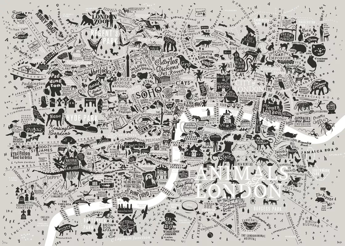
Dex, profilic creator of typographic maps of London , has published Animals of London, in partnership with the London Wildlife Trust (who receive 20% of
More...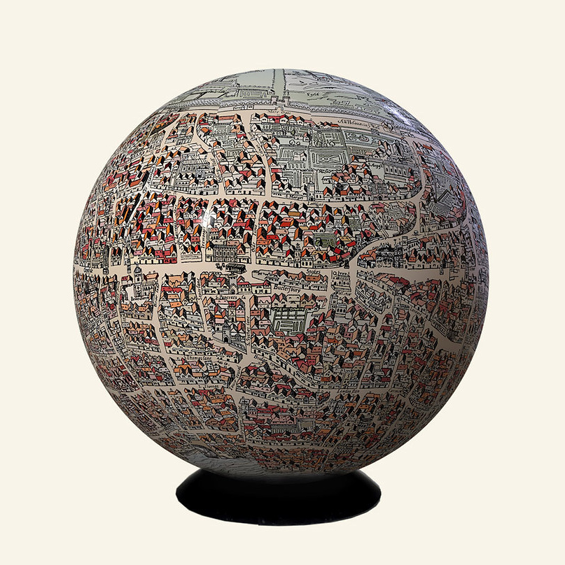
London-based artist and globemaker Julia Forte was featured in one of Mapping London’s earliest posts – way back in 2011 we featured the Map of
More...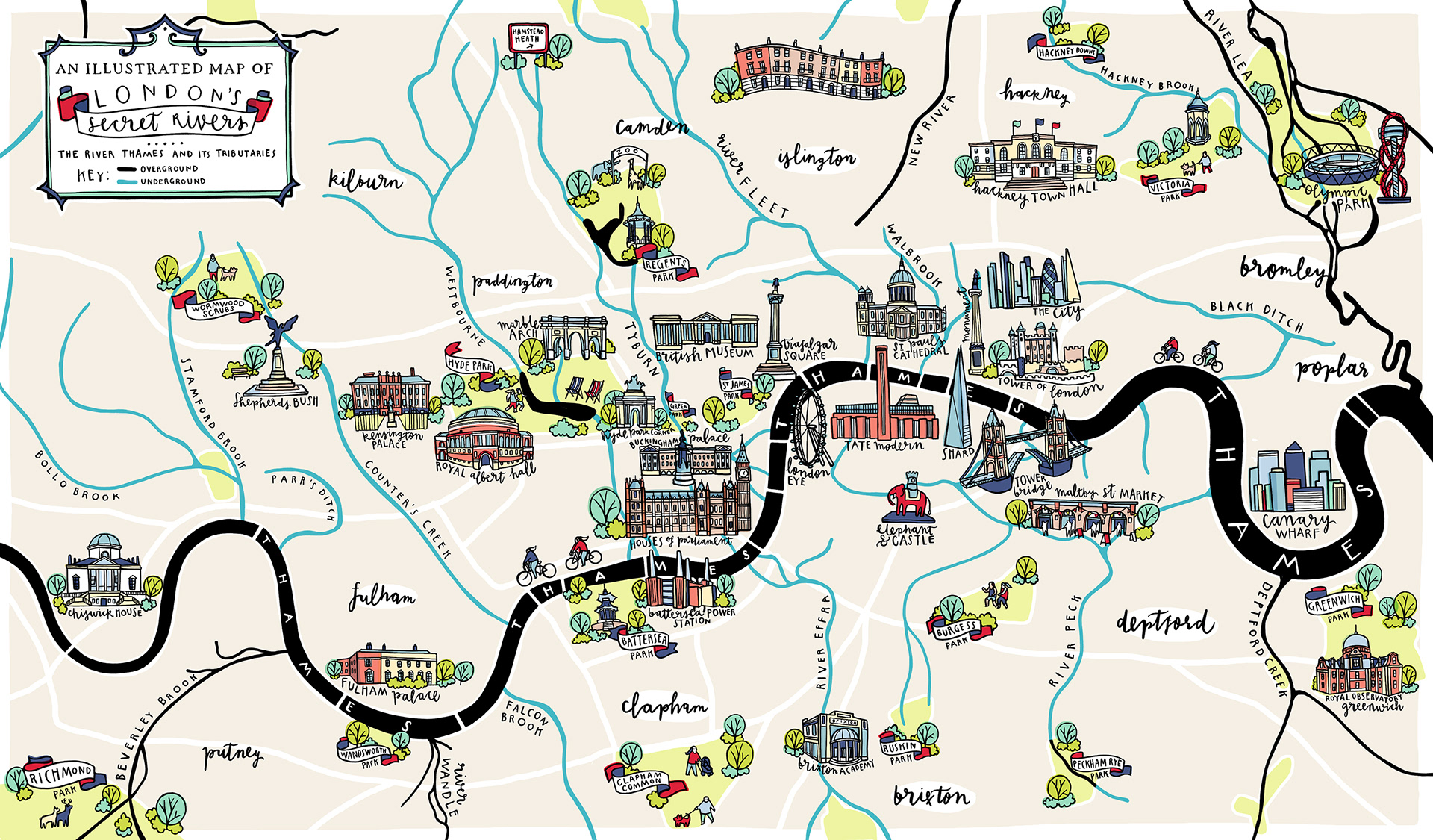
London has a lot more rivers than just the River Thames and River Lea – but many of the rest are either very small and
More...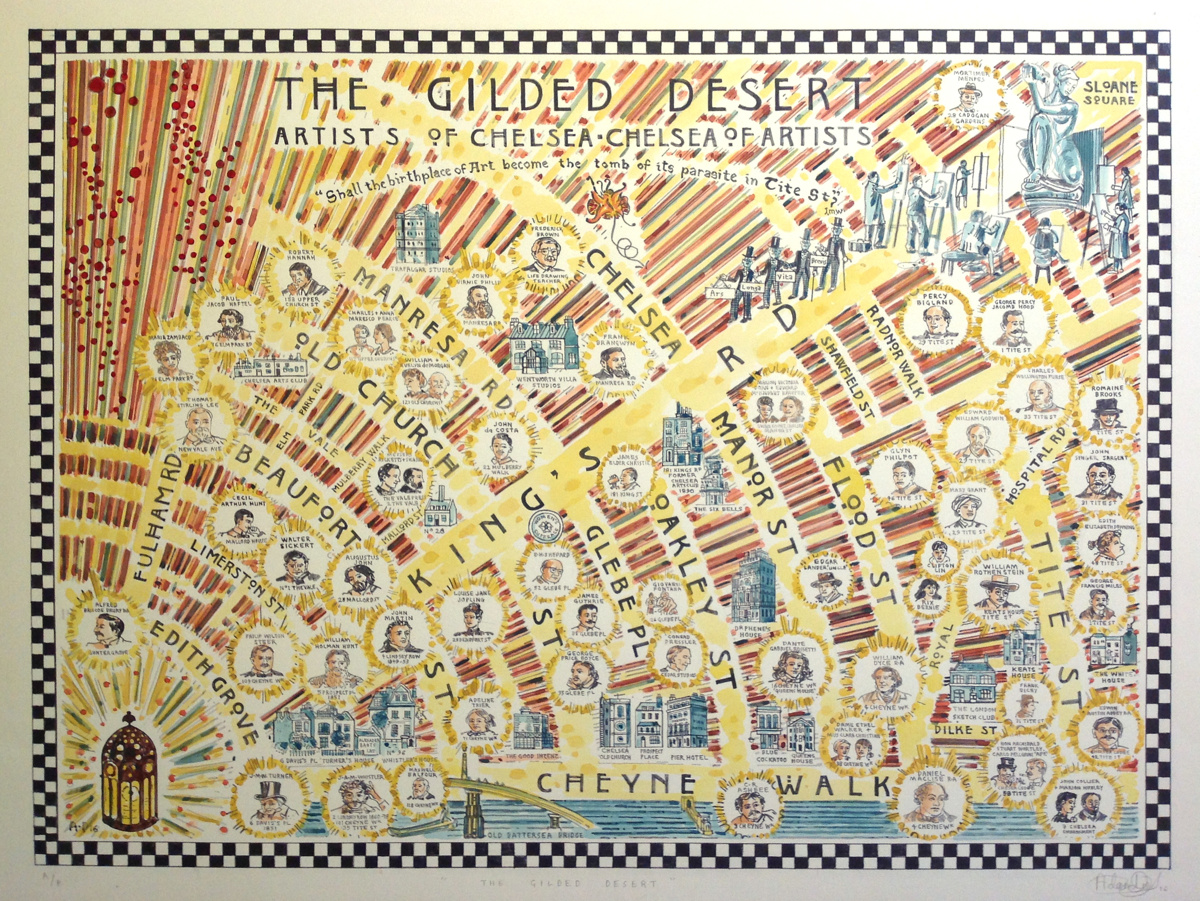
Adam Dant, artist, creates art which is often based around a geographical location, using cartography to frame a topic, often drawing out a key road
More...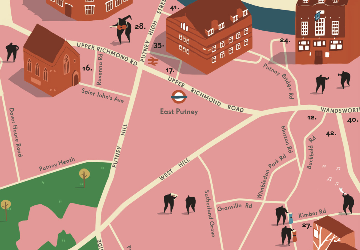
Quite a bit of creative activity is going on in the south-west London borough of Wandsworth, as this map & guide, produced late last year,
More...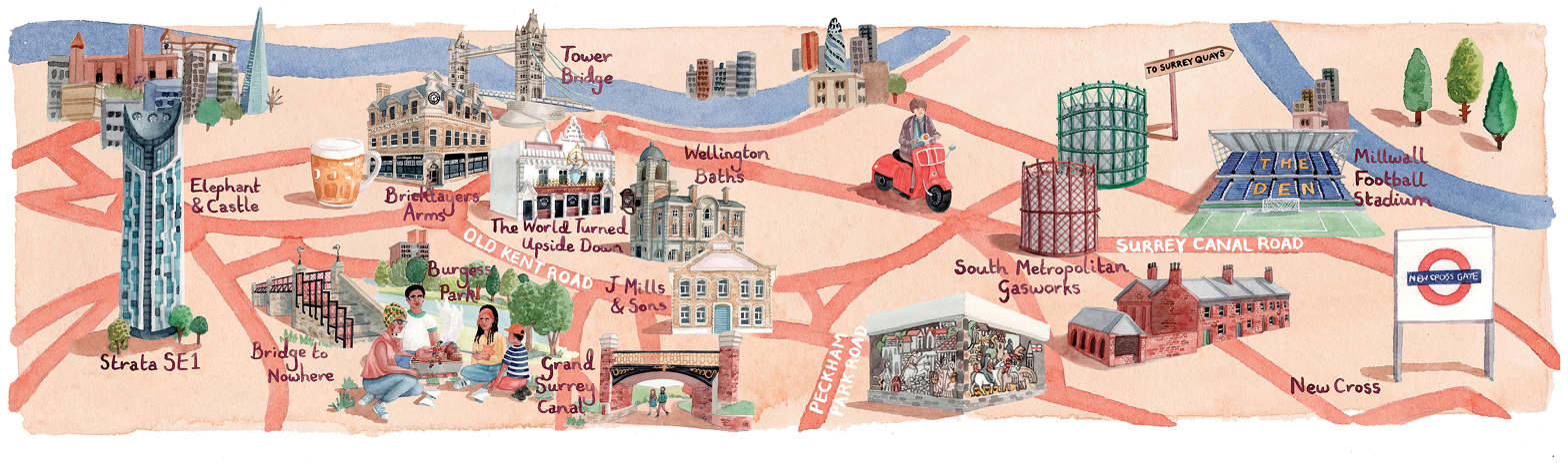
The FT has run a couple of articles [$] recently on housing in Peckham and the Old Kent Road area in south-east London – the
More...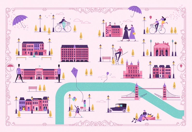
This stylised map of central London was created by MUTI, a South African design studio, and is “as seen in Mary Poppins Returns”, a film
More...
The public may not be able to visit Tottenham Court Road station’s Crossrail concourse or platforms yet, thanks to the well-publicised delay across the wider
More...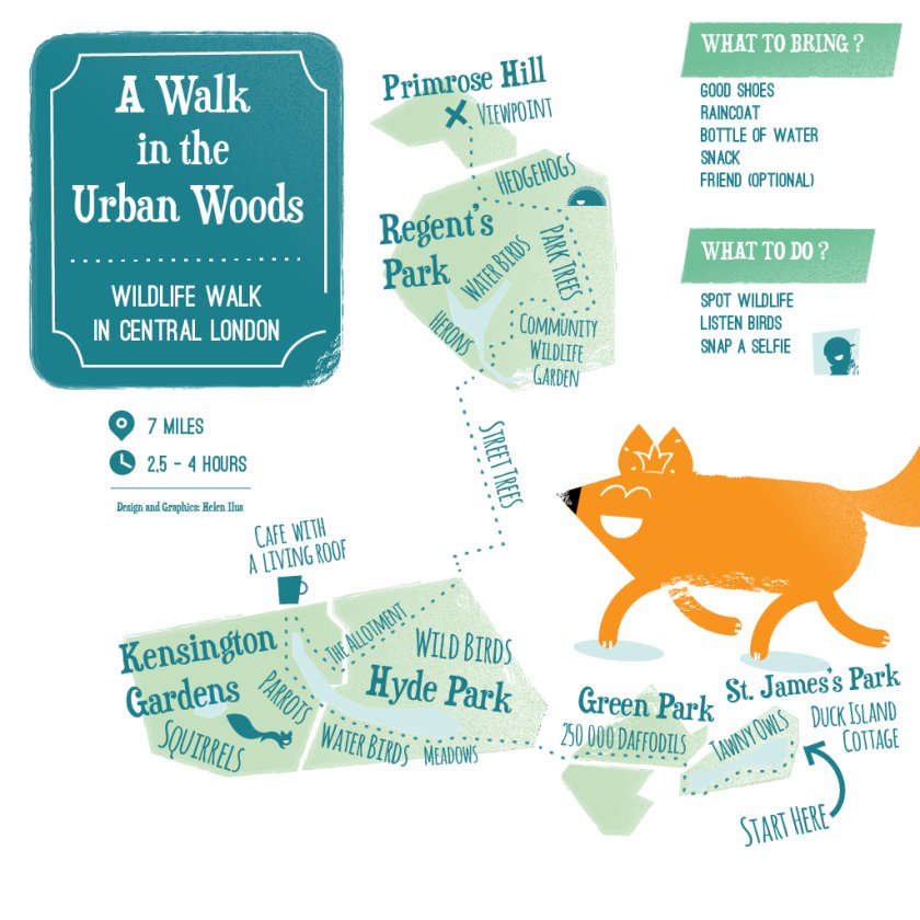
This artistic map of a green walking route in central London has been created by graphic designer Helen Ilus. By showing just the parks that
More...