The Tube Map is a design classic – the straight lines, even spacing and lack of unnecessary above-ground detail has become a hall-mark of metro
More...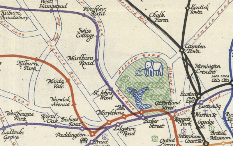
Highlighting the best London maps
The Tube Map is a design classic – the straight lines, even spacing and lack of unnecessary above-ground detail has become a hall-mark of metro
More...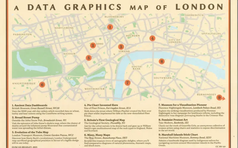
The sun is out, the days are getting longer. It’s time to get into central London and walk the streets. And how about a Mapping
More...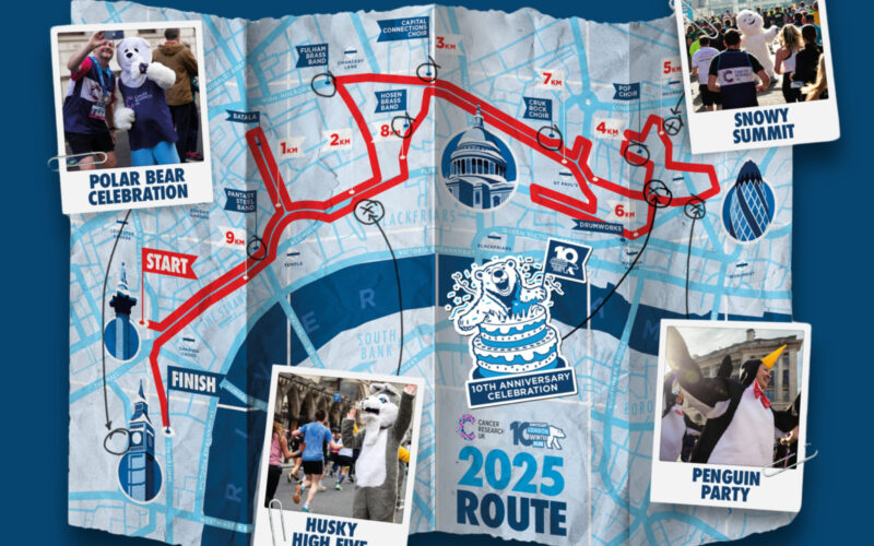
We love a good custom map for an event, and the London Winter Run has just one – and despite it pretending to be an
More...
You’ve read the blog, maybe you’ve read the book, now come and hear from the creators. A very special evening of talks will take place
More...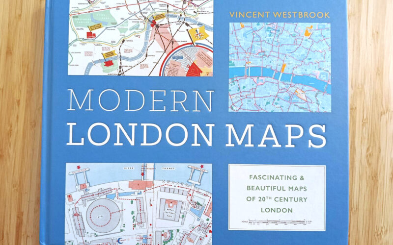
Ever thought we should be a book? Well, Modern London Maps, while unrelated to Mapping London, is probably quite close to the book that we
More...
Easter is approaching and its time for some eggs to find – 120 two-foot high ones are in London right now thanks to the Elephant
More...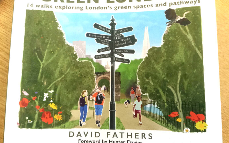
It’s a frosty start to March, but green shoots are finally appearing in the ground. So it’s a great time to introduce a new book,
More...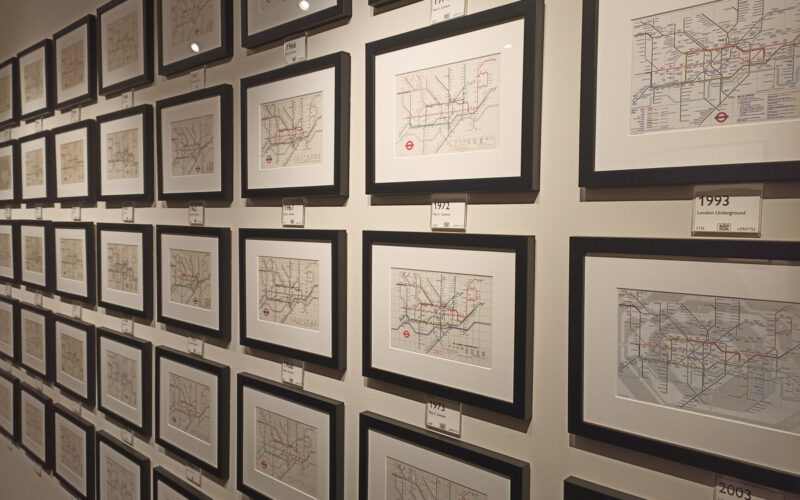
The Map House, a wonderful gallery in Knightsbridge in central London which is itself over 100 years old, has just launched a month-long exhibition specifically
More...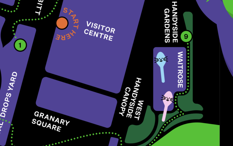
King’s Cross Central, the area behind King’s Cross and St Pancras stations, has launched a monster trail, which is running up to and including Hallowe’en
More...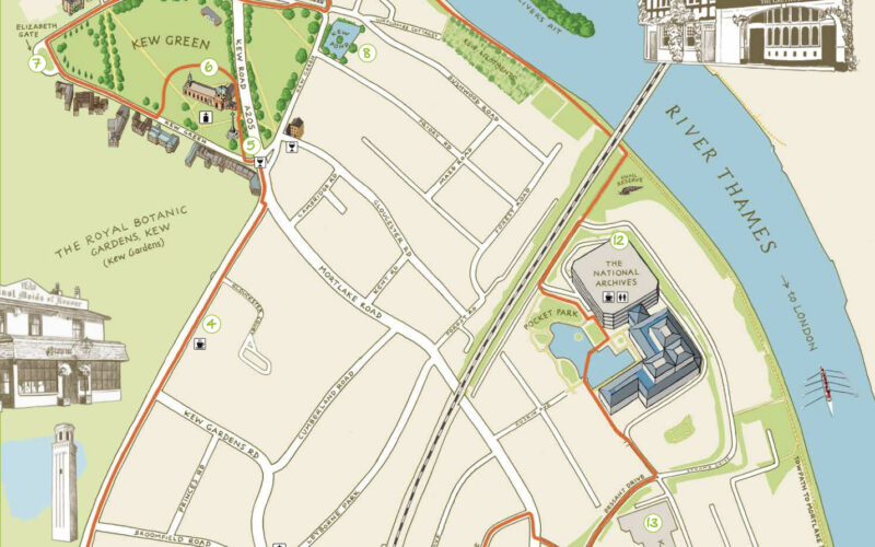
Kew is one of London’s leafy surburban neighbourhoods. Situated on a long curve of the River Thames, ot is of course famous for Kew Gardens,
More...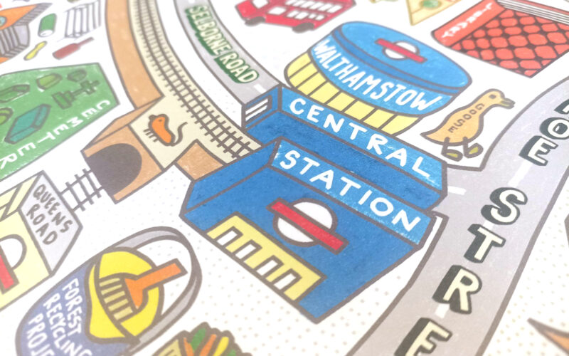
This delightful, colourful piece of cartography, is the first map by illustrator, limerick-creator and Walthamstow resident Angry Dan. The piece is a 60cm x 60cm
More...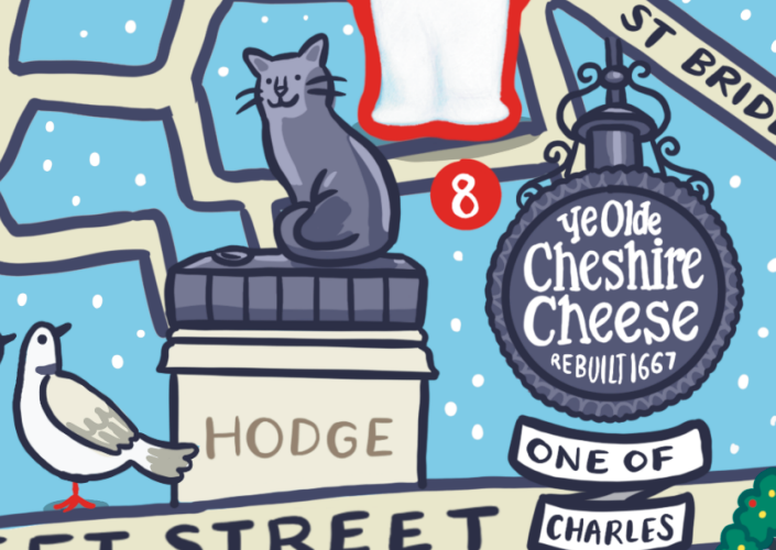
We’ve long liked temporary “parade” sculpture trails in London – they make exploring a neighbourhood even more interesting, if around the corner is one of
More...