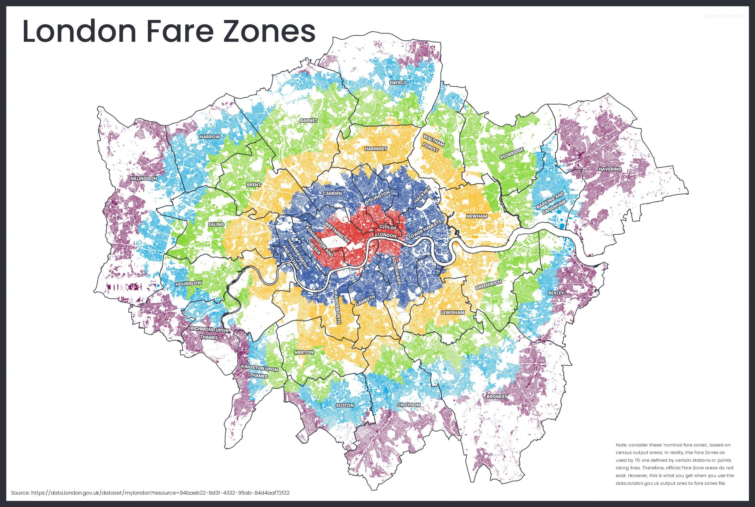
People in London generally know what tube zone they live “in”. There are no defined zones as such, zones are simply classifications assigned to each tube and railway station in, so it is likely people label their “zone” based on the zone of their nearest tube/railway station. Your zone, or the number of zones you travel in, set your journey fare.
Zones make a big difference to how much it costs to travel around London on the tube and railway network – particularly when travelling into or out of Zone 1 in the centre. As such, there are fairly regularly campaigns to get certain stations reclassified by Transport for London, who defined and control the zone system. Such a change though sometimes creates more problems than it solves – as TfL changed Stratford to Zone 2/3 from Zone 3, after the London 2012 Olympics gave this east London hub more prominence. Changing to Zone 2 would have made it cheaper to get from Stratford to central, but more expense for people travelling from outer London to Stratford – so the Zone 2/3 is a cartographically ugly compromise on the tube map.
Anyway – despite the lack of zone “areas” as such, the GLA published a dataset assigning each small statistical area in London to a zone, based on the nearest station – and Alasdair Rae has mapped this data onto a base Ordnance Survey dataset showing all building blocks in London, and coloured all the buildings in each zone with a distinct colour. Visually it is rather striking. It shows, if nothing else, that the fares are “fair” – there is no great consipracy, rather just that they are concentric rings, slightly squished because London is wider than it is tall, due to the effect of the ancient settlement running along the Thames and lines of hills to the north and south.
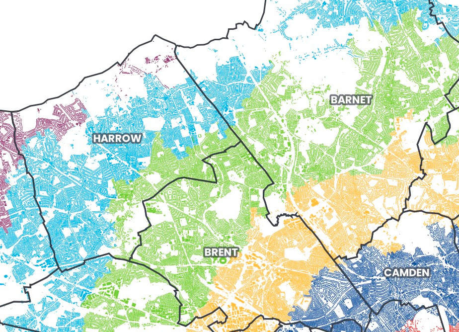
It also shows, much better than a normal borough map, which London boroughs are actually “inner” (Zones 2-3), which are “outer” (Zones 4-6?) and which are a bit of both. For example, Haringey is unambiguously a Zone 3 borough, and Redbridge, despite being on the London border, almost entirely Zone 4 – because the London border is really not far from the centre of town, here. It also shows just how rural much fo Zone 6 is -the majority of Zone 6 Bromley, for example, has no buildings nearby.
There are a couple of alternative versions – his original minimalist one with no borough boundaries, and one with the tube stations on it.
London’s fare zones actually extend out of Greater London these days – but that’s a map for another day.
Maps © Alasdair Rae.
Why is an area quite far into the conurbation like Kingston in Zone 6 while areas further out are often in Zone 5 ? Also, why is Epsom, clearly part of the conurbation, not in Zone 6 ?!?
Have to disagree as a Woolwich resident who lives in zone 4, a rivers width away from zone 3 on the direct opposite bank of the river… also are you aware a train journey south of the river cost more than a TFL dlr/tube journey from the same zone, unlike North of the river where all forms of railed transport charge the same for a zone 4 to 1 journey
I’ve made a more accurate version of this. See https://rti2-demo.whoosh.media/demo/demo
Southwest London is being completely robbed by the Zone system. So many places here should be in zone 3 4 or 5. Many are unfairly in Zone 6 regardless of their actual distance from the city center, It’s as if all the rules of this system go out the window when applied to Southwest London!?