London-based artist and globemaker Julia Forte was featured in one of Mapping London’s earliest posts – way back in 2011 we featured the Map of
More...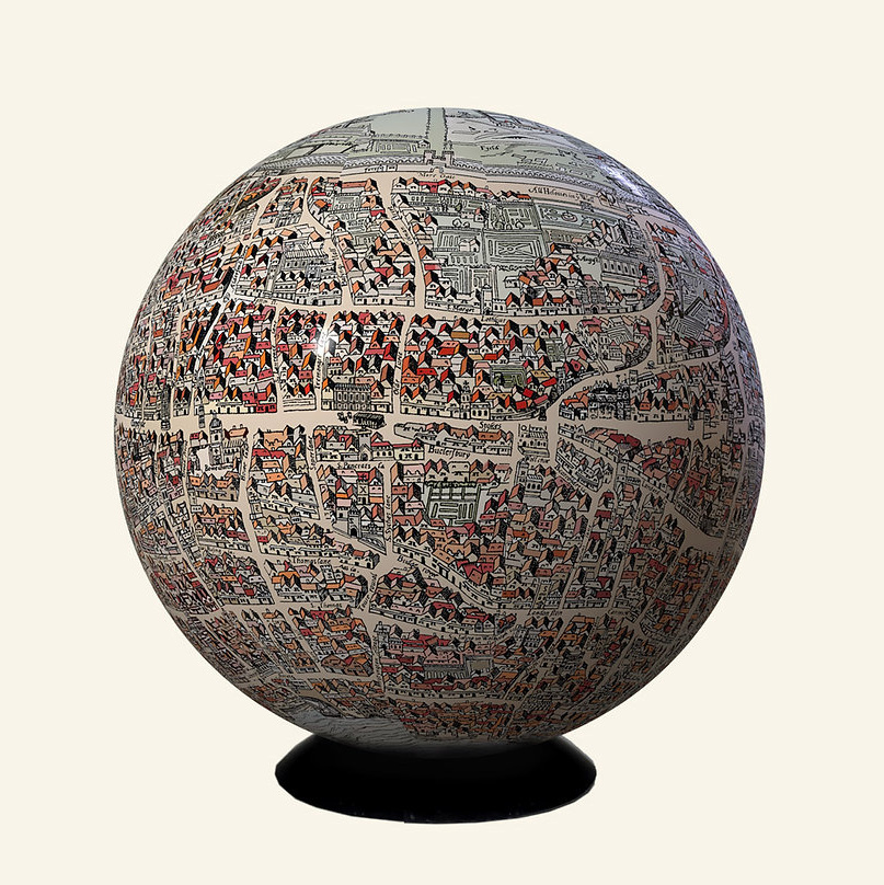
Highlighting the best London maps
London-based artist and globemaker Julia Forte was featured in one of Mapping London’s earliest posts – way back in 2011 we featured the Map of
More...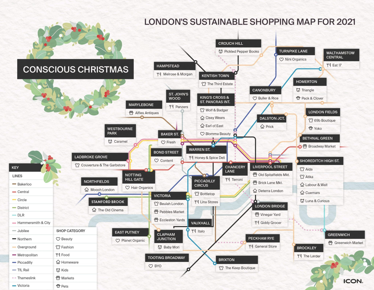
Just in time for Christmas, here’s a central London alternative tube map that has been made by ICON Printing, a custom apparel design firm. It
More...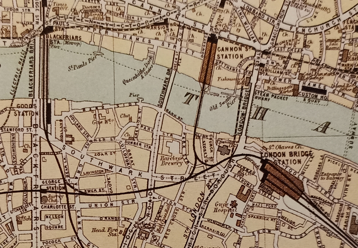
London’s railway terminus stations are major landmarks in the inner city – they form a ring around the city’s core are used by many, these
More...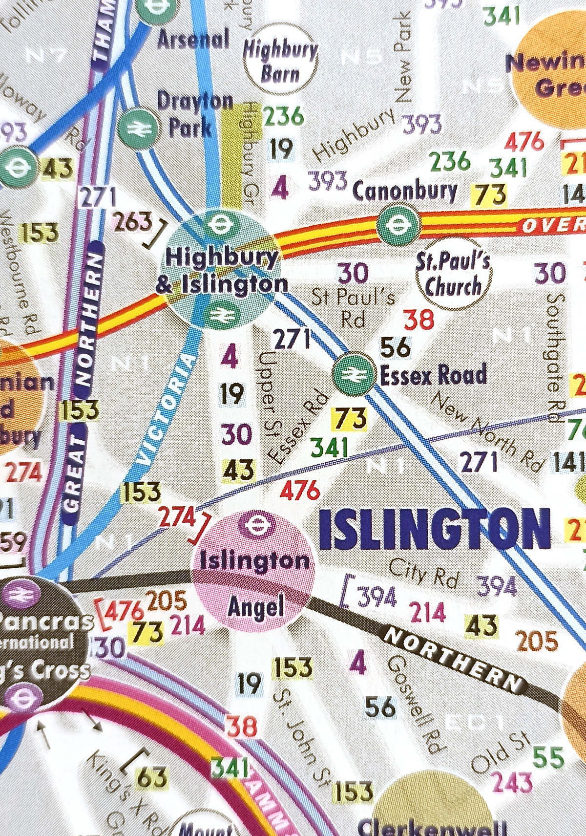
Central London has long been a spatial challenge for tourists and others unfamiliar with it. It’s very big, and most of it isn’t built on
More...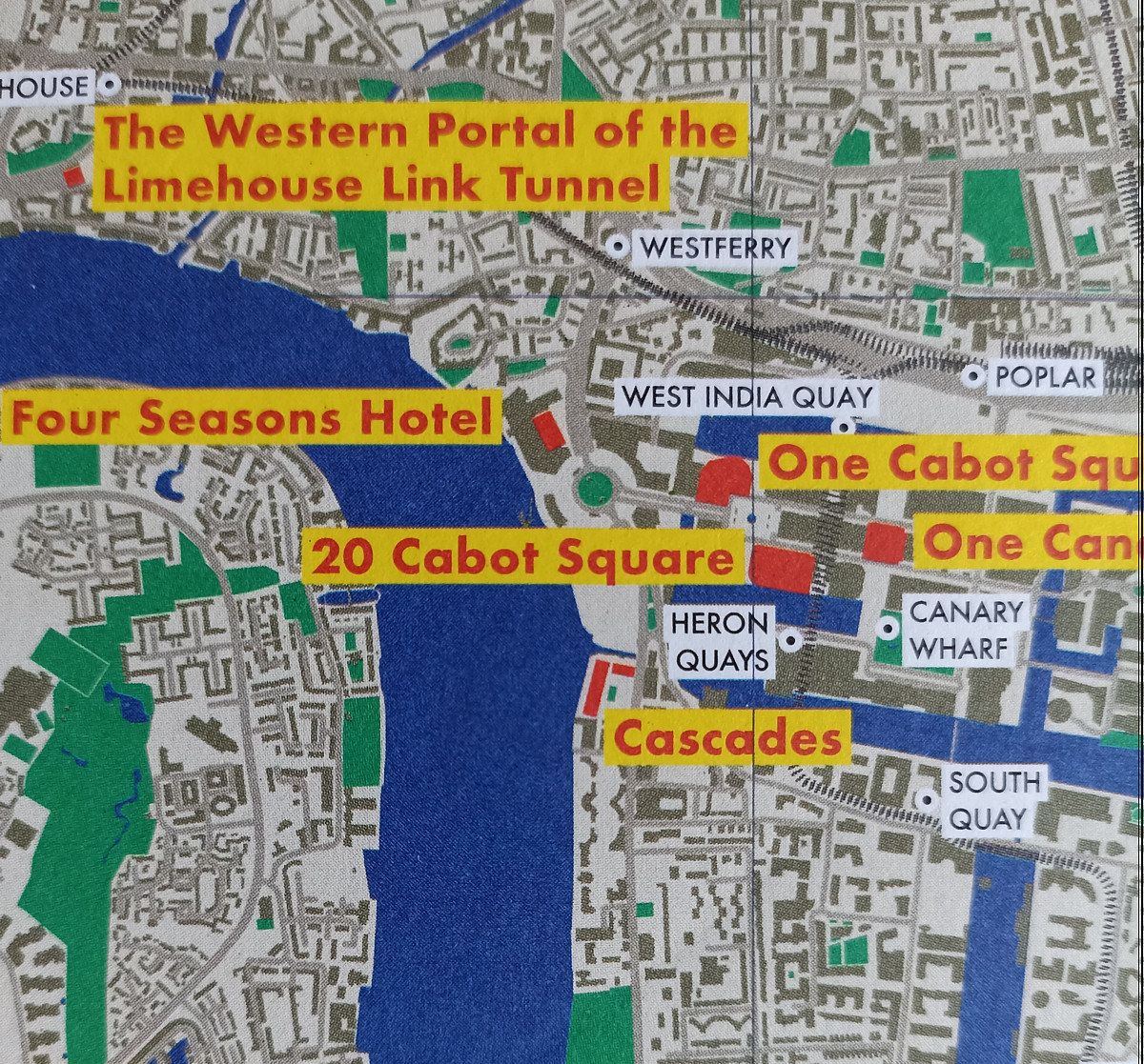
From the desk of Blue Crow Media (we’ve featured several of their maps before) comes this new map of London, focusing on Postmodernism in the
More...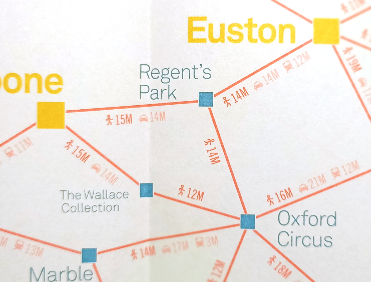
Various central London locations are this week, as part of London Car Free Day (which is today!), stocking free copies of a paper map (you
More...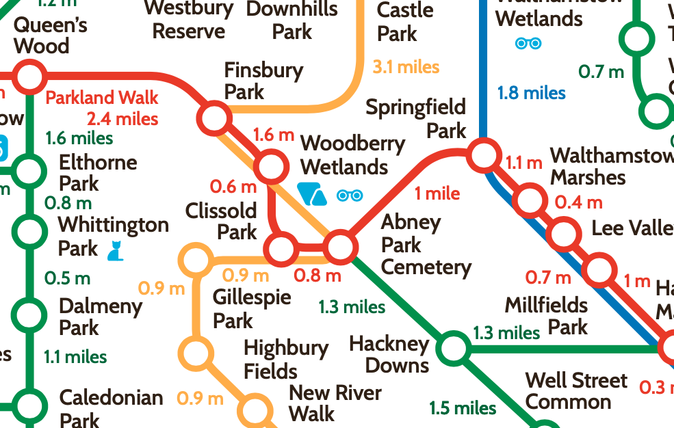
The London Greenground Map, by designer Helen Ilus (Hi Design), takes its inspiration from the famous tube map to create a network of walking routes,
More...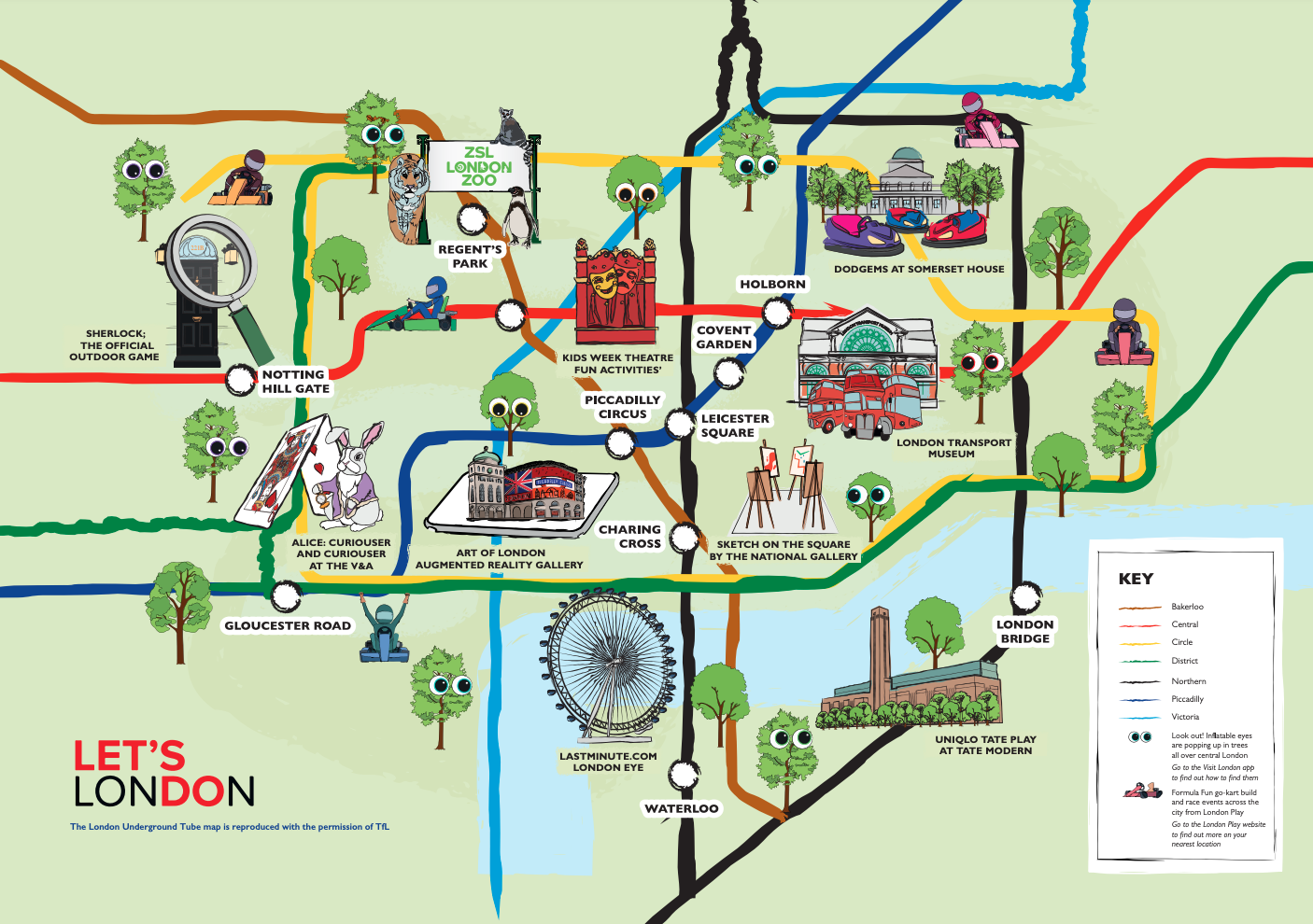
After nearly a year and a half when much of London has been staying away from its central business district, there’s a big push to
More...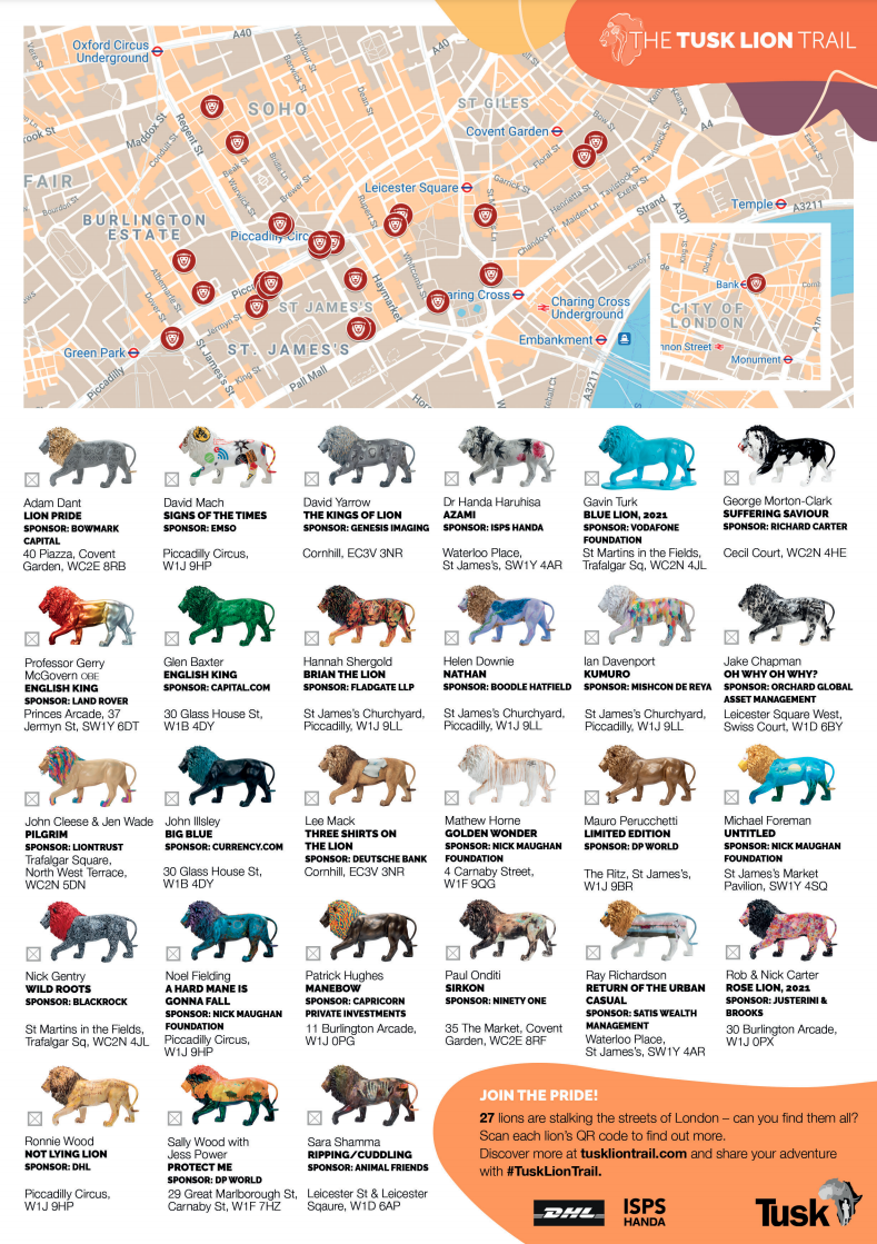
Time to find some painted lions in central London! The Tusk Lion Trail is a series of life-size fibreglass lions, painted by a variety of
More...
People in London generally know what tube zone they live “in”. There are no defined zones as such, zones are simply classifications assigned to each
More...
Route Plan Roll is the creation of Dermot Hanney – his concept is to marry a map of safe London road cycle routes, with proper
More...
We’ve all had plenty of to explore our local areas, over the last year, with several lockdowns and other movement restrictions meaning that our local
More...