The above graph shows the results of the council elections that took place last week for each of the ~600 wards in London. The colours
More...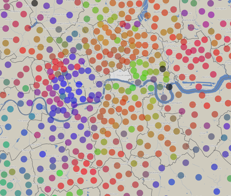
Highlighting the best London maps
The above graph shows the results of the council elections that took place last week for each of the ~600 wards in London. The colours
More...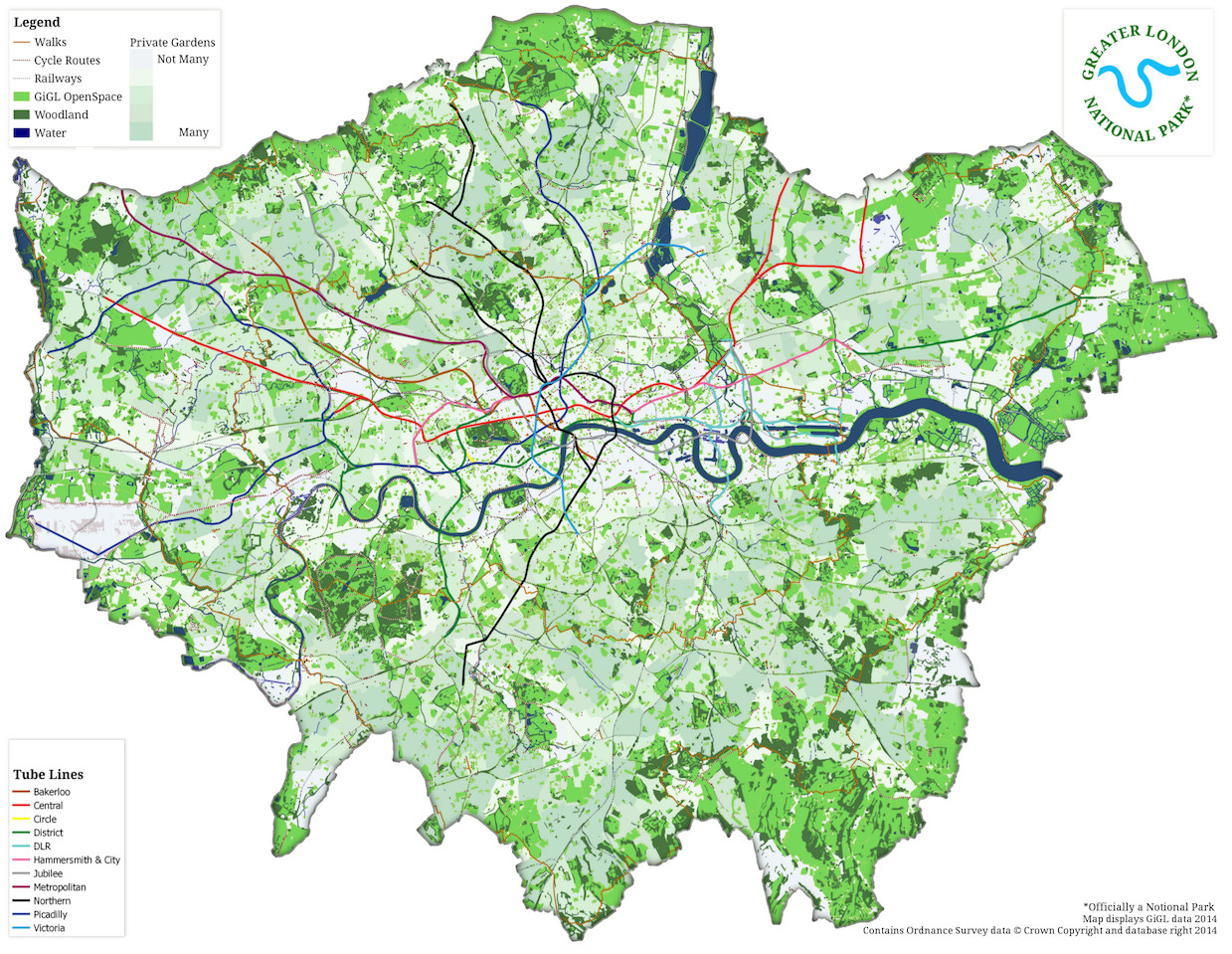
A website calling for a Greater London National Park launched today (1 April) although it’s keen to point out that it’s not actually an April
More...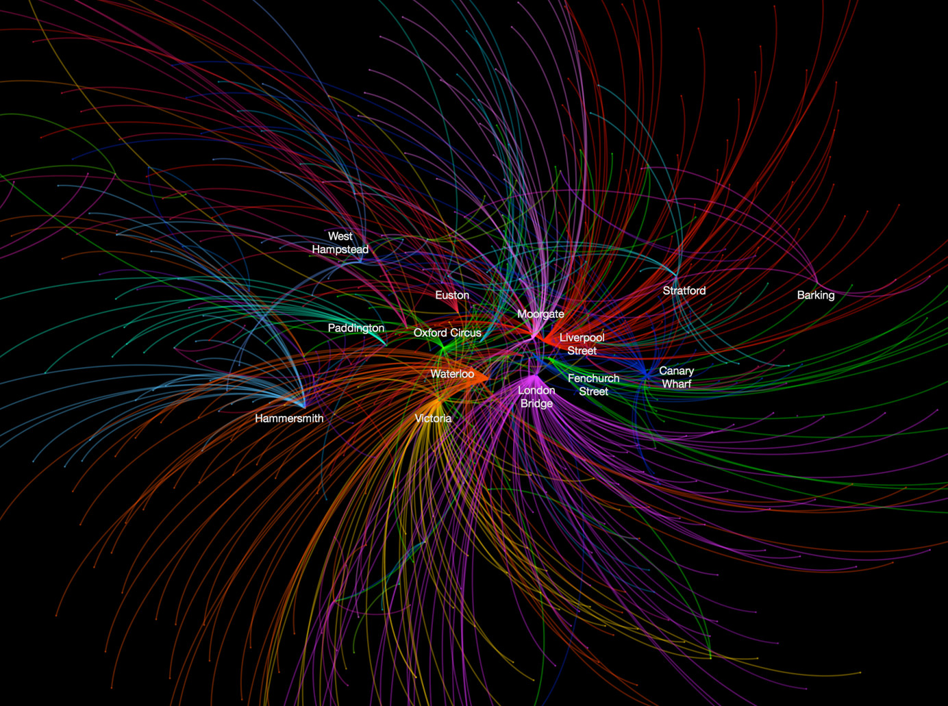
This data map, from UCL CASA‘s own Ed Manley, shows the top destination station, for each starting station, in and around London. The graphic is
More...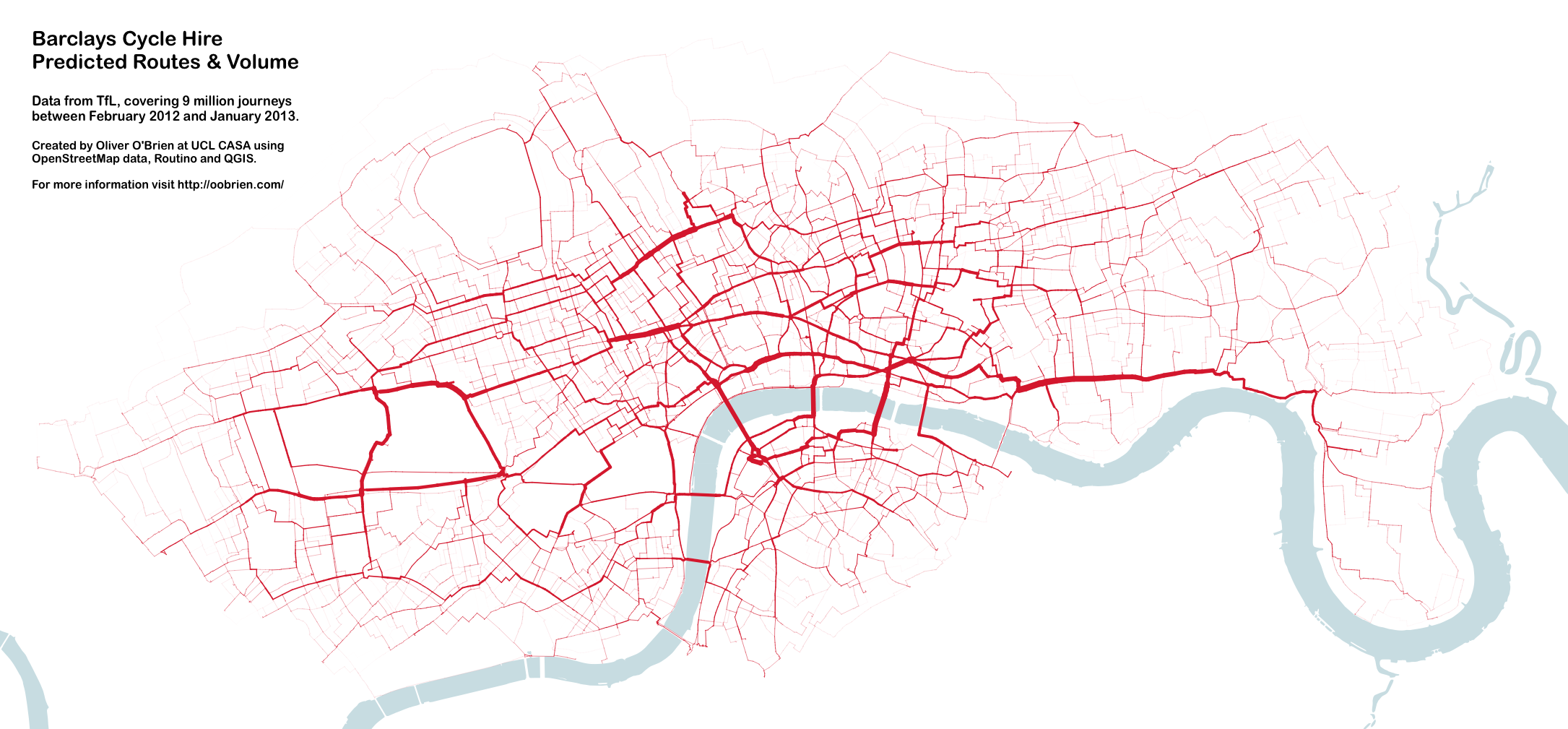
You may remember this map produced by Mapping London co-editor James in 2012. A version of this map appears in a journal article published by
More...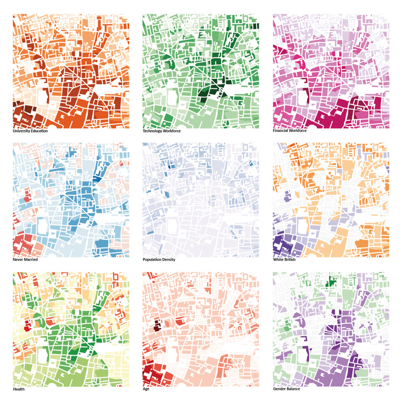
This was the submission by the Mapping London editors into the 10×10 Drawing the City London 2013 art event, which was a charity auction run
More...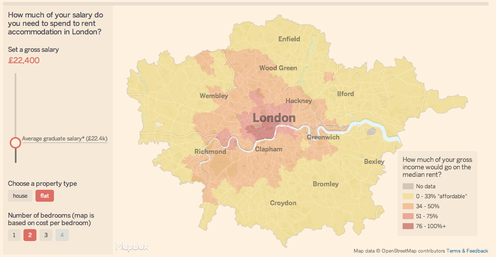
There is always interest in London’s astronomical rents and house prices. As with any global city, there is huge demand for somewhere to live in
More...
Dr Ed Manley (@EdThink), a research associate on the Mechanicity project here at the Centre for Advanced Spatial Analysis, created this dramatic, colourful graphic (excerpt
More...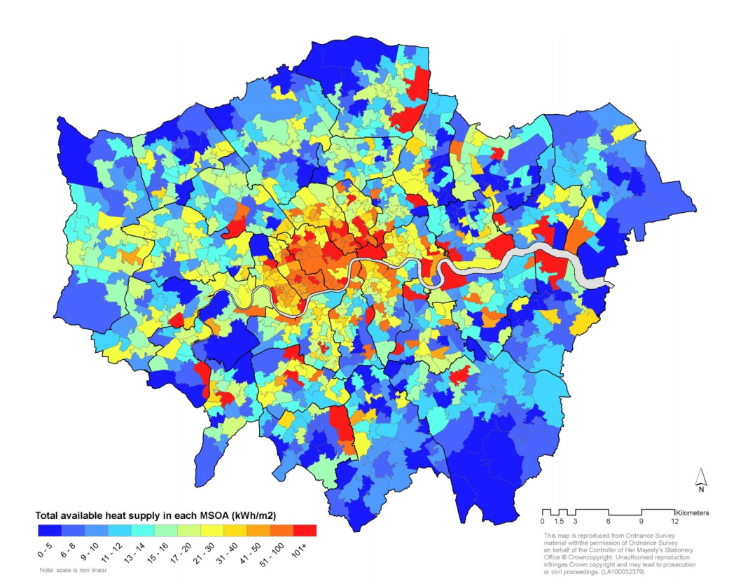
A huge amount of energy is wasted each year in London as heat escapes from our buildings in winter or is pumped out from
More...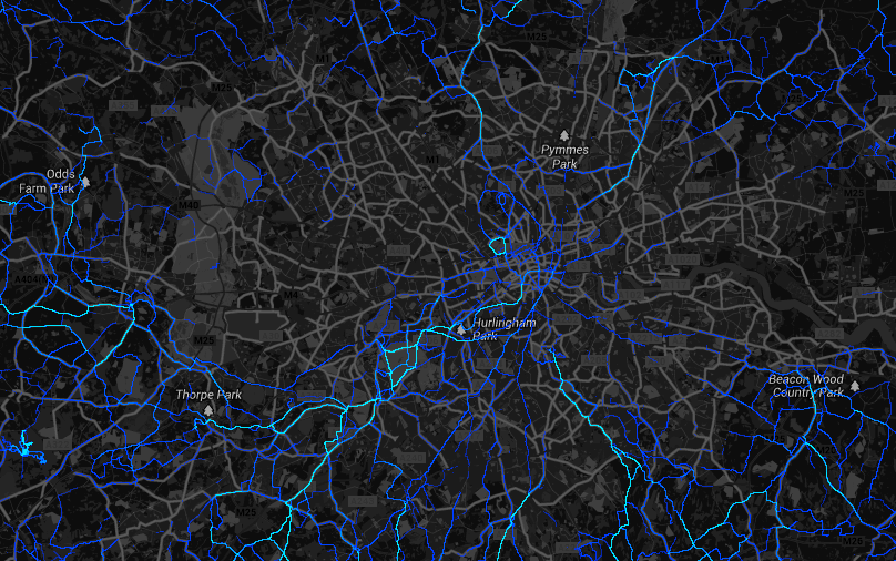
Strava, one of a number of services that walkers, runners and cyclists can use with their smartphones, recording and uploading their routes, has released a
More...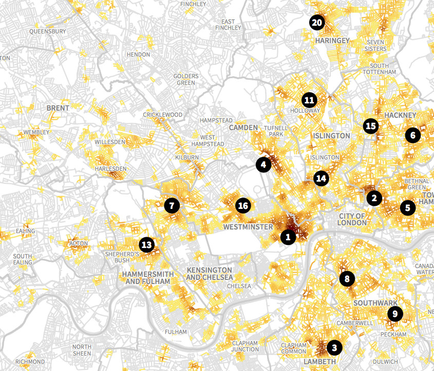
This is an extract of a map, by Matt Ashby, formerly of the UCL SECReT (Security and Crime Science) lab, that takes police.uk open data
More...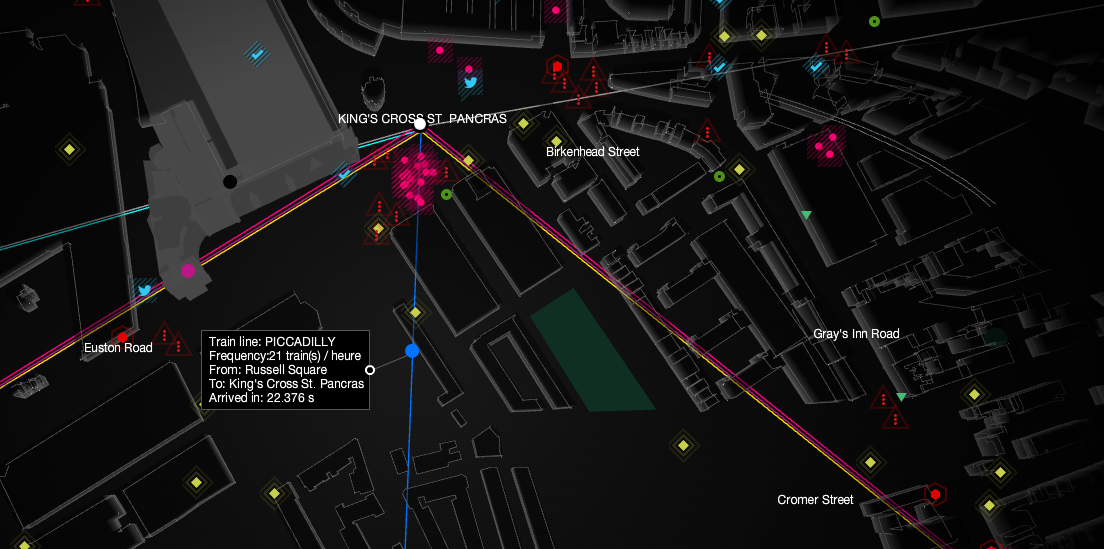
UbiSoft have created this compelling live map of London’s sensor and social media data, as part of a promotion for their upcoming game “Watch Dogs”.
More...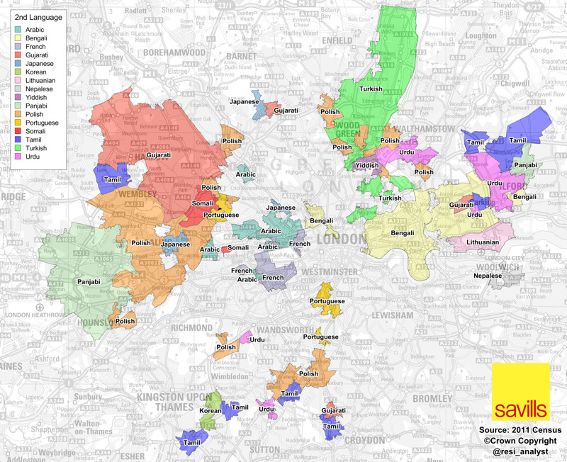
A map full of striking patterns, from Savills’ analyst Neal Hudson. It shows the areas of London where, for each area, the second most popular
More...