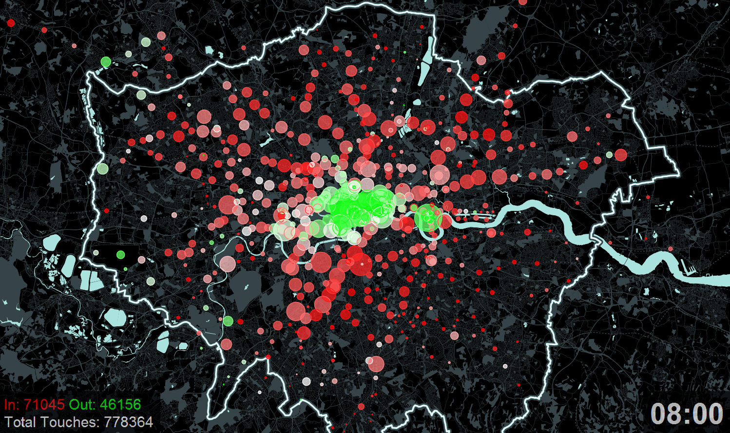
A new exhibition – Sense and the City – opens today at the Transport Museum in Covent Garden. It includes a number of transport data visualisations produced at UCL CASA. One of them, which I produced, is a visualisation of Oyster card tap-ins and tap-outs on a typical day. This is very similar to the previous Mapping London post – on TubeViz – although my map is based on a different dataset and is presented geographically. The circles grow and shrink as tap-ins/outs increase in each of the 10-minute windows, and the colour changes from red, through white to green, as the balance shifts from all tapping in to all tapping out.
To see a full-size version, click on the image below. To see the animated version you’ll need to visit the exhibition – or there’s a glimpse of it on Dr Martin Zaltz Austwick’s video. [Update – now that the exhibition is closed, I have added a video above so you can see the animation.]

Contains data from OpenStreetMap (CC-By-SA) and Transport for London.
2 comments