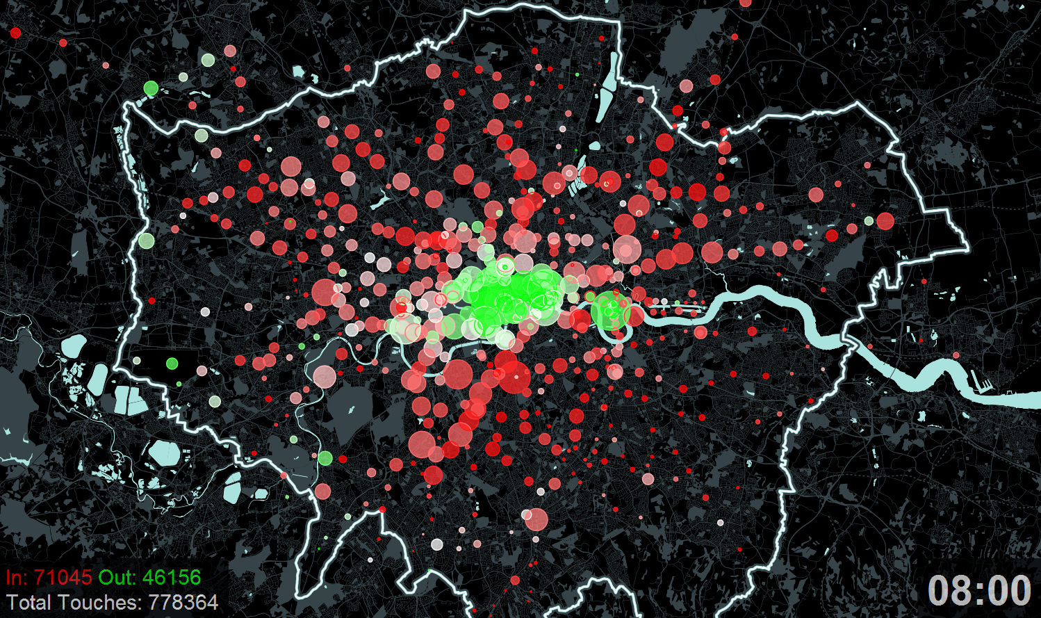
Here is an animation that Ollie created a couple of years ago for the “Sense and the City” exhibition at the London Transport Museum. We did a feature on this at the time but I thought it was well worth another post now that the animation has been viewed over 30,000 times in the past couple of weeks! The map shows the touch-ins (going into the network) and touch-outs (leaving the network) of Oyster cards at London’s tube and train stations, including a few beyond the Greater London boundary which still accept . As the animation moves forwards in 10-minute intervals during the typical weekday, the balance between touch-ins and touch-outs is shown by a colour scale. Red indicates the great majority of taps are touch-ins, and green indicates mainly touch-outs. White is the “neutral” colour, indicating that roughly as many people are entering the network as leaving it, at that period in time.
All credit to “trailerchecker” on YouTube who noticed 23 missing touch ins/ outs in the video! Nice to see we are not the only Tube data fanatics out there…
Looks great! Just curious – what were you using to make the map frames?
Quicktime Player’s screen recording function.