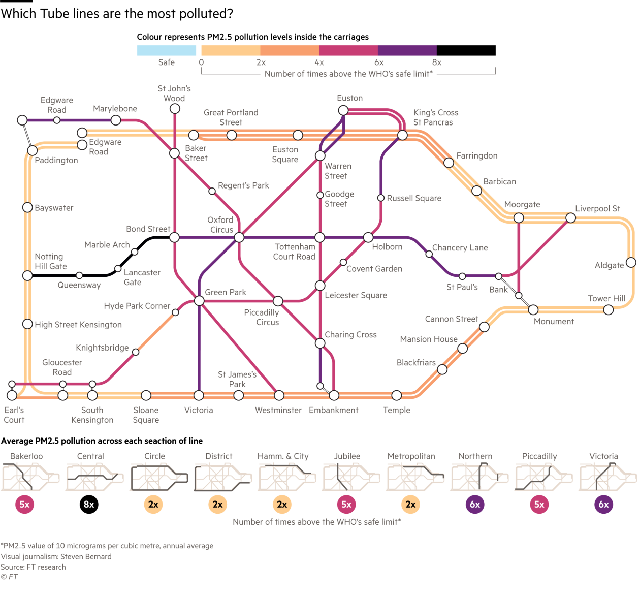
An eye-opening version the Tube Map for central London was published by the FT today (& on Twitter). The graphic, created by Steven Bernard of the FT Data team, is based on “PM 2.5” air pollution particulate matter readings, measured by FT researchers while travelling in tube carriages between stations in an area roughly bounded by the circle of the Circle line.
It shows that the deep-level tube lines are worse for PM 2.5 than the “cut and cover” ones (which form the border circuit of the map here), but that pretty much everywhere in the zone has PM 2.5 readings above the WHO safe limit.
It also shows that once again, the Central line is the line that you really don’t want to be on (and that should have had many of its journey now replaced by the Elizabeth line – however that is now very late). Be it crime, temperature, overcrowding or pollution, the Central line always wins.
The accompanying article goes into detail about the measurement work, the nature of the dust, and how hard it is to clean. It’s surprising that only in the last 3 years has TfL started to think seriously about the pollution in the central London tube tunnels, some of which have been carrying passengers for more than a century.
©FT. Created by Steven Bernard.
Air Pollution on the Tube: https://t.co/ffAViRa0DY – excellent data visual by the FT & shocking data, based on orig… https://t.co/1R7aDr2PYH
Air Pollution on the Tube https://t.co/dzm5JMwlsx
#Map: Air Pollution on the Tube https://t.co/QcgDtndkhd
Air Pollution on the Tube via @MapLondon https://t.co/Ukobih3FRp via @MapLondon