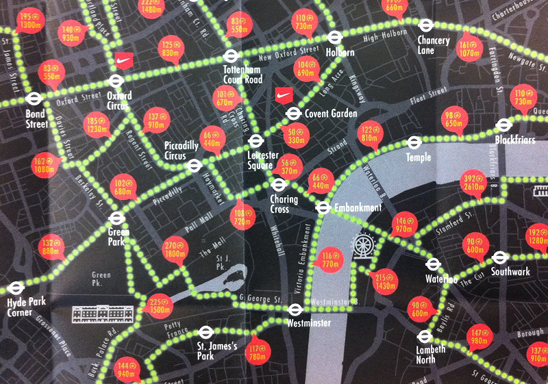

After reviewing many fine maps produced by others, it’s always nice to feature our own work once in a while. Above is an extract of a map that was created by the Mapping London authors, James and Ollie, as part of a project to create a “walking tube map” for Nike, in conjunction with their FuelBand personal movement tracker. FuelBand counts and displays NikeFuel points based on how much you walk or run.
We took this data source, and, in conjunction with UCL Urbanist John Bingham-Hall who personally walked the routes to measure them, created this alternative map which shows walking routes between London’s “Zone 1” tube stations, with distances and points. Designer David Luepschen then enhanced the map and gave it its final sparkle. Lines of glowing green dots lead along the routes, past stylised illustrations of iconic landmarks – that you don’t get to see if on the tube. The base map was created from Ordnance Survey Open Data.
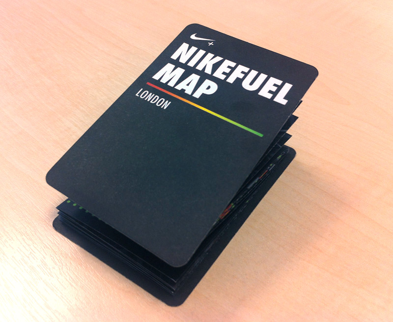
It’s great to see the finished printed product, which can be picked up for free at any of the four Zone 1 Nike stores in London (which are, themselves, also shown on the map). The map folds up to pocket-size, so now there’s no excuse to get extra points and exercise by walking the tube. You can also see both Mapping London editors in this how-it-was-made video which was filmed by Wallpaper magazine.
Resources
2 comments