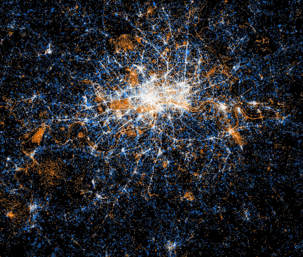

Eric Fischer produced this interesting data map of London a while back. The map is entirely made of of location coordinates included on Twitter tweets, and Flickr photographs, in the London area. Flickr photos show up as orange dots, while Twitter tweets show up as blue dots. In place on the grid where there is both Flickr and Twitter activity, a white dot is shown.
The centre of London predictably has intense traffic from both Twitter and Flickr. It’s when you move away from the centre that interesting clusters appear. The route of the Thames is obvious because of the high density of Flickr photographs, compared to tweets – so it stands out in orange. Similarly London’s major parks and open spaces all stand out in orange. Two particularly large orange blobs, near the left and right edges of the image, represent Kew Gardens and Greenwich Park respectively. Other places have large young populations (likely leading to more Twitter activity) but aren’t so photogenic, so appear in blue. Croydon, at the bottom edge of the image, and Kingston, near the bottom left edge, stand out in this year, as do some straight lines radiating out from the centre of the city, corresponding to major arterial roads.
Eric has applied the same technique for other cities around the world, and also compared Flickr photograph locations for locals and tourists, again revealing some distinctive urban zones.
Imagery is CC-By Eric Fischer.
do you have a contact email for Eric Fischer please?
You may be able to contact him through the MapBox contact page.