
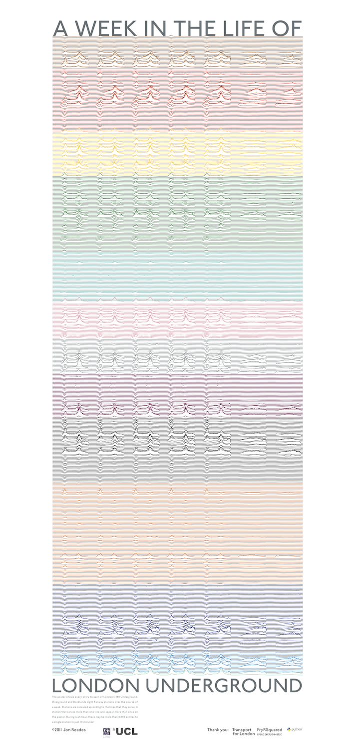
Perhaps inspired by Joy Division’s Unknown Pleasures album cover (maybe a favourite for the commute?), Jon Reades (from UCL CASA– of course!) has created this beautiful infographic depicting “a week in the life” of the London transit system. Like all great data visualisations Jon’s chart works on a number of levels. Stand back and it looks like some abstract Tube platform art, get closer and you begin to see that there are many interesting patterns. The lines show average entries at each and every Underground, Overground, and DLR station over the course of a week using a 10-minute interval. Big peaks represent over 8,000 entries! The stations are coloured by the TfL colour scheme and if they, like Victoria, serve multiple lines then they appear twice. As Jon says there are over 43,000 datapoints behind this graphic all taken from Oyster Card data provided by TfL. You can see weekday rush hours contrasting with the slightly more sedate peaks of the weekends. You can also see that some stations have much higher passenger flows than others. Read more here and stay tuned for some print versions.

I recognise this shape. It looks a lot like the munin traffic graphs on my servers at http://placr.co.uk. They’re servicing API requests to various mobile apps which London travellers are using. Particularly bus travellers using the http://busmapper.co.uk app.
Came across this graphic recently and was very impressed. Clever idea and beautifully executed. The whole web site is interesting. Did anything come of the print version? Where would I find out?