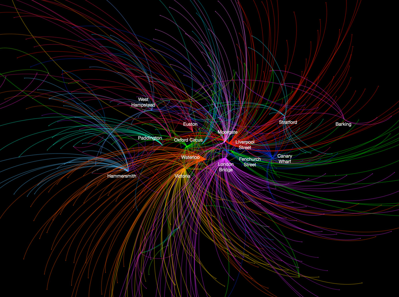

This data map, from UCL CASA‘s own Ed Manley, shows the top destination station, for each starting station, in and around London. The graphic is for the morning rush-hour period and is based entirely on Oyster card data on journeys on the London Underground and Oyster-accepting rail networks.
Ed goes into detail about the map on the Urban Movements blog, which also includes a larger version of the graphic extending to cover the whole of London – the version here is slightly cropped to focus on Zones 1-4. In the full version, further major destinations appear, including, interestingly, Uxbridge. The map was produced using Gephi.
We’ve featured another map from Ed, of minicab journey commonalities, previously.
Thanks to Ed (@EdThink) for allowing the graphic to be reproduced. It is an aggregation of data that is © Transport for London.
3 comments