The A-Z is probably the most famous London Atlas – it’s been around for over 75 years, and has been updated ever since. The company
More...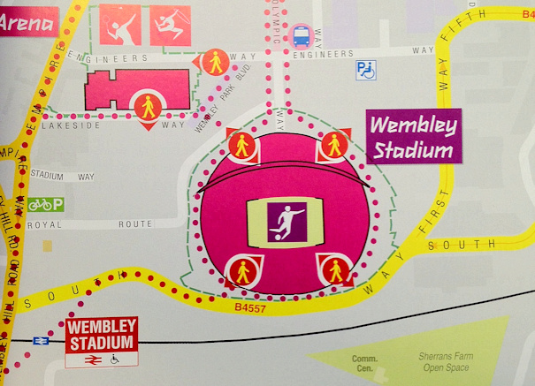
Highlighting the best London maps
The A-Z is probably the most famous London Atlas – it’s been around for over 75 years, and has been updated ever since. The company
More...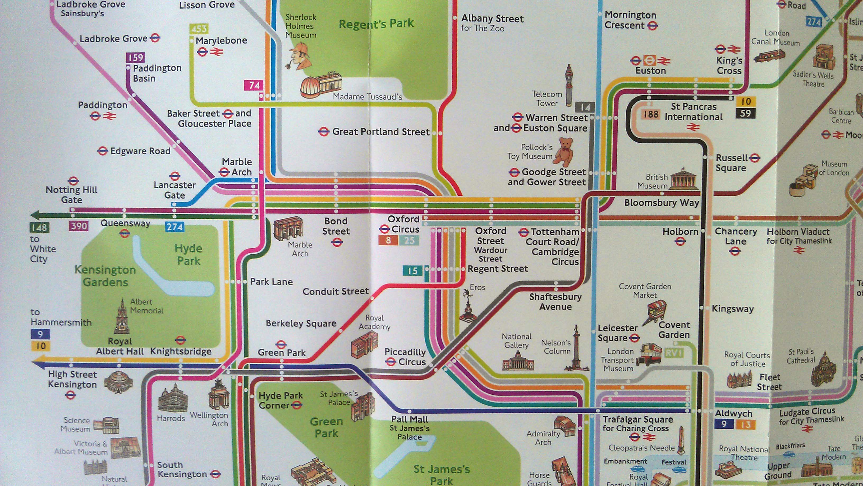
Next time you are passing through a station keep an eye out for a “London Summer 2012” map. It is a similar style to the
More...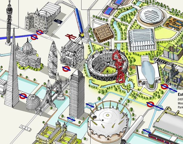
Thanks to the Chairman of CASA, Prof Michael Batty, for tipping me off about this map of Olympic Venues in London, created by Katherine Baxter
More...
Mike Hall, illustrator and designer, has been painstakingly creating large poster maps of each of the London boroughs, largely by hand. Each map has a
More...
Recce is an iPhone app which locates you on a map and shows you various POIs (points of interest) on demand such as local coffee
More...
Duncan Smith from UCL CASA has produced some great maps of commuter flows. Each line represents the routes people follow to work (as a straight line from
More...