This animation, produced by Jay Gordon, does a great job of capturing the daily flows of London’s commuters. It combines the 16 million or so daily
More...
Highlighting the best London maps
This animation, produced by Jay Gordon, does a great job of capturing the daily flows of London’s commuters. It combines the 16 million or so daily
More...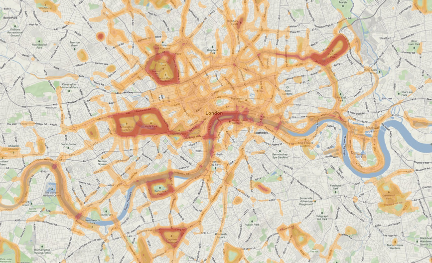
This is a screenshot of a heatmap of runs carried out in central London, using the Nike+ training “app” which utilises a phone’s built-in GPS
More...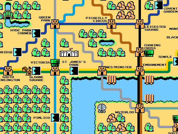
Here’s a map of Zone 1 London (concentrating on the tube lines) constructed with sprites from the old-skool (80s!) console game Super Mario Bros 3.
More...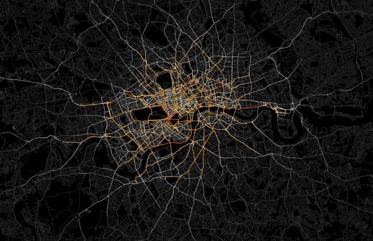
Ed Manley (UCL Geomatic Engineering) produced this great map of private hire vehicles in London (note my avoidance of the “T” word). He was able
More...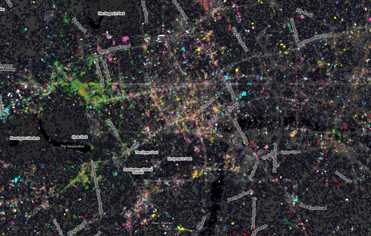
Last week Ed Manley and I published a map showing the top 10 twitter languages in London. To our surprise it made it to page
More...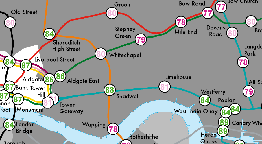
Most government statistics are mapped according to official geographical units such as wards or lower super output areas. Whilst such units are essential for data
More...
Recce is an iPhone app which locates you on a map and shows you various POIs (points of interest) on demand such as local coffee
More...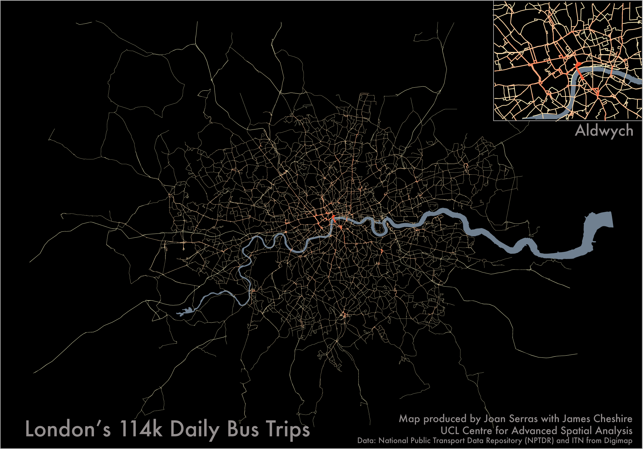
People often say “I waited ages for a bus and then they all turned up at once”. As the map above shows if all the
More...
Stamen Design are a bespoke design and technology company based in San Francisco. They have a reputation for creating wonderful looking maps, often with OpenStreetMap
More...
Eric Fischer produced this interesting data map of London a while back. The map is entirely made of of location coordinates included on Twitter tweets,
More...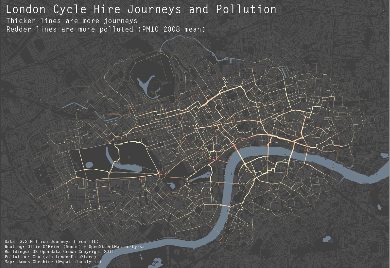
As a cyclist in London you can do your best to avoid left turning buses and dozy pedestrians. One thing you can’t really avoid though
More...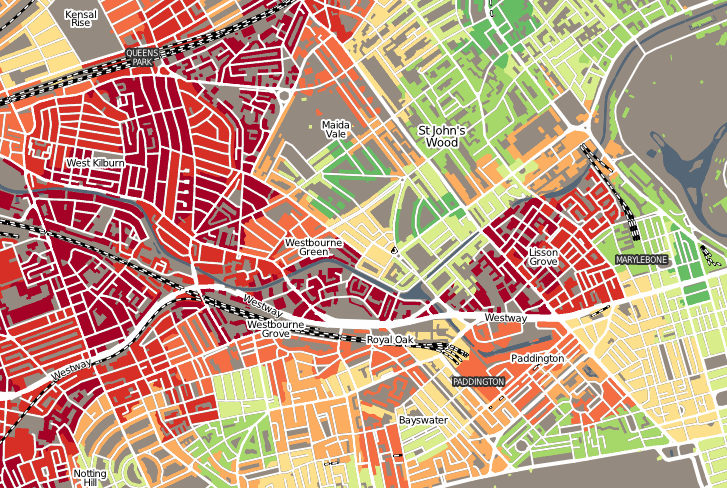
“Geodemographics of Housing in Great Britain – a new visualisation in the style of Charles Booth’s map” is a map that I have produced that
More...