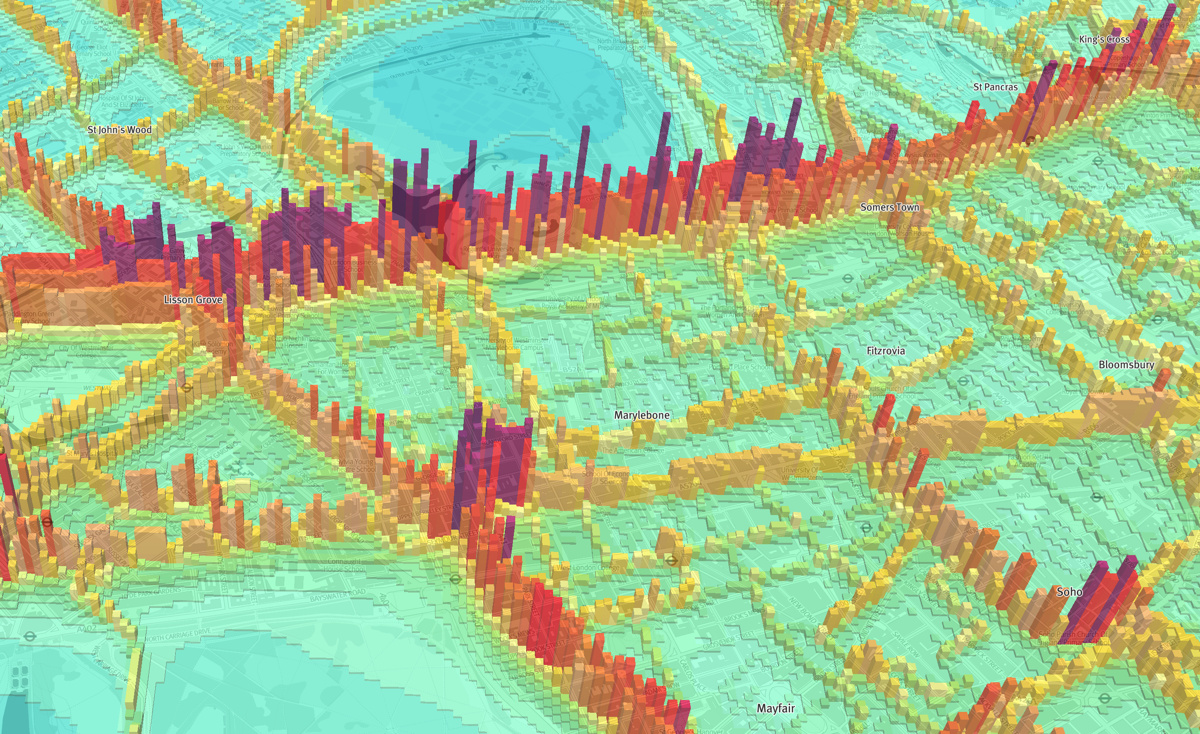

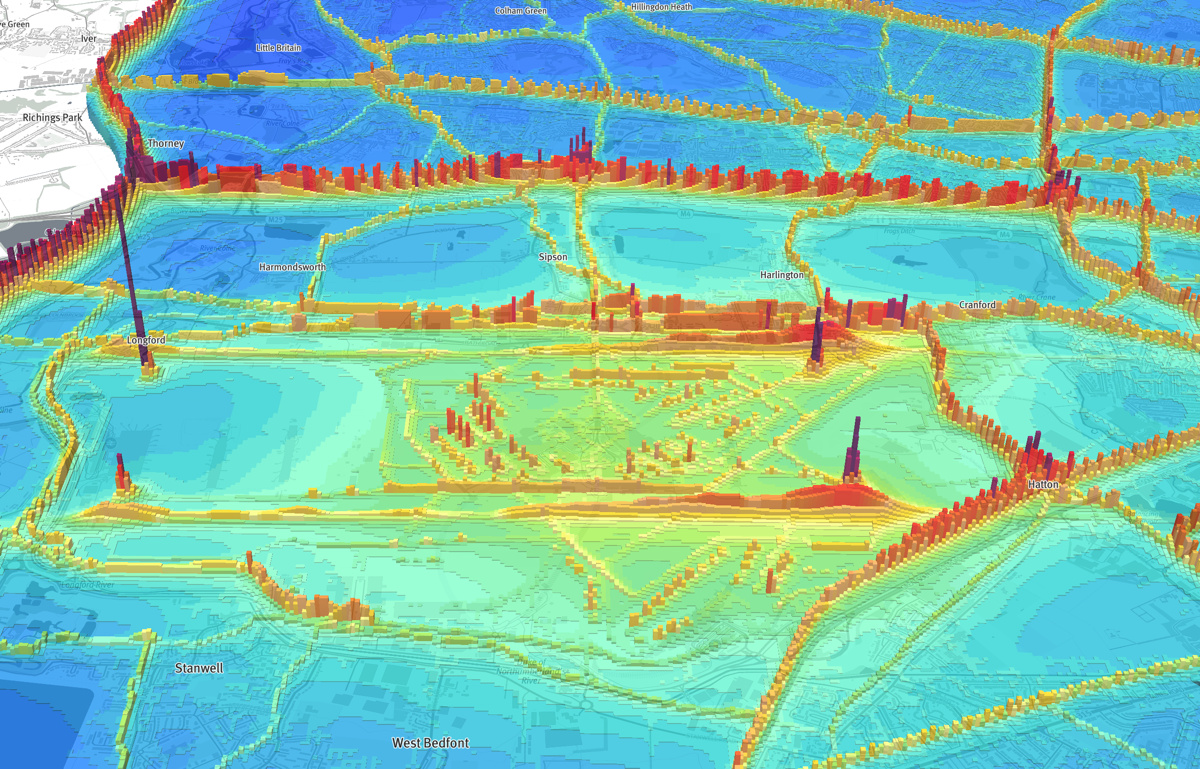
Air pollution has long been a problem in London, and the current mayor has identified pollution as one of his major goals to highlight and tackle polluion, and improve the capital’s air quality during his time in charge. This map, of the modelled 2020 annual pollution levels of NO2, has been produced by Parallel, using the London Atmospheric Emissions Inventory 2013 (LAEI) dataset that was published by the Greater London Authority in 2016 (they have since published a slightly updated version). The calculated data is presented as a raster (a grid of estimated pollution values) and Parallel have taken this and made it into an 3D webmap, so that you can “fly around” the map and see towers of pollution – and troughs of fresh, clean air:
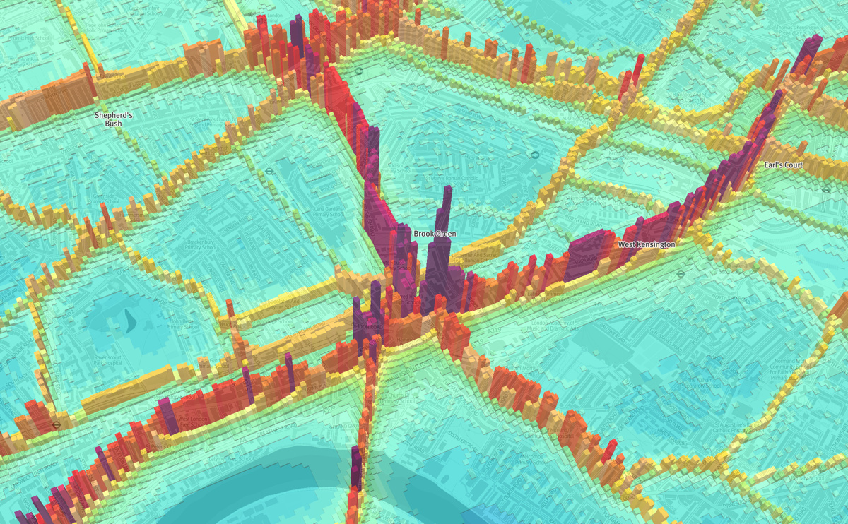
There’s something quite compelling this kind of presentation – it works well because this kind of pollution is dominated by, and generally restricted to, major roads. The 3D spikes therefore don’t obscure the rest of the map, as they are generally constrained to quite linear features. They act to both emphasise the significant and scary nature of pollution in some areas, and illustrate that, by walking or cycling through back streets rather than on main roads, your pollution intake can be significantly lowered. One striking element, on examining the map, is where elevated sections of road, such as the Hammersmith Flyover, the Westway and the bridges across the Thames, are pollution hotspots – the height meaning that the surrounding environment is further away and so can less effectively absorb the pollution:
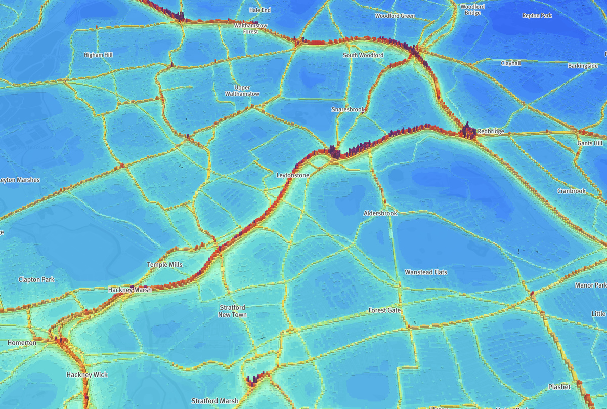
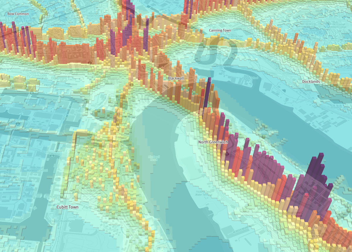
It’s not just cars, of course – some pollution shows along railway lines frequented diesel trains, while Heathrow Airport (see bottom image) also stands out – particularly the two runways, and specifically the points where aeroplanes take off and land – with the resulting elevation being a key hotspot. There are some issues with model – it seems to assume that London City Airport will be closed by 2020, as it appears to generate no NO2 pollution at all. It also doesn’t take into account the partially implemented Ultra Low Emission Zones in London – to be fair, the model was produced before these were announced. Some data fluctuations are not immediately obvious – such as the elevated levels in Cubitt Town – a mainly residential area that is not near any main roads:
The maps are created using Mapbox’s 3D WebGL libraries and are rendered on-the-fly by your browser. There are some “moire” type artifacts visible as a result of taking data that is roughly constant along vectors (i.e. main roads) but drops off quickly beside them, and then is displayed as a raster grid. Where the full width of the road vector lies directly within a raster “pixel” then it shows on the map as a higher bar then if it runs between two pixels – with each pixel getting 50% of the modelled pollution value. This causes a “rising step” effect along some of the roads, which looks a little odd, and is emphasised by the 3D pillars. A much higher, or lower, resolution, than the 20m resolution here (that happens to unfortunately be similar to the thickness of the major polluted roads) would minimise this 3D version of the “moire” effect.
This is just one of a number of maps that Parallel, a visualisation agency who specialise in web mapping of health data and other geospatially-linked data in the UK, have released on their main website. Their mapping is clear and effective, and uses a simple grayscale background map, based on OS OpenMap data, allowing the information of concern to be prominent while effectively setting it in London’s familiar geography.
View the interactive map here.
All images © Parallel and contain OS data Crown Copyright.
2 comments