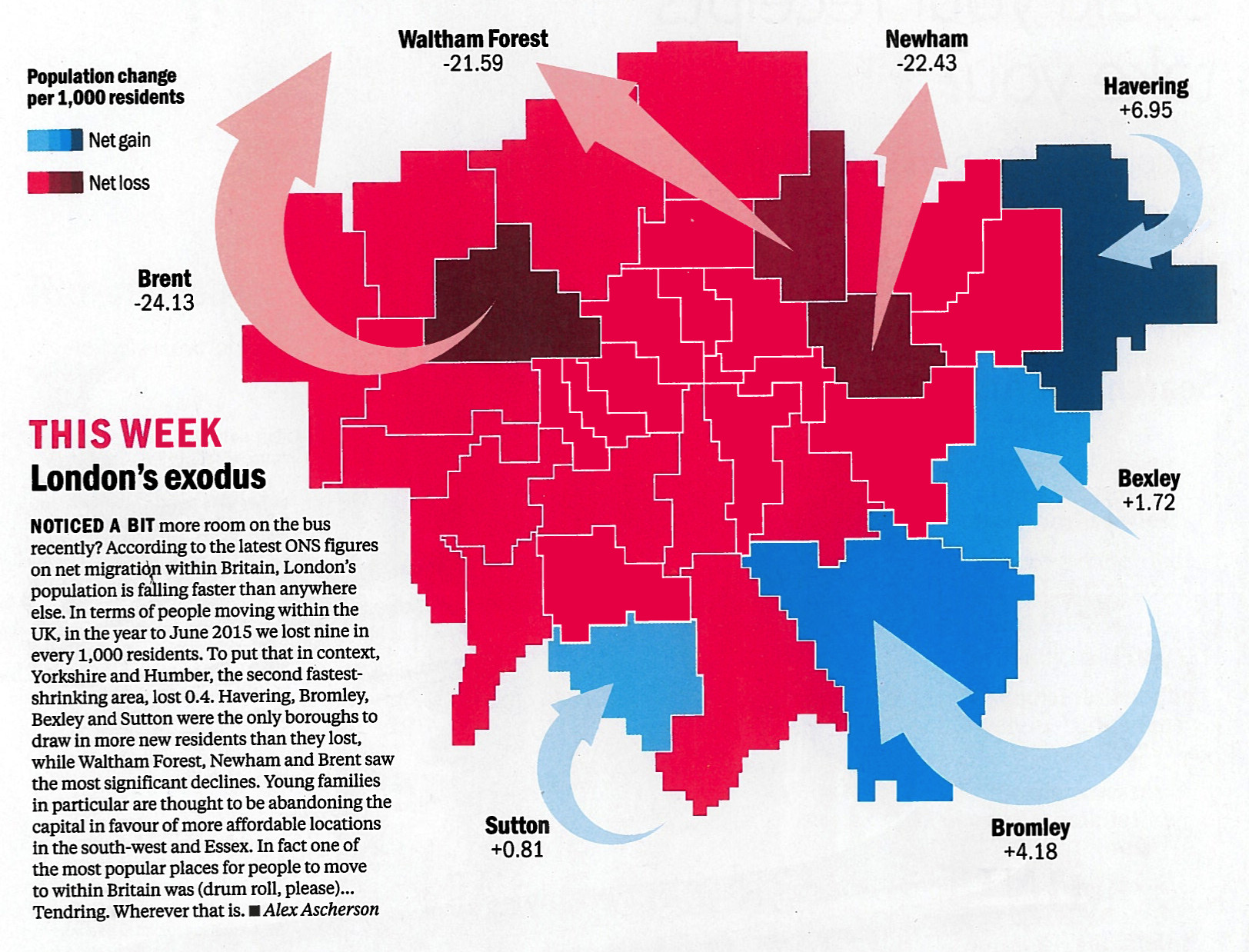

Time Out London, the venerable London free magazine, have spotted that everyone in London loves maps, and so have launched a regular London Mapped feature in their City Life section & blog. This week’s map is rather interesting and not one I’ve seen before. It shows ONS 2015 data on net migration between each of London’s boroughs and the rest of the UK – so it includes cross-borough moves within London (which typically radiate outwards from Zone 1 to 6 as people age) but doesn’t include international migration (which tends to come straight in to Zones 2 to 3). Instead, it looks at the migration that happens when Londoners form families and need a bigger space than they can afford in their local borough or pensioners that yearn for the seaside or a quieter part of London (e.g. the east and south-west boroughs) or somewhere else in the UK, balanced against a steady, but often temporary, move to the universities and graduate opportunities in the capital.
The key statistic is an overall outflow (domestically) seen in London’s population. London in general is increasing in population, but this is mainly due to a combination of births and inwards international migration (and in particular, the high birth rate of international immigrants.) By removing these particular population sources and flows, London suffers just under a 1% population decrease from 2014 to 2015 – a lesser reported statistic in between the headlines that London’s total population has recently hit an all-time high.
We like the simple, blocky style, which approximately retains the shape of the 32 boroughs (+ the City of London), so is a hybrid of a pure squares approach and a regular geographic data map. Bravely, the creator omits the River Thames, and also leaves out the names of most of the boroughs, just labelling (and arrowing) the top gainers and fallers. It’s a simple, but effective, way of showing an interesting demographic trend in across the metropolis. The map was co-produced by Alex Ascherson, a data journalist at the Centre for Investigative Journalism, who crunched the numbers, and Tom Havell at Time Out London.
In this week’s Time Out London print edition (get your copy here), and likely in due course on the Time Out London blog. The graphic is Copyright Time Out London and Alex Ascherson.
RT @MapLondon: London’s Exodus: https://t.co/I8TrTM0aae – a great @TimeOutLondon map of demographic change, by @alexascherson https://t.co/…
RT @MapLondon: London’s Exodus: https://t.co/I8TrTM0aae – a great @TimeOutLondon map of demographic change, by @alexascherson https://t.co/…
#London: London’s Exodus | Mapping London via Reddit https://t.co/LieqowsS8Q https://t.co/vynW8ZPBdi
RT @MapLondon: London’s Exodus: https://t.co/I8TrTM0aae – a great @TimeOutLondon map of demographic change, by @alexascherson https://t.co/…
RT @oobr: London’s Exodus: https://t.co/hBsfsu3UUm – a great @TimeOutLondon map of demographic change, by @alexascherson https://t.co/cOkOg…
RT @oobr: London’s Exodus: https://t.co/hBsfsu3UUm – a great @TimeOutLondon map of demographic change, by @alexascherson https://t.co/cOkOg…
RT @MapLondon: London’s Exodus: https://t.co/I8TrTM0aae – a great @TimeOutLondon map of demographic change, by @alexascherson https://t.co/…
RT @MapLondon: London’s Exodus: https://t.co/I8TrTM0aae – a great @TimeOutLondon map of demographic change, by @alexascherson https://t.co/…
London’s hidden population exodus via @MapLondon ONS statistics https://t.co/JTPbsbZQwH via @MapLondon
#London’s exodus: how London is losing #population faster than any other area in the #UK @TimeOutLondon https://t.co/bPsU9d1AfD
#Mapping London reveals fastest falling population in the #UK https://t.co/SsXiBf3wLC #BigData #CityLife #Statistics https://t.co/JVaVbpci4D
RT @MapLondon: London’s Exodus: https://t.co/I8TrTM0aae – a great @TimeOutLondon map of demographic change, by @alexascherson https://t.co/…
RT @MapLondon: London’s Exodus: https://t.co/I8TrTM0aae – a great @TimeOutLondon map of demographic change, by @alexascherson https://t.co/…
RT @MapLondon: London’s Exodus: https://t.co/I8TrTM0aae – a great @TimeOutLondon map of demographic change, by @alexascherson https://t.co/…
RT @MapLondon: London’s Exodus: https://t.co/I8TrTM0aae – a great @TimeOutLondon map of demographic change, by @alexascherson https://t.co/…
RT @MapLondon: London’s Exodus: https://t.co/I8TrTM0aae – a great @TimeOutLondon map of demographic change, by @alexascherson https://t.co/…
RT @MapLondon: London’s Exodus: https://t.co/I8TrTM0aae – a great @TimeOutLondon map of demographic change, by @alexascherson https://t.co/…
RT @MapLondon: London’s Exodus: https://t.co/I8TrTM0aae – a great @TimeOutLondon map of demographic change, by @alexascherson https://t.co/…
RT @MapLondon: London’s Exodus: https://t.co/I8TrTM0aae – a great @TimeOutLondon map of demographic change, by @alexascherson https://t.co/…
London’s Exodus via @MapLondon https://t.co/uPbdFo8CU4 via @MapLondon