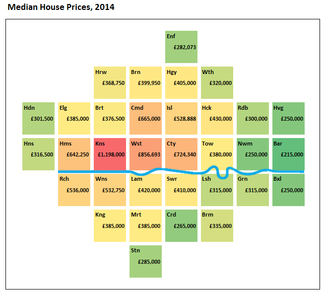

This is a simple but effective borough-by-borough cartogram of the median house price in London. The map appears on the London data store but is otherwise uncredited. However, it is the first “in the wild” map that we’ve seen based on the prototype London Squared Map concept, produced by After The Flood and the Future Cities Catapult. The data comes from Land Registry price-paid data. The idea reduces each London borough (which have approximately equal populations, but are generally smaller in area in the inner city) to a square, then arranges them in the approximately correct location in relation to each other – a cartogram The Thames is added as a cartographical stroke as it the standard referencing object for London and helps make the cartogram more “normal” and relatable to London’s true geography.
The numbers may be of surprise to some – a £500,000+ “average house price” figure has been popular in the press recently, because it sounds like a huge number and so worth shouting about – but it’s worth bearing in mind that this is a simple average. The median figures used in the graphic here are a better measure as 50% of houses are below the figure and 50% above – the skew caused by a few extremely high-priced houses doesn’t affect the median. There is no upper limit for how much you can sell a house for, but the lower limit is obviously £0. The graphic shows that in some of London’s boroughs, the figure is (relatively) low – and remember, 50% of properties in such boroughs sold for lower still. London’s median value for 2014 was around £340,000.
We like the simple, “grid of squares” concept and the addition of the Thames. Cartograms are hard to produce in a way that makes them familiar to an audience familiar with Google Maps, but with this concept, that challenge may have been met. The green to red ramp is also simple and effective for drawing the eye both to the very cheap boroughs (Barking) and the ridiculously expensive (Kensington & Chelsea). As such, the map does a good job of mapping the data effectively. Mapping London has featured house price maps a couple of times before, we think this map is an excellent addition to the maps already out there.
Found on the London Data Store via a Google search for London house price data.
Good to see this first instance – we are working on making digital versions easier for people to use so watch this space.
What is the definition of “house” in this analysis? Is it the traditional notion of a multistory occupancy with a number of bedrooms and reception rooms? Or is this just the median of “all domestic dwelling property sales” which would include everything from one or two bed flats to very large family homes, and everything in between?
There are I’m sure cases where a two bed flat in, say, Hammersmith, costs as much as a three bedroom house in Croydon. Is it possible to derive different sets of data for the same cartogram to address those variations?
It is, I suspect, a place which you can buy and live in. So, it could be anything from a grand detached house to a small studio flat. Outer boroughs are, I would have thought, likely to have larger properties for sale than inner city ones. The above cartogram is a metric of transaction costs – doubtless if you normalised by number of bedrooms or floor area, the distribution might look a little different although the basic pattern would probably be similar (i.e. central, north and south-west = more expensive).
Hello, I would like to get a map for my comapny. It should be for a london city and surrounding areas and oriented to a london Airports, roads and areas. What would we the price?
Regards,
Zygimantas
RT @MapLondon: House Prices – A Borough Cartogram http://t.co/hJ1yQWo9oe (via @LDN_data) http://t.co/mAIAJ4g4yd