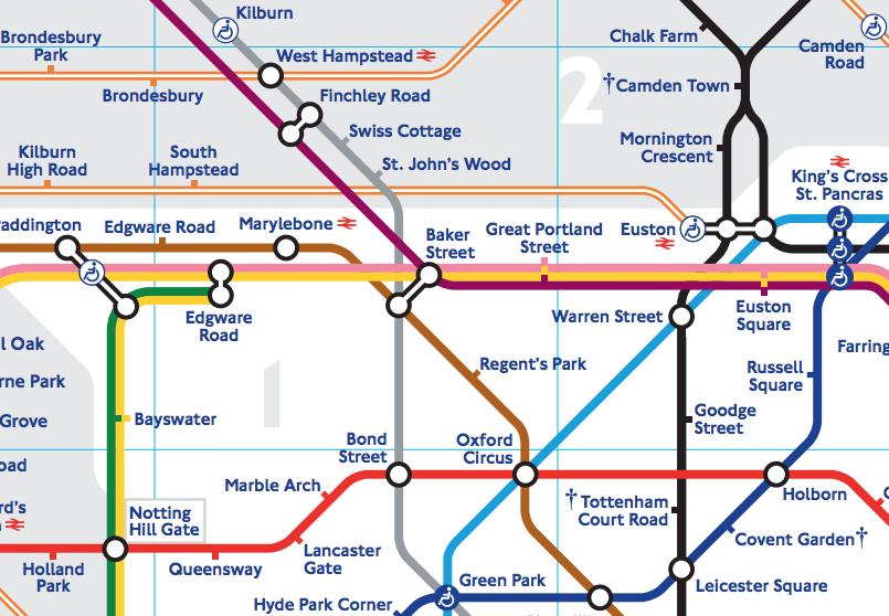

The Tube map is probably London’s most famous contemporary map. We’ve featured numerous alternative tube maps but have never featured the official map itself in over 200 posts so far on Mapping London. The famous map, with its 45 degree turns, sea of colours and geometric simplicity, has been around since 1931 when Harry Beck famously realised that showing the strict geographic route that the lines take is not necessary, as the area between stations is not one you can move freely around in, when travelling on the system. Removing the geographic link allowed the complex central section of the network to be greatly enlarged, making connections across Zone 1 London easier.
Since then, the map has been refined many times, but the basic idea has remained the same. Londoners really care about their map, its evolution has always been a big deal. When the River Thames got removed from the map a few years ago, there was an uproar and the Mayor intervened. It returned a few days later. It’s probably the most abundant map in the capital, thanks to multiple copies appearing at every tube station, and free pocket-sized versions available there for people to take away. Most visitors will probably have picked up a copy.
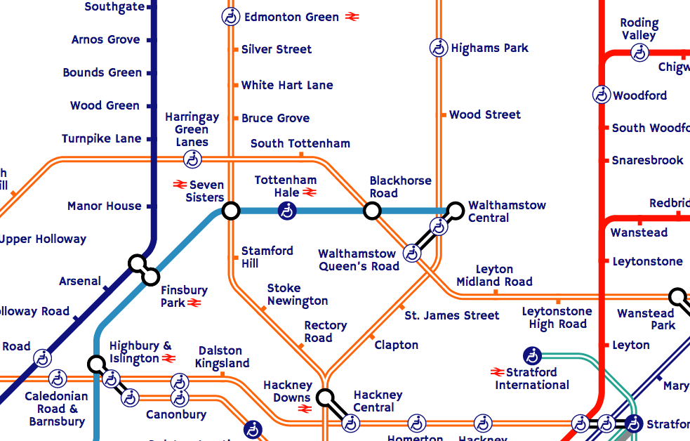
At the end of this month, the Tube map* will see one of its biggest changes, as over 30 new stations get added to the map. TfL is taking over various new lines in north-east London, and rebranding them as part of its Overground network (shown in orange). It is also taking over a further line, and giving it an interim blue “TfL Rail” brand. This will, in time, turn purple and become part of Crossrail, in 2018.
So, this big expansion of the map seemed like a good excuse to finally feature it here on Mapping London. Above is an extract of the PDF version, there was also an SVG version (extract below) which TfL uses for showing disruption information on their website, it has a couple of bugs, so I fixed them up on a shell website. Sadly TfL’s licensing contractor got in touch a few years later to (correctly) point out I had not licensed the use of their map for this, so this proof-of-concept is no longer available. The SVG version was nice because it allows a lot of flexibility in its display. However it didn’t include a key, special station notes or zonal information. You can download the PDF version although this link is subject to change. There is also a canonical link, which should always work but doesn’t yet show the new services.
Get the Map
- Paper version – available for free at most tube stations.
- PDF version
*None of the new additions are actually tube lines, the Tube map has gradually become a multi-purpose map of most of the TfL-owned rail services – Tube, Overground, TfL Rail, DLR and Cable Car, although notably not Tramlink. The tube lines themselves are next likely to change in 2018-20, with the Northern Line extension and the Metropolitan Line Watford rerouting.
The Tube map is Copyright Transport for London.
Your html shell uses “Hammersmith One” typeface which I didn’t have. Although it loads the said typeface from Google Fonts, it is not displayed in my browser and only the default font (Arial) is loaded. Then I downloaded and installed the font to my hard disk and it turns out the correct name of the font should be “hammersmithone” without any space (letter case is irrelevant, “haMMeRsMithoNE” works as well.)
Thanks for this, good to know – I’ve fixed it now.