
[Updated – Thanks to this blog post, this map is now officially on the TfL website – read on!]
The Transport for London (TfL) tube map, with its straight lines, 45-degree rounded corners and simple, clear cartography, is a design classic. The map dispenses with other features such as parks, roads and urban extents – because you don’t need those if you are getting from A to B on the tube network. Similarly, real-life wiggles and curves on the network are straightened – they’re not important, because they don’t affect your journey. It also means the complex central section can be shown at a larger scale than the rest of the network, while still connected to it. The London Rail & Tube services map extends the concept to show all London railways in the same way, the increased complexity making it a bit harder to read, but still adhering to the same design principles.
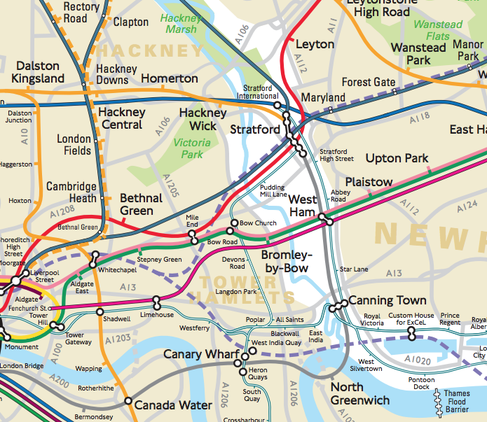
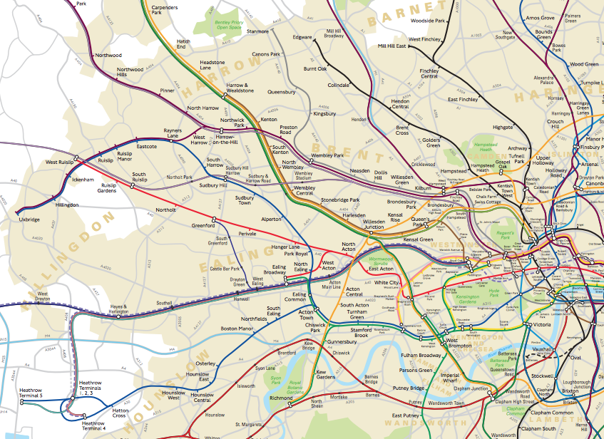
But did you know that TfL produce another version of the map – one where roads, parks and neighbourhoods are included? One which shows the real-life wiggles of the network, and where distances between links can be directly compared, and journey lengths estimated? (Chalfont & Latimer to Chesham is actually a journey of several kilometres, but looks shorter than a 200m one-stop journey in central London, on the regular map.)
It’s the TfL London Connections map and it’s not made generally available to the public, however this Freedom of Information request reveals its existence.
While I can understand TfL’s reluctance to crowd the public narrative with multiple, different looking maps of its network, it’s a shame that this one is accordingly given a relatively low profile, as it’s really rather nice, combining a level of geographical utility (with the major parks and rivers in/near London, borough names, and the capital’s built-up extent) with the familiar tube line colours. Mainline rail colours are also included, buffered in black. There is the tube-map style spacing between lines on the same track, and the familiar connectivity blobs show links between different lines at a single station. The Thames Barrier also makes a cameo appearance in the connectivity blob style.
The lines are simplified, with the smallest wiggles removed and quirks like the White City line split omitted. The forthcoming Crossrail lines are included, as are the connections to them. One quirk is the mix of fonts – with TfL stations shown in the familiar New Johnston font and National Rail stations shown in a narrower font – both at a variety of sizes depending on the closeness to central London and the type of station.
The map isn’t quite up to date – it’s from May 2014, so the recent Overground expansion is still shown as pending, with the old operator’s lines present. An inset shows central London at a larger scale, as the major problem with a geographical map of the tube network has always been the high density of stations here. Considering the complexity here, I think the cartographer has done an excellent job and, if it wasn’t for the popularity and utility of the existing tube map, this map would be not a bad substitute at all. It has a minimal presence on the web, but, apart from the FOI version, I did find an old (2006) version of the map, via the London Transport Museum shop.
[Update – TfL have now published the map online here – it’s the May 2014 map for now but will be updated soon – thanks to CityMetric, who heard about this map via this blog post, asking!]
Found via a Reddit (hello /r/London!) link to the Freedom of Information request.
We suggest that the answer isn’t a messy quasi-geographical map or the venerable but geo-inaccurate diagram but a modern location-accurate hybrid map.
https://pbs.twimg.com/media/CPDlqiiWEAQQDq8.jpg:large
It’s harder to read than the geo-inaccurate version though.
As a nitpick, this map isn’t *fully* accurate. It has some “real-life wiggles of the network” by virtue of placing stations in the correct manner, but routes between stations are still idealized. Jubilee line between Baker Street and Bond Street is an obvious example – at Baker Street its station is oriented east-west and the line swings out east in a huge arc almost out to Portland Place before getting to Bond Street. District line between Earls Court and West Kensington is another example, as is Piccadilly weaving back and forth between King’s Cross and Finsbury Park or magically straightening between South Kensington and Knightsbridge.
Of course, drawing *every* wiggle of the old tubes would require a much higher resolution and likely be impractical.
What we all know and love as the London Connections map is the diagrammatic one showing all the rail routes, TfL and “National Rail”. I have tried to make some suggestions for improving this map (which is widely distributed) but my messageshave not been acknowledged by TfL customer services.
The geographic map you show looks a lot like what used to be LT’s “Visitors’ London” map.
I much prefer the Harry Back style map which is published by Assoc of Train Operating Coys with LUL lines shown in usual colours and TOC lines in colour and white dashes It needs small redesign as splendid Blackfiars station should be shown as over Thames which also entails moving London Bridge Station further east. I would like to see it produced in two sizes Central London (Zone 1 plus bits) and Greater London ie zones 1 – 5. Always to be displayed as posters next to each other and back to back on the card issue. I would also credit to Harry Beck and George Dow. George Dow did in carriage diagrams for LNER which Harry Beck would have seen on his commuute.
I’d love to be able to buy this map.i guess it would be difficult to get it printed from a pdf file
I am looking for a map but it is not the recently revealed 2014 one you show here in this blog. It was a free concertina map of Central London I obtained when I first came to this country 20 year ago (in 1998, to be precise). It is a geographic London tube map. Due to its scale, it showed the urban blocks in a soft-coloured background.
I am an architect and urban designer who loves maps and drawings. I treasured that map for years until it succumbed to a stormy rain out of the Victoria and Albert Museum. Now that I have been invited to write in a specialist’s journal, I need to find a good quality electronic copy to illustrate ‘My favourite Map’ entry.
Where do you think I could find it?
Just acquired some DVDs of London Underground driver’s eye views of various lines and thought it would be a good idea to look up my old geographic map. This is actually a tourist info map given away free and is a street map with tube lines superimposed. The tube lines are probably simplified without the wiggles but as it is a street map the geography is correct. The map is dated 1983 and it has adverts to help pay for it and it was printed by Staples Printers Kettering Ltd. It only covers the main tourist area from Camden Town in the North to Stockwell in the South and Ladbroke Grove in the West to Aldgate in the East.
The TfL map is good and I have enjoyed following the lines whilst watching the DVD but as a previous correspondent noted some of the distances and directions are idealized.
A person with the alias u/a_wandering_chemist posted this animation of the Tube map and “real” geography : https://www.reddit.com/r/dataisbeautiful/comments/b8ihhr/comparison_between_the_london_tube_map_and_its/
Not that useful but fascinating to watch.
Note that the PDF document no longer exists (at least not on the links on this page).
It may be harder to read but it makes sense of why my phone’s compass seemed not to make sense on the central line where I thought I was going due West from White City but the compass says it goes North for a bit, I see it now.
But it doesn’t explain why the train seems to have crossed on to the opposite tracks coming out of the tunnel at White City.
It is useful to know the link with the surface street plan as sometimes walking at street level is a good option in Central London.