The Tube Map is a design classic – the straight lines, even spacing and lack of unnecessary above-ground detail has become a hall-mark of metro maps across the world, since it was first drawn by H.C. Beck in the 1930s. Today, the printed versions of London’s tube map include a specific acknowledgement of the creator of the concept, even as the map itself has greatly expanded with the addition of a great many services.
However, there was a period of time, between the merging together of various rival networks in central London at the beginning of the 20th century, and the creation of the tube map, where cartographers attempted to show the crowded and complex network in different, but more conventional ways. This post focuses particularly on three tube maps that were published between 1920 and 1930 – the ones immediately before the Beck “revolution”.
MacDonald Gill (1920-3)
Intriguingly there are three slightly different versions of this map, drawn in 1920, 1922 and 1923 by MacDonald Gill. The 1922 version is shown above. While remaining geographic maps, and therefore quite bunched up in the centre of London, they remove all non-tube information, including the River Thames. They show interchange stations as circles with white holes in them (just like the map of today), distinguishing these from the other stations which have with filled circles. The long, curved stems on the station names give it the map a classic 1920s look and, surprisingly, don’t detract from its readability. Some arrows are used to place the text labels correctly, while small text is used for connection information to mainline rail networks. and Other forms of transport are also referenced – “motor bus” and trams. The 1922 version includes a lovely illustrated title “London’s Underground”. The 1923 highlights stations for British Empire exhibition venues and also includes extensions at either end of what is now the Northern line.
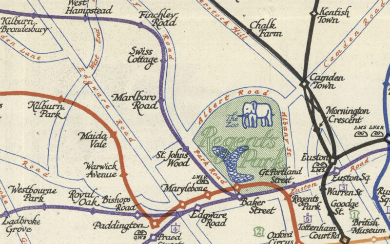
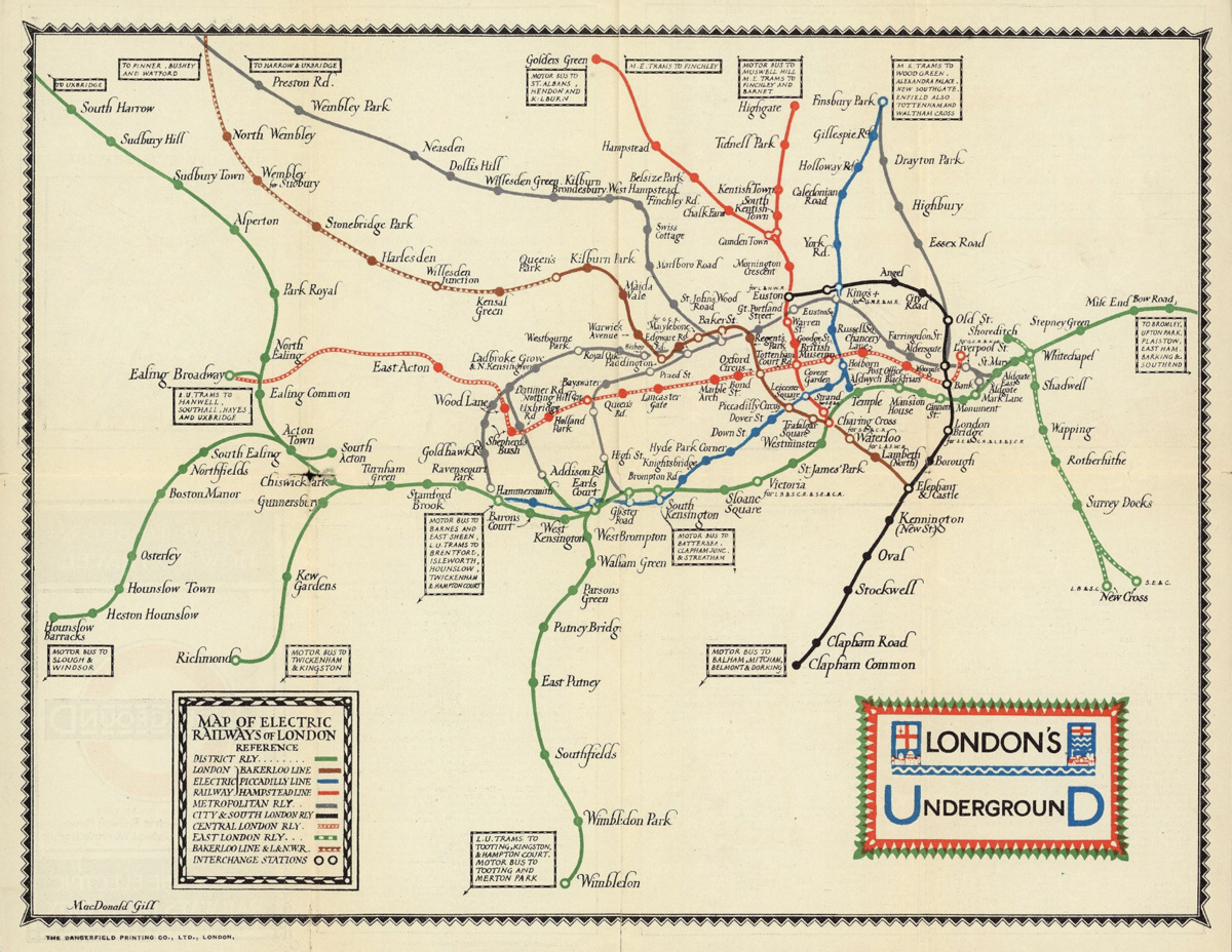
Perman (1928)
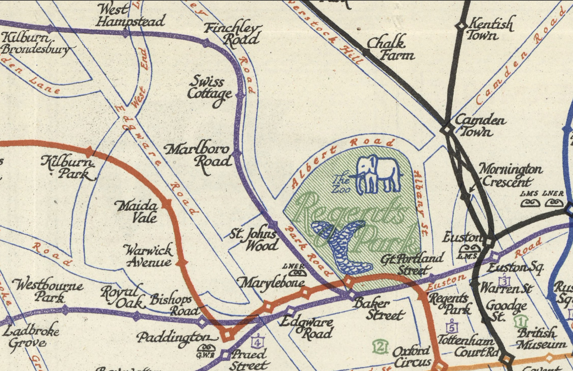
This map was drawn by E.G. Perman in 1928. There is some road network detail along with some key locations to visit, such as museums (green numbers) and hospitals (purple numbers). I particularly like the detail of the network shown by Camden Town, implying correctly that both southern lines can go to any of the northern branches. Connector stations are shown with white centres. Mainline train terminii are shown witin their company initials, e.g. GRW , LNER or LMS. London Zoo gets an elephant.
FH Stingemore (1925-1932)
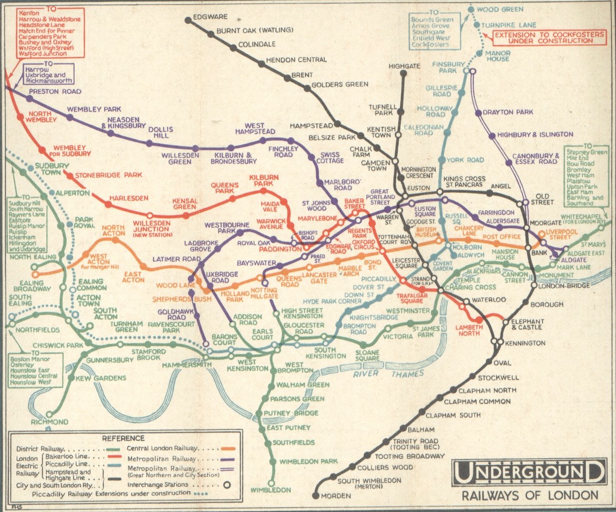
The FH Stingemore map was, I believe, the last map of the London Underground network that was widely circulated, before the straight lines of the H.C. Beck concept in 1933. There were various editions of it starting from 1925, as the cartographer tried to map the increasing complexity of the network. Non-tube details, like streets were left out, although the River Thames was added back in in the later editions (such as the one shown above), somewhat mirroring what happened to the modern tube map in the 2010s when the Thames was removed, leading to an outcry and its reinstatement. (Photo from here). The tube map has been straight lines ever since – although TfL do have a geographic version hidden away on their website.
Some of the images above are Copyright David Rumsey Map Collection and 2018 Cartography Associates.
One comment