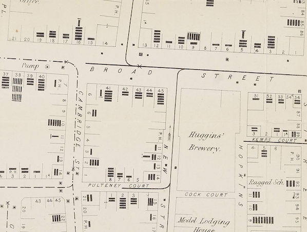
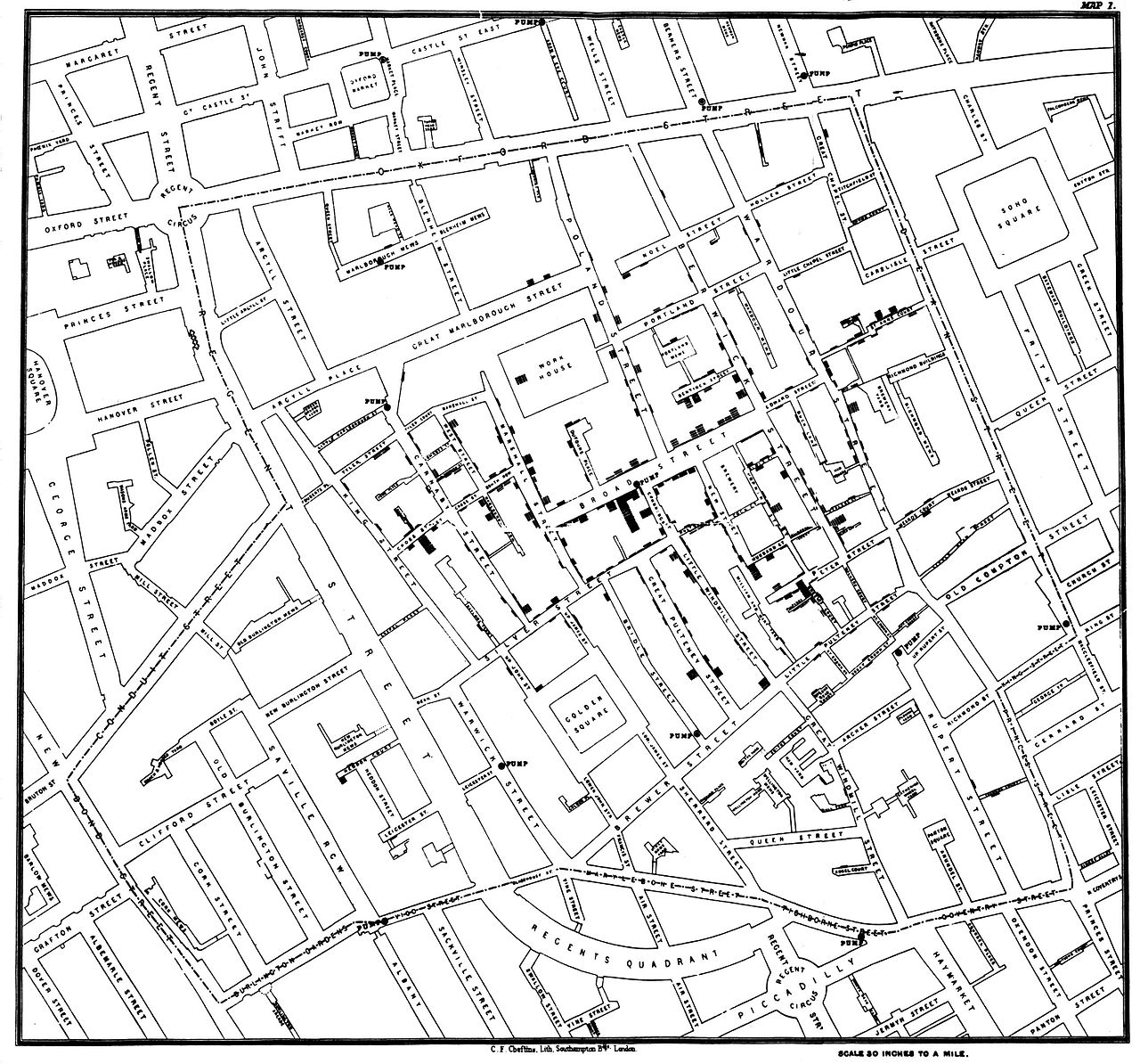
 John Snow’s map of cholera has become one of the most iconic of an era when the importance of statistics and graphics were becoming recognised. The map above is the one most commonly used as a Snow map example, which we featured a few years ago, but digging around the Wellcome Collection’s excellent image library I have found a couple more. These are in fact more detailed and used at the time by Snow and his (few) supporters to make the case that cholera was spread by dirty water and not dirty air – “miasma” – from the Thames.
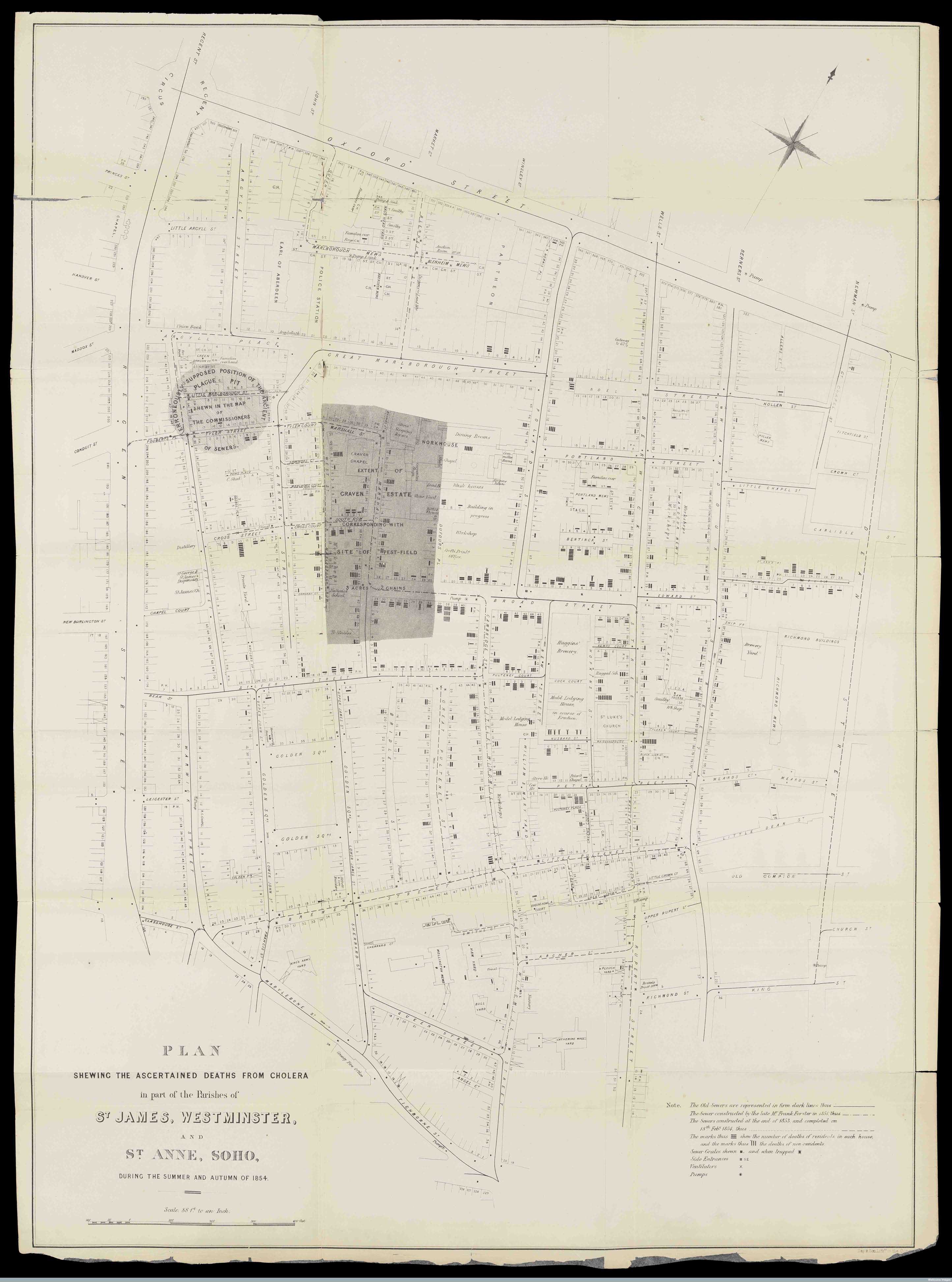
The map above (click it to load the full size map and record) shows the full extent of the outbreak alongside some contextual information including an (incorrectly) suspected plague pit. At the heart of the map is of course the “Broad Street Pump” which was the infamous source of the Soho outbreak.

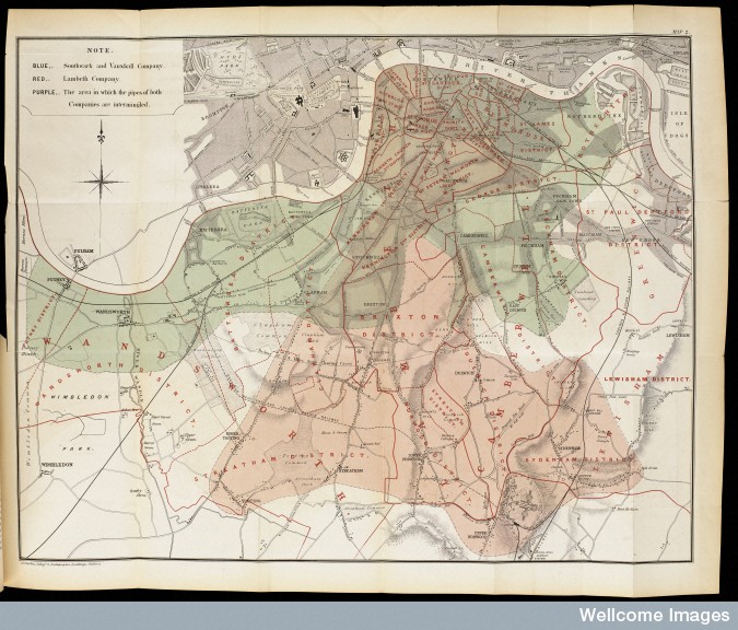
A second map I hadn’t seen before, although had heard about in “The Ghost Map“, shows the multitude of water supplies that residents of South London were receiving. This is partly why water was hard to prove initially as the source of the outbreak because the mixture of suppliers created a complex geography of cases at the city level. It was not until Snow zoomed in on a small area of London that all became clear…
Images CC-By the Wellcome Collection.
2 comments