There is always interest in London’s astronomical rents and house prices. As with any global city, there is huge demand for somewhere to live in the heart of the action – that is within 40 minutes or so commute to central London. This is a classic geographic problem with where you live determining how much you pay to a greater extent than almost any other factor. Maps therefore offer the best way of charting the trends.
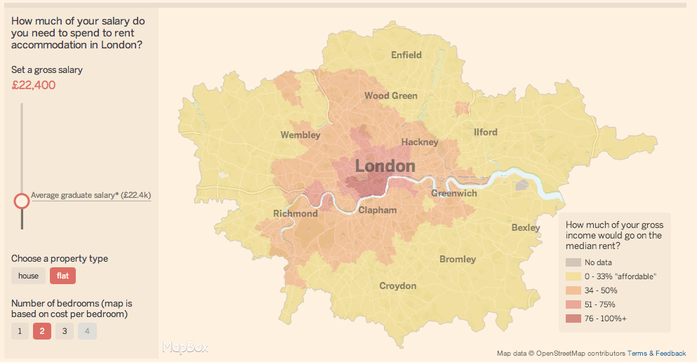
The FT Interactive team have produced this map that shows the proportion of people’s gross income required to rent in each postcode area of London. This was part of a series of articles that discussed the increasing amount of house sharing required amongst recent graduates in order that they can afford London prices.

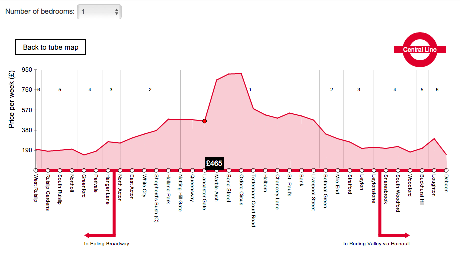
Find Properly have created Tube- map based graphics of rental prices. This concept isn’t new, but they have made them “real-time” which is a neat feature especially given the volatility of prices in some areas.
Finally, for those looking to buy, Neal Hudson from Savills has produced this (very dense!) map of the average prices paid for flats per postcode.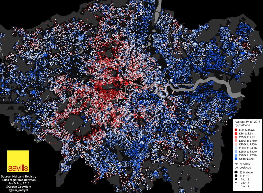
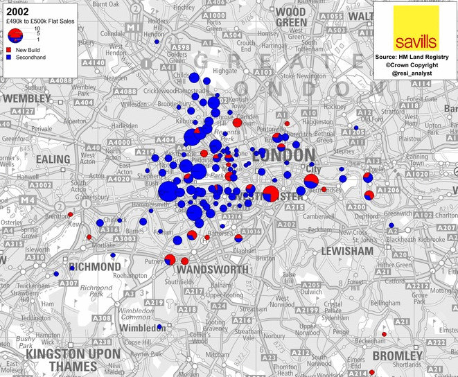
…and for those readers on a larger budget, here are where flats are selling for over £500,000.
Oh dear, some what grim viewing! My hope is that they don’t inflate so much that they drive anyone who isn’t a millionaire out of the city!
It’s amazing how the rental prices varying considering that the distance between the centre and the surrounding areas is not that large.
I want a housing rent data of City of London for a project work. How can I download that required data?
Have a look at the London Data Store: https://data.london.gov.uk/