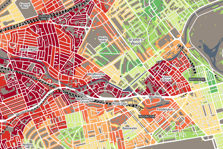

“Geodemographics of Housing in Great Britain – a new visualisation in the style of Charles Booth’s map” is a map that I have produced that shows the Index of Multiple Deprivation ranking deciles for London and the rest of England. The most deprived 10% of areas in coloured in dark red, the next 10% in lighter red, and so on. Instead of colouring each area uniformly, as a choropleth (or thematic) map, only building blocks are coloured as such. This stops parks and other uninhabited land from acquiring the colours of surrounding housing, although non-residential housing is unfortunately not excluded. This can be thought of as a primitive forma of dasymetic mapping. It is similar in concept to Charles Booth’s Poverty Map of London from 1898-8, where he also coloured building areas based on the classification, although his map was at a much finer detail, being based on personal visits to the houses. The building outlines, along with roads, railways, water features and placenames, come from the Ordnance Survey’s Vector Map District dataset, part of its Open Data suite.
There is more information about the map on my blog. A simliar map, of the Output Area Classification (OAC), is also available, although, due to the capital’s unique size and characteristics, the OAC does not distinguish its areas well.
Contains Ordnance Survey data © Crown copyright and database right 2011. IMD 2010 data from the Department of Communities and Local Government.
Fascinating map – aesthetically it looks great too. Having cycled all over London for more than a decade, it’s interesting to match the deprivation index with my experience of the streets. Riding from West Norwood (near Streatham) to Hyde Park covers an huge deprivation range – through the Elephant and Castle and then over Chelsea Bridge into Westminster, or walking from the City into Tower Hamlets.
Hi Ollie
I am a Post grad student at the University of Kingston studying Architecture.
I am researching maps similar to yours and that of Charles Booth (London Poverty Map) and Sir Abercrombie and Forshaws maps (County of London Plan). I will be producing a map illustrating a comparison between my research and that of Charles Booth’s analysis of London in the late 1880’s.
I am emailing you because your map looks intriguing and was wondering if you could give me a little background into your map and why you chose to produce it. Although I am producing a map of my own and looking into other peoples I am also interested in seeing why the producers of the maps undertook them in the first place.
Kind regards,
Ricardo
Hi Ricardo
The map was produced as an experiment to see if dasymetric maps like this are more informative than traditional choropleth maps which tend to overemphasise rural areas. Also I hadn’t yet seen a good country-wide map of the IMD which is a key index that informs quantitative geographers.