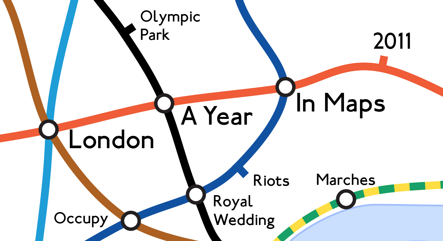

Mapping London editors James and Ollie look back at some of the many maps produced each year in London to highlight the highs and lows of London life. As you can see there was more to 2011 than riots and Royal Weddings: hand drawn maps have never been so popular, nor have those showing transport and people’s use of social media. So before we head into 2012, take a moment to enjoy 2011’s cartographic delights.
January: Congestion Charge Shrinkage
The Mayor of London removed the Congestion Charge’s Western Extension (WEZ), shrinking the zone back to its original area east of Park Lane.
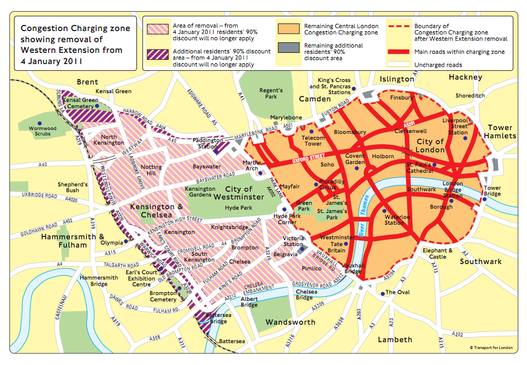
Map Copyright: Transport for London
February: Tweets in London
UCL CASA researchers Steven Gray and Oliver O’Brien produced a heatmap of London, based on geolocated Twitter data, collected through February. Certain geographical features of London appear simply by looking at where people were tweeting from.
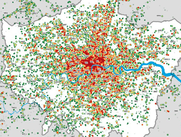
Contains data from Twitter, OpenStreetMap and Ordnance Survey Open Data (Boundary-Line).
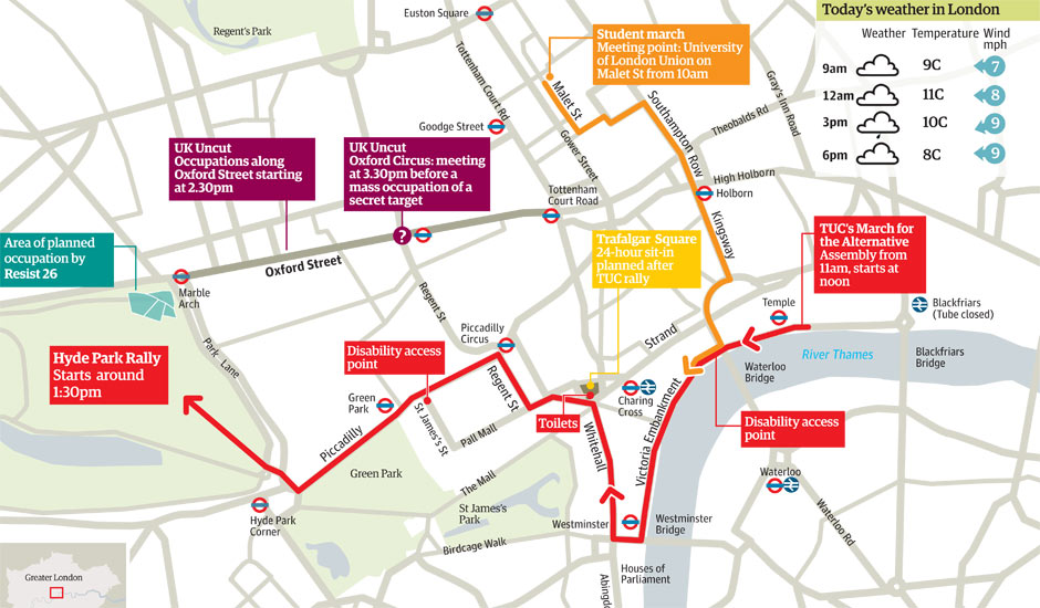
March: Anti-Cuts March
In March there was a huge march against the government’s spending cuts, with an estimated 250,000 taking part. The Guardian produced this map of the planned route.
Bonus Map: The Index of Multiple Deprivation 2010 was published in March. UCL Geography student Chris Gale mapped the data for London as a cartogram, distorting the areas to more properly represent the population in them. The full version on his site allows for a “swipe” comparison between the cartogram version and the geographical one, showing an apparent correlation between highly populated areas and areas with relatively high deprivation.

Map produced by Chris Gale. Contains boundary data which is Crown Copyright and data from the Office for National Statistics (ONS).
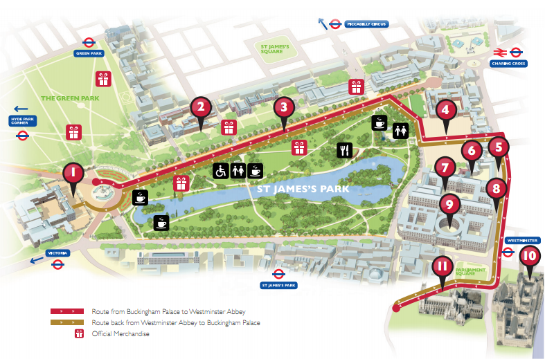
April: The Royal Wedding
The Royal Parks produced a beautiful 3D map showing the route of the procession of the Royal Wedding Party from Buckingham Palace to Westminster Abbey for the wedding of Prince William and Catherine Middleton, and its return. The original map is offline now but can be glimpsed here:
May: Londonist Hand Drawn Maps Exhibition
The Londonist had an exhibition of hand-drawn maps, contributed by readers, in the Museum of London. Below is an example, showing the River Fleet, one of the largest “lost” rivers of London, which now flows underground. The Londonist’s exhibition was a great success and may return in the future.
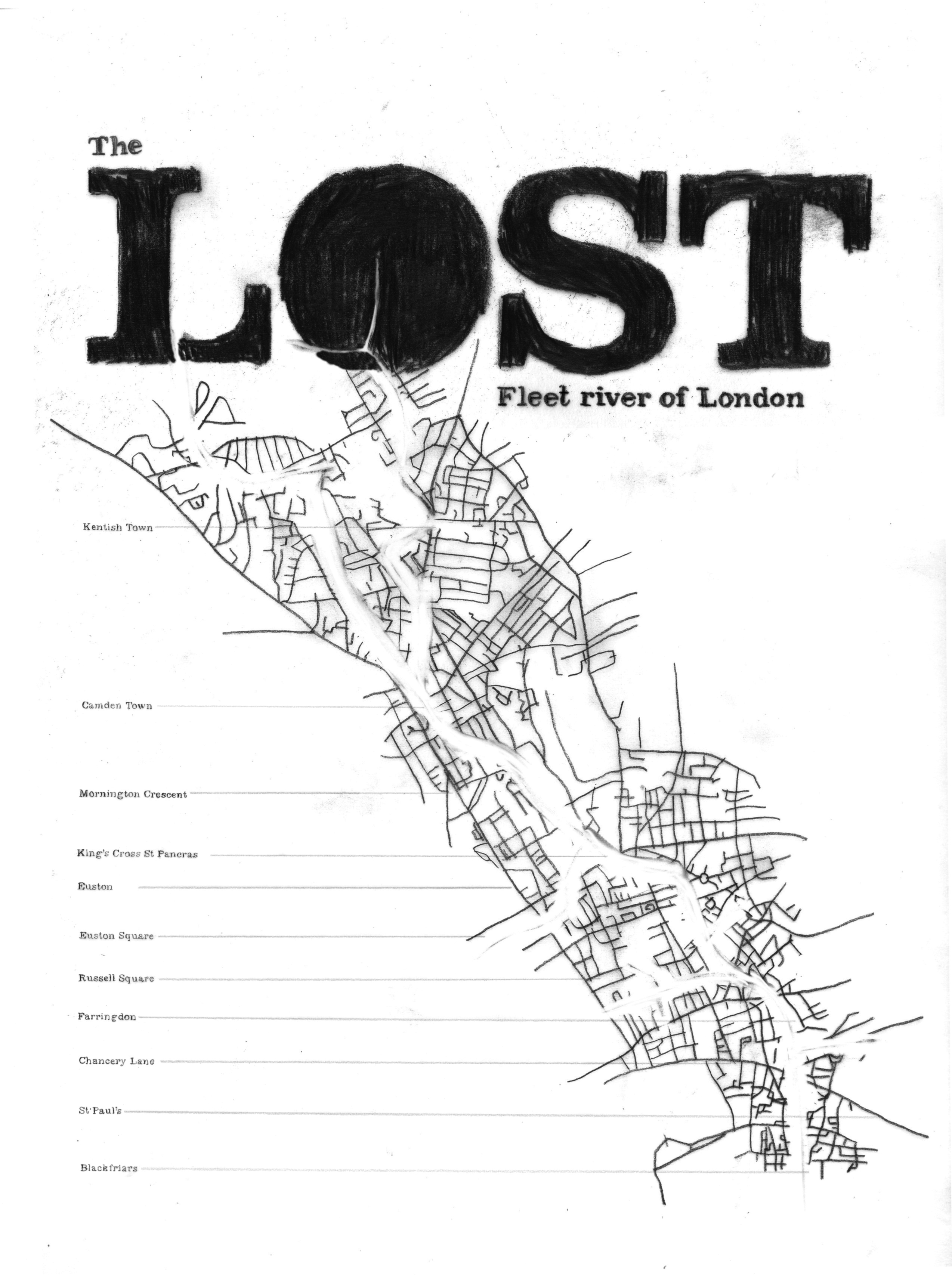
Map drawn by Londonist reader Simon Dovar.
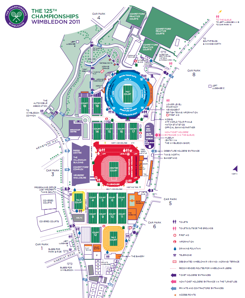
June: Wimbledon
June in London wouldn’t be June without the The Championships at Wimbledon. The All England Lawn Tennis & Croquet Club, which hosts the tournament, produces this beautiful, highly detailed map, showing the courts and spectator facilites, as well as the trees in and around the grounds, known as Aorangi Park.
July: One Year of Boris Bikes
The Barclays Cycle Hire celebrated its first birthday with the announcement of a significant expansion to the east. Over six million journeys were made on the distinctive bike share bikes in the scheme’s first year of operation. The map below, by UCL CASA researcher Oliver O’Brien shows how the current extent of the scheme relates to non-Zone 1 tube and train services, opening up the possibilities of cheap journeys by combining non-Zone 1 travel with Boris Biking the final mile.
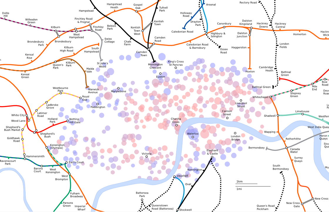
Contains data from Transport for London, OpenStreetMap and Wikimedia.
Bonus Map: The Sense and the City exhibition opened at the Transport Museum in Covent Garden. The exhibition includes a number of visualisations of transport produced by researchers at UCL CASA. The exhibition runs until March 2012. The map here shows Oyster card touch-ins and touch-outs at stations, between 08:00 and 08:10 on a sample weekday.
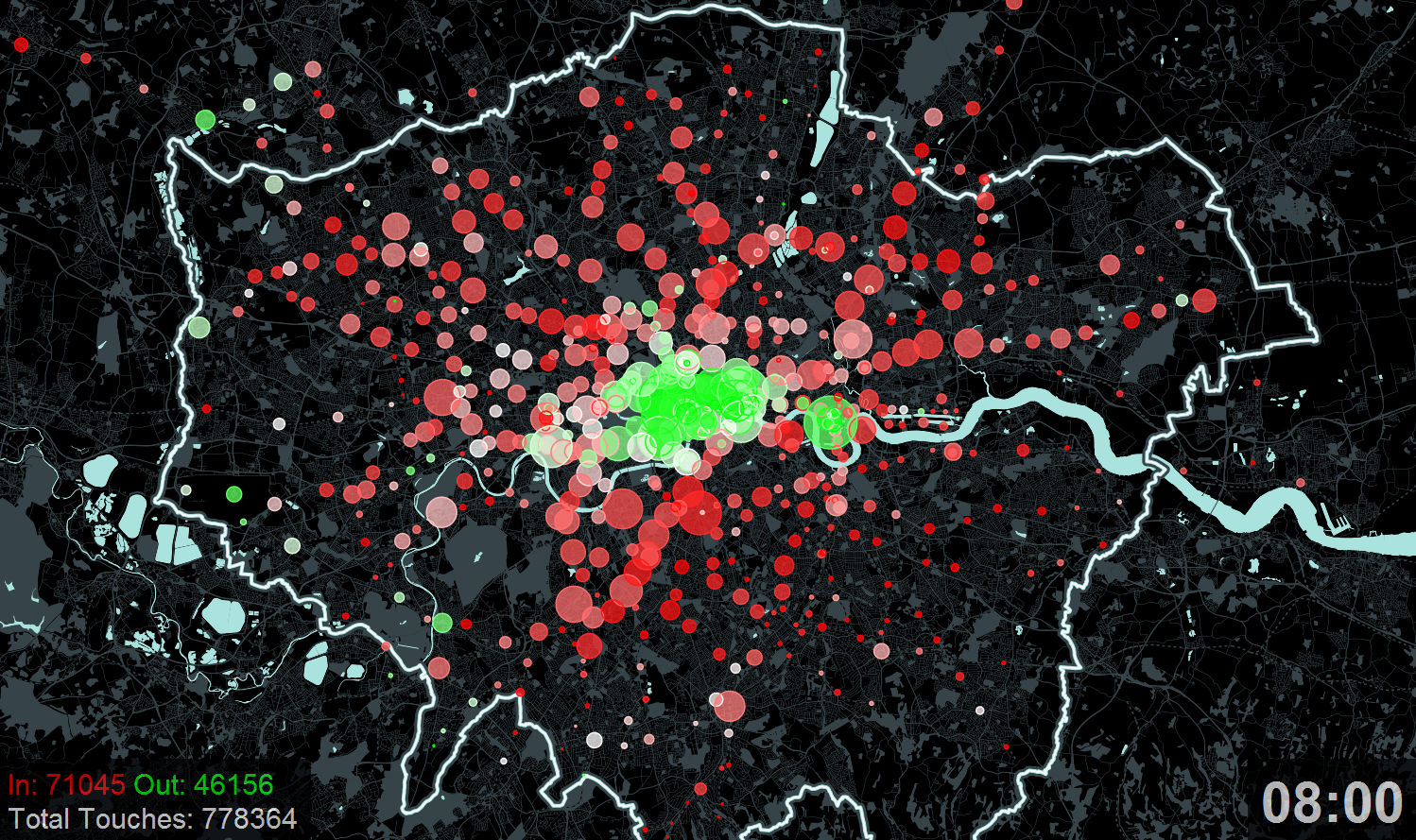
Contains data from Transport for London and OpenStreetMap.
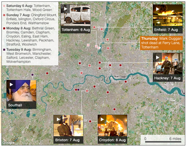
August: Riots
Riots spread from Tottenham in North London on 6 August, to engulf other parts of the capital in the following days, before spreading beyond the capital. The BBC produced this map showing the main locations, and updated it as the crisis spread. Maps were an invaluable way for the public to learn what was happening and where.
September: Stratford City and the Olympic Park
Westfield Stratford City opened – the largest urban shopping mall in the EU. It is notable for being particularly well connected to public transport, as shown on this map. It is estimated that 70% of spectators who visit the Olympic Park for next year’s Olympic Games will pass through the mall.

You can compare the changes in the Olympic Park landscape in the last five years here – the latter aerial image being taken while Stratford City and the Olympic venues were in the final stages of construction.
October: Times Atlas of London
The Times Atlas of London was published. Over 300 pages long, it maps each borough in turn, as well as having comprehensive sections on the history of mapping in London and other themes. It also featured James‘ London Surname Map.

November: Occupy London
The Occupy movement reached London. It didn’t quite make it to its target of the London Stock Exchange but set up camp outside St Pauls Cathedral. Satellite camps then appeared in Finsbury Square and Shoreditch. The below map shows the organisation of the main camp – more than just tents. Large version of the map.

December: Last of the Bendy Buses
The last Bendy Bus was withdrawn from London on 10 December – route 207. It was last of the 12 bendy bus routes to be converted over to “normal” operation – the Mayor of London had targeted removal of the bendy buses, and the introduction of a Routemaster-esque “New Bus for London”, as an eye-catching election pledge. Route 207 was a perfect one for the long buses, as the map shows – it was pretty straight, with few corners for the long buses to need to manoeuvre around.
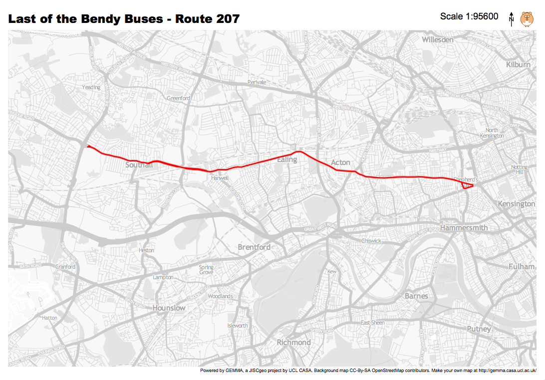
Map produced by UCL CASA’s GEMMA, with data from OpenStreetMap. The graphic at the top of this story was created by James and is based on an SVG geographical map of the London Underground, from Wikimedia.
What an interesting way to look back over the previous year in London. Thanks for collating!
fascinating overview
“70% of spectators who visit the Olympic Park for next year’s Olympic Games will pass through the mall”. Eugh! Someone should make a map showing how to make sure you’re one of the lucky 30% who manage to avoid it! 🙂
There will be three other entrances to the park which are harder to get to by train (hence the high figure for Stratford – these are to be the Public Transport Games after all) – I’ll blog about the new map that LOCOG have released, showing this, now.