This animation from Will Gallia shows over 500,000 individual journeys on the London Underground network, it’s a 5% sample of Oyster-card journeys during a week
More...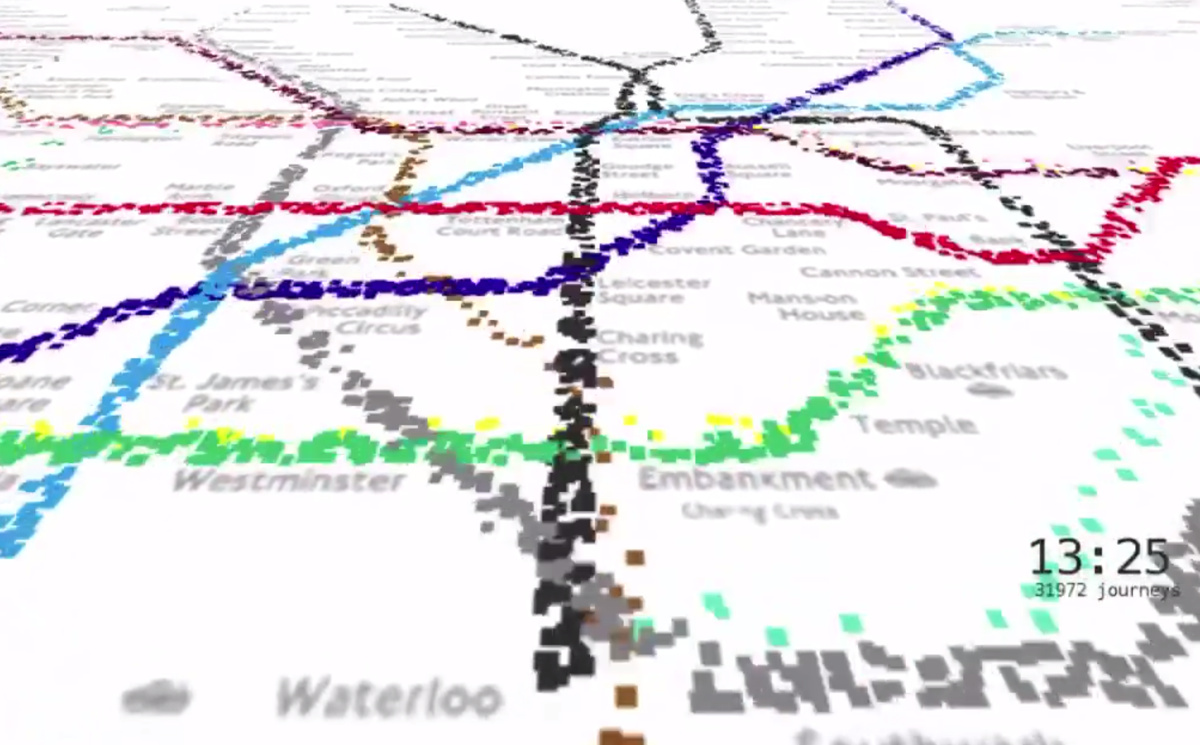
Highlighting the best London maps
This animation from Will Gallia shows over 500,000 individual journeys on the London Underground network, it’s a 5% sample of Oyster-card journeys during a week
More...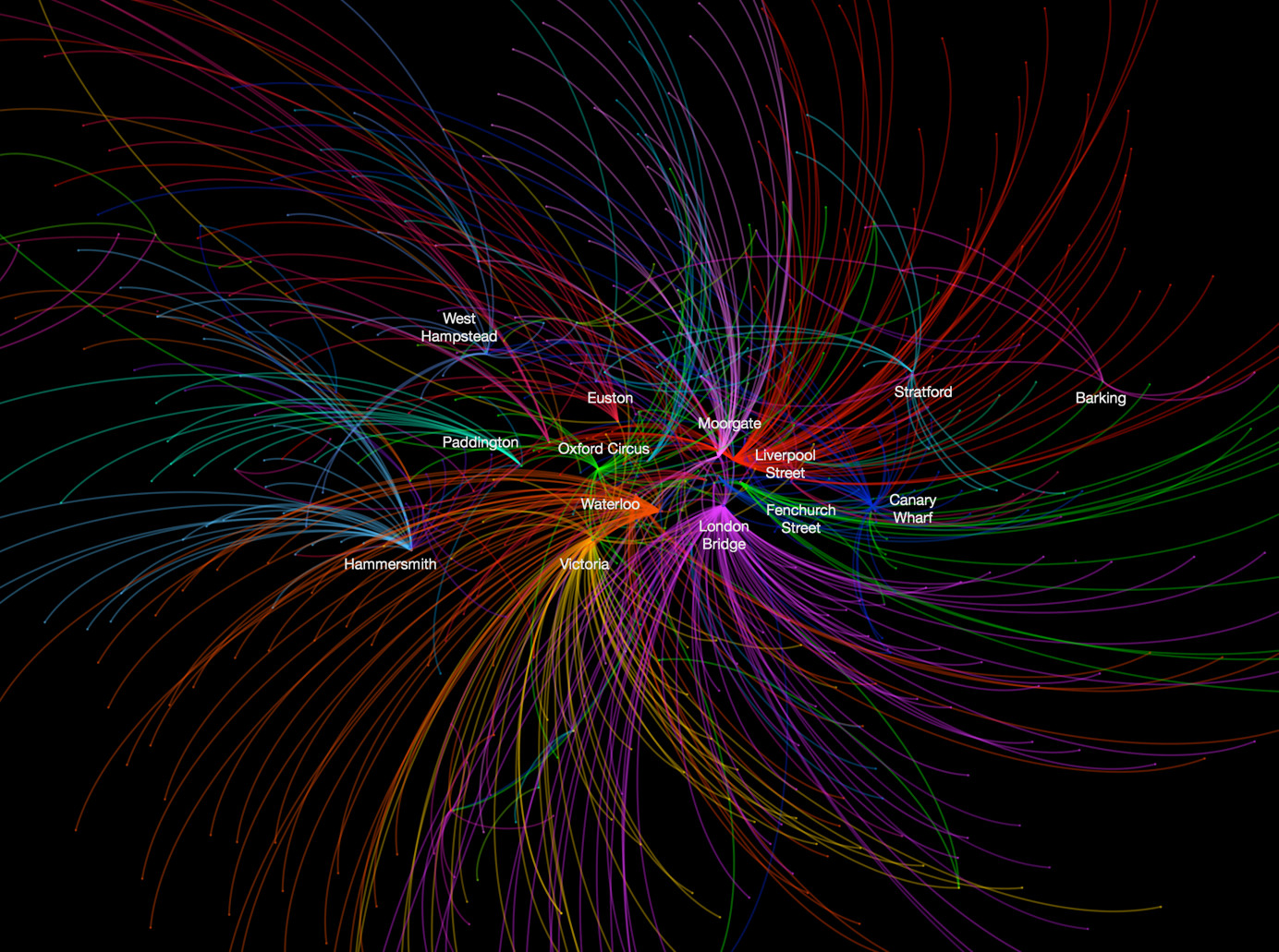
This data map, from UCL CASA‘s own Ed Manley, shows the top destination station, for each starting station, in and around London. The graphic is
More...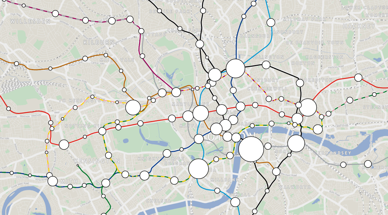
London Tube Data Map takes ten years worth of passenger entry/exit counts for stations on the London Underground network, and sizes the circle representing each
More...