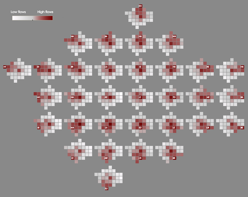
This map shows the cross-borough London commuting flows in a different way to the conventional approach of drawing lines between the start and end of
More...
Highlighting the best London maps

This map shows the cross-borough London commuting flows in a different way to the conventional approach of drawing lines between the start and end of
More...
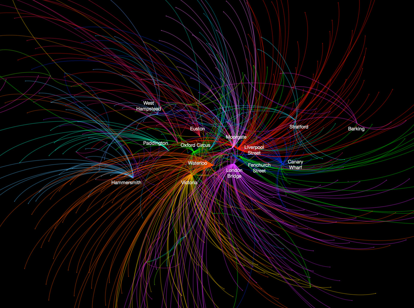
This data map, from UCL CASA‘s own Ed Manley, shows the top destination station, for each starting station, in and around London. The graphic is
More...
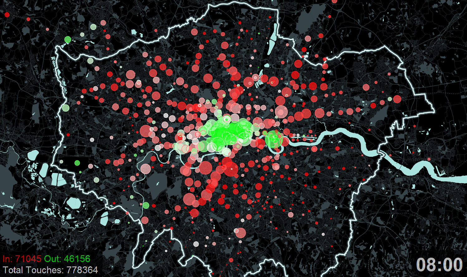
Here is an animation that Ollie created a couple of years ago for the “Sense and the City” exhibition at the London Transport Museum.
More...
Duncan Smith from UCL CASA has produced some great maps of commuter flows. Each line represents the routes people follow to work (as a straight line from
More...