It’s a typical August day in London today, with the rain falling pretty heavily and at least one tube station closed due to flooding.
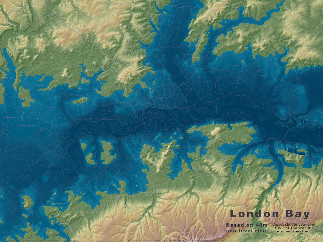
London’s greatest long-term flooding threat, though, is from isothermal expansion of the world’s water (i.e. it needs slightly more space as it heats) due to climate change. The above map was produced by Jeffrey Linn, showing what London would look like if submerged by 40 metres of seawater, which would happen due to the isothermal expansion happening by a temperature change that would cause 2/3rds of the world’s ice sheets to melt. Blues show the underwater regions, while greens and yellows show land that is dry – for the time being. Unsurprisingly, Thames-side London is well and truly in the drink, with some new islands appearing at Wimbledon Common, Kingston Hill and Richmond Park, while Shooters Hill, Crystal Palace, Highgate and Epping Forest form new peninsulas. Dark blues show particularly deep water – as well as the Thames itself, the Bluewater shopping centre, currently deep inside a chalk quarry, becomes a dark pool.
This is a nice looking, if alarming, piece of cartography by Jeffrey, using the classic altitude and bathymetric colour ramps made famous from the Times Atlas and other classic physical maps of the world, with the lush, verdant greens of low-lying areas offset by the barren yellows and browns of higher places. The existing main road map is lightly superimposed in grey, to ground this map in current reality and allow for easy checking of the under/above water status of your neighbourhood.
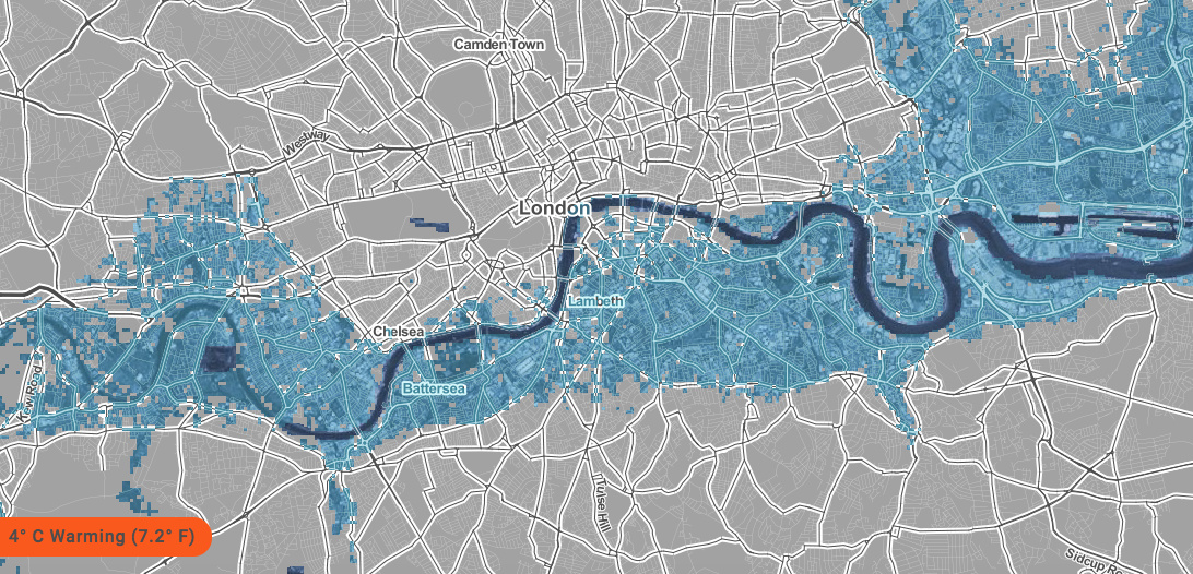
Quite a bit of climate change will have had to have happened for this scenario to happen. A more pressing scenario, showing a water rise of just 10 metres, will still put plenty of London underwater. A second map, Surging Seas created by Climate Central, shows the impact of 2°C and 4°C temperature changes, resulting in 4.7m and 8.9m rises rises in London (and indeed the planet in general). Southwark, Thamesmead, Newham, Fulham and Barnes are the areas really in trouble. This is a data-driven map, so not as pretty, but it shows the data and impact in just as a dramatic way, with the flooded areas colouring a road-network background map blue. The Thames Barrier might be able to keep back storm surges, but it won’t stop these huge, longer-term changes.
You can buy London Bay from Jeffrey’s online shop, Spatialities, or explore the Climate Central map, which covers almost the whole world, interactively.

The maps are Copyright their respective authors and include OpenStreetMap data CC-By OpenStreetMap contributors.

London a little wet today? Could be worse tomorrow. London Bay by @JeffreyLinn & Surging Seas by @ClimateCentral… https://t.co/vS4a8fokL2
RT @oobr: London a little wet today? Could be worse tomorrow. London Bay by @JeffreyLinn & Surging Seas by @ClimateCentral https://t.co/liI…
London pals: fancy a swim?
https://t.co/DYDSrAGceJ
RT @MapLondon: London a little wet today? Could be worse tomorrow. London Bay by @JeffreyLinn & Surging Seas by @ClimateCentral https://t.c…
RT @oobr: London a little wet today? Could be worse tomorrow. London Bay by @JeffreyLinn & Surging Seas by @ClimateCentral https://t.co/liI…
RT @oobr: London a little wet today? Could be worse tomorrow. London Bay by @JeffreyLinn & Surging Seas by @ClimateCentral https://t.co/liI…
RT @oobr: London a little wet today? Could be worse tomorrow. London Bay by @JeffreyLinn & Surging Seas by @ClimateCentral https://t.co/liI…
London is drowning, and I live by the river! London Bay via @MapLondon https://t.co/r11OrJycbU #coolmaps – actually #globalwarmingmap
RT @jasonmarkwebber: “London Bay” via @MapLondon https://t.co/t3o1LggL9t
Map: London Bay https://t.co/urvO30Zfrz
Some interesting and informative maps that help people understand the impact of 2°C and 4°C temperature changes, resulting in 4.7m and 8.9m rises actually means. Regards, Alastair Majury
? Mapping London Advent Calendar ? Day 20: London Bay. What London would look like if 2/3rds of the world’s ice she… https://t.co/8rO5E5Zg50