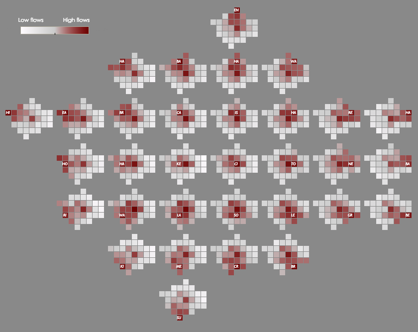
This map shows the cross-borough London commuting flows in a different way to the conventional approach of drawing lines between the start and end of each commute (as shown here. It’s a large map of London boroughs, which each borough itself containing a small map of London. The intensity of the colour in each of these mini-maps shows the size of the flow from the origin borough (on the big map) to the destination borough (in the small map).
Once you get your head around it, it’s a powerful and simple way to show a complex dataset. The simple grey, white and red colours reduce the clutter of the map (although personally I would have added a River Thames link through the main map and mini maps, for clarity) and, as long as you are familiar with London’s boroughs and their approximate location relative to each other, studying the map allows some interesting results to appear that would otherwise be hidden if just using lines. For example, in the affluent boroughs to the south west, most commute flow seems to either remain within the borough itself, or to the centre of London. In the poorer north east boroughs, the pattern is different with a strong additional commute flow to intermediate boroughs, as well as the local and central-London flows. This is likely caused by the different location and nature of jobs performed by residents in these respective borough groups.
This technique of nested maps to show flows was developed at the giCentre at City University London. The map was created by Robert Radburn and he explains in detail its creation, along with an interactive allowing the display of different types of commutes, in this blog post.
Via a tweet.

O/D Map of London Commuting via @MapLondon https://t.co/BRQK5sLOk1 via @MapLondon
RT @MapLondon: O/D Map of London Commuting by @robradburn – https://t.co/X6hthtqnox https://t.co/YqQfFH9emt
Looking for data/shapefiles and just stumbled upon this https://t.co/ujWPzWDcLt via @MapLondon – @robradburn’s grea… https://t.co/fLE2vlLhJ9