The John Snow Cholera Map is world famous as the map that identified the cause of the disease, and was one of the first epidemiological maps created. However, a number of other maps of the location of individuals with the disease were produced at around the same time, in an attempt to try and determine spatial patterns and possible causes. The Wellcome Trust‘s collection contains many of these maps and various graphs and other data visualisations of the disease’s spread. Various theories were tested, from postulating the airborne spread of a “mist” of the disease, to looking at the location with respect to the sewer network, underground geology, or simply height above sea level. We show excerpts of three such maps here, all good examples of data mapping in London in the 1800s.
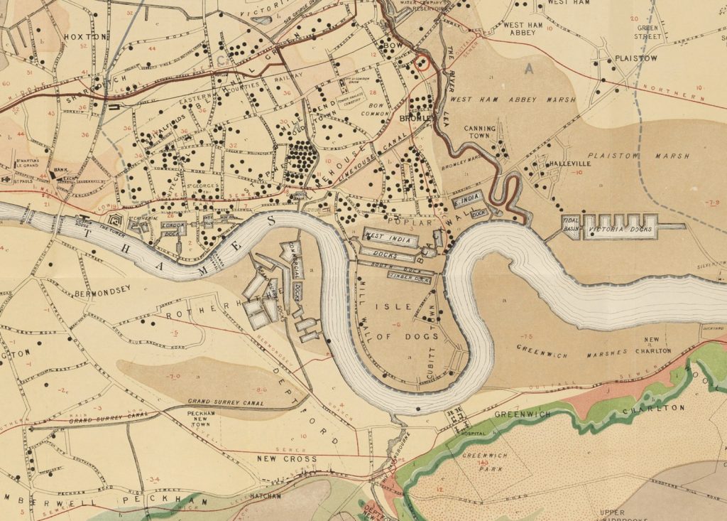
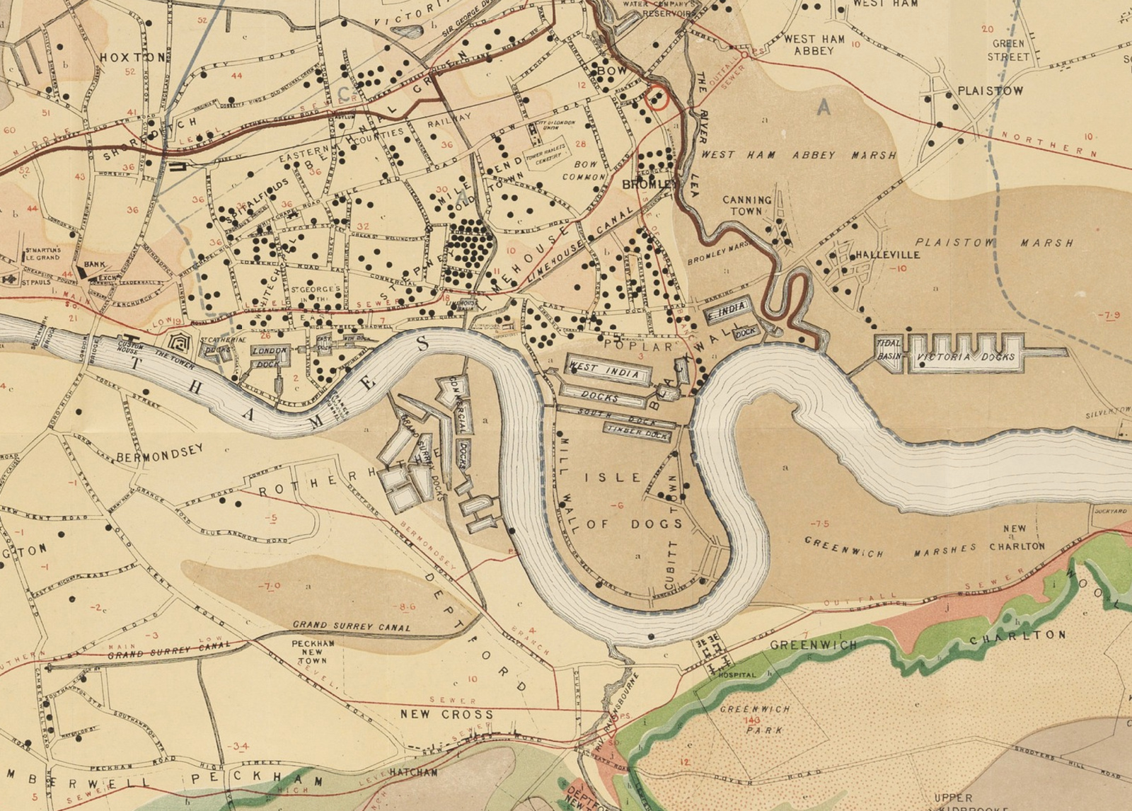
Above (source) is a map of an outbreak in London’s east end in 1866, with dots showing each victim. Red lines show the sewer network and areal colours correspond to different rock types. Blue lines show water supply catchment areas and the outbreak source is circled in red. The dot data was likely rolled onto an existing topology/geology map of London rather than the full map being drawn specifically for this purpose. Aside from the morbid nature of the subject, it’s a rather attractively draw and crisp map of London’s extent and major natural features and networks, in the mid-1800s.
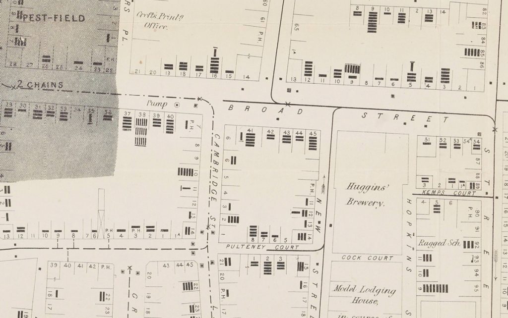
Below (source) is a variant of the “famous” John Snow map produced in 1854, showing deaths by household, each as a black bar moving away from the street entrance to each house. Also shown is a shaded area indicating a disused burial pit suspected as a possible source, along with the pump that famously was the actual source vector for this particular outbreak.

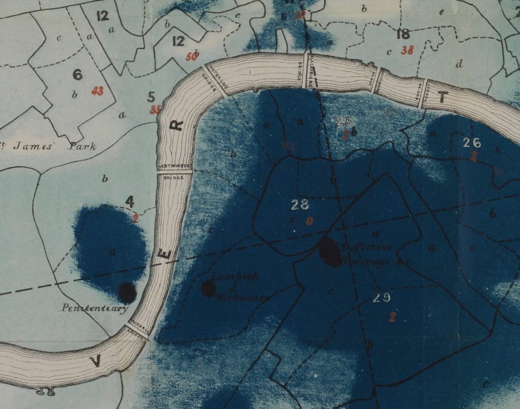
Finally, at the bottom (source) is a “density plot” style map showing the extent and severity of another outbreak of cholera, this time in Southwark in south London, in 1849. Numbers in black/white and red show district IDs and altitude, respectively, while an accompanying table lists the death rate in each subdistrict. Additional possible sources are indicated in black “smudges”, such as “bad ventilation”, or “penitentiary”:

For further examples please see this blogpost by Dr James Cheshire.
Excerpted from How the Victorians Mapped London’s Cholera by Mapping London co-editor Dr James Cheshire. All maps courtesy of the Wellcome Collection.

The Cholera Maps — https://t.co/nqcyfE4DjK
The Cholera #maps https://t.co/MgQHLG1Pup
The Cholera Maps https://t.co/FM5q1AISvk