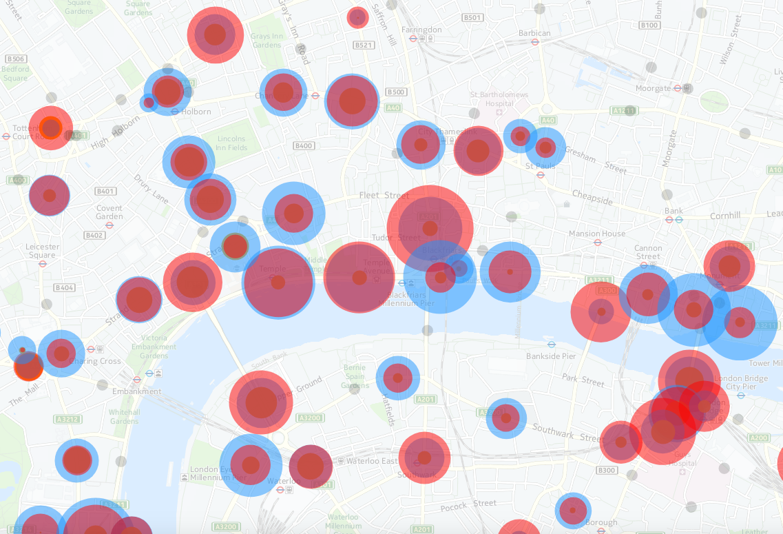
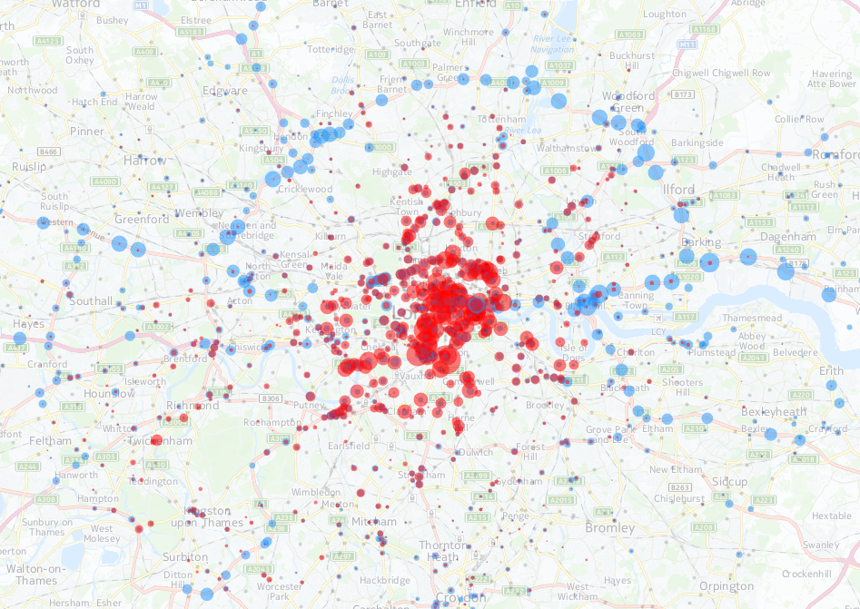
My latest London data visualisation crunches an interesting dataset from the Department of Transport. The data is available across England, although I’ve chosen London in particular because of its more interesting (i.e. not just car dominated) traffic mix. I’ve also focused on just the data for 8am to 9am, to examine the height of the morning rush hour, when the roads are most heavily used. 15 years worth of data is included – although many recording stations don’t have data for each of those years. You can choose up to three modes of transport at once, with the three showing as three circles of different colours (red, yellow and blue) superimposed on each other. The size of each circle is proportional to the flow.
An alternate mode for the map, using the second line of options, allows you to quantify the change between two years, for a single selected type of transport. Green circles show an increase between the first and second year, with purple indicating decreases.
In the extracts shown here, the top map shows bicycles (red) vs lorries (blue) across inner London. The map below compares bicycles (red) with private cars (blue) for the heart of the capital. The data is for the 8am-9am weekday rush hour.
- Go to the London Traffic Counts Map
- See also a central London directional version based on TfL data
- See also a map focusing on Southwark, with the borough’s own data

Crossposted from the author’s research blog. Data from DfT, TfL and LB Southwark. Background map from HERE maps.
Traffic Counts https://t.co/eubhNJuGag | #GIS #mapping
New post on CASA blog: Traffic Counts https://t.co/moa85eAmbB
RT @MapLondon: Traffic Counts: https://t.co/f3uK369dNO https://t.co/NsKUaXn5Eb
Map: Traffic Counts in London https://t.co/K3Cb4l85SB
Hi Ollie,
Great maps.
Do you know if there is any monthly traffic flow data (Southwark)?
I am trying to find out what the difference in traffic volumes is between term time and holiday time.
Any help gratefully received.