
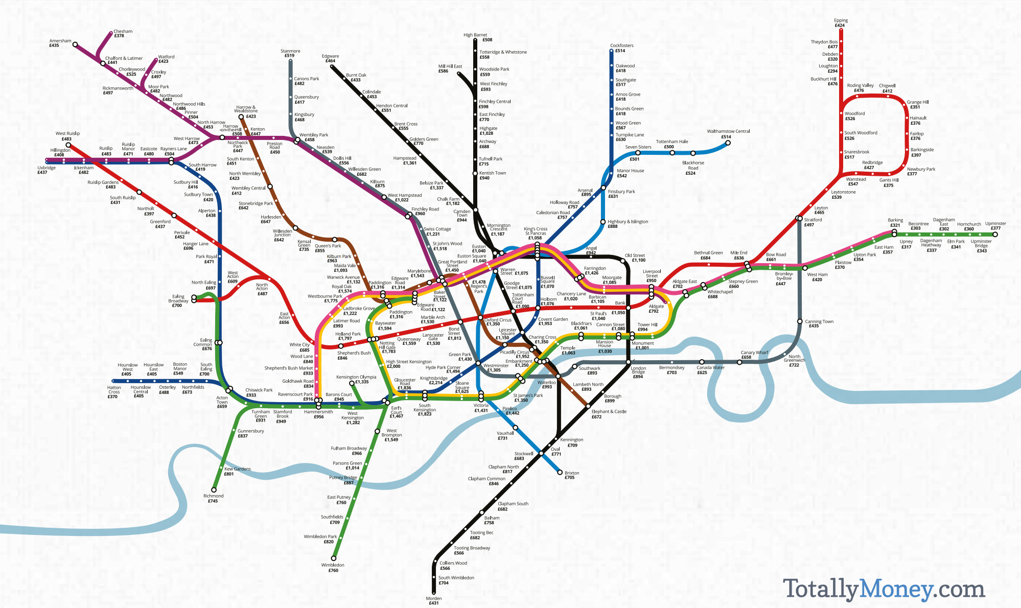
The tube map is a useful base for data maps of London, because most people (north of the river, at least) tend to think of the city’s layout in terms of the tube map – generally, you know what your nearest tube station is. We’ve used the idea before to show maps of life expectancy, jobs and local languages, but TotallyMoney have taken the idea for one of London’s most discussed metrics – the cost of property in the capital.
There’s been a few property price/tube mashup maps that have crossed the Mapping London desk over the years, but we particularly like this one because rather than using the official map (which TfL get upset about, and can be hard to work with), or a geographic map (which is less recognisable, if more representative) it uses a hybrid, custom-created map which is recognisable enough as the tube map but has a design which works well in showing the data. We particularly like the ribbon-like, always-important River Thames which flows organically through the map.
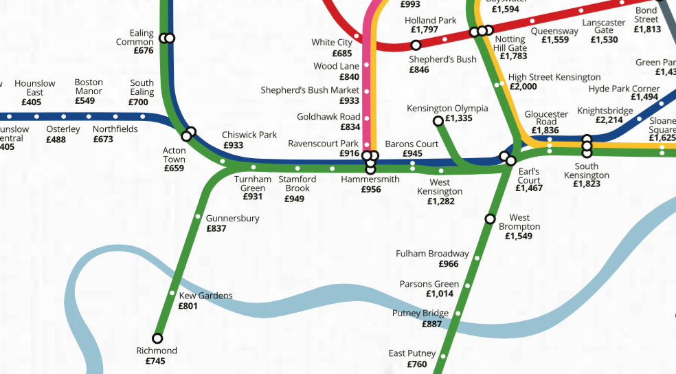
The creators have also been careful to make clear what they are showing – it is the average price per square foot of properties for sales within half a kilometre of each of the tube stations, based on data from Zoopla on 1 May 2016. In some cases this may only be a small number of properties (and Heathrow is removed altogether as there are obviously no sales there!) but the variations as you travel along tube lines are relatively smooth, suggesting the measure is accurate and useful. Values range from £300 around Dagenham, in the east, to Knightsbridge, in central/west London – the latter being handy for Halfords but a property would set you back £2000 per square foot. A typical 1-bed London flat is around 500 square feet, so multiply the values by 500 to get a equivalent price – so that’s £150,000 for Dagenham and £1mm for Knightsbridge. There is a full explanation of the methodology on the map’s website which notes that, in many areas in central London, the value is higher than an equivalent floorspace made entirely of premium Macbook Airs.
The map may well show the “high point” in property pricing in London – only yesterday, following Brexit, it was reported that the average property prices was down by £30,000 in a month. This may be due to regular seasonal effects or a short-term reaction, or it may be the start of a downward trend, we will see…
Click the image below for a larger version, or see the original map.
From an email from Totally Money.
One comment