So London’s myriad of suburban commuter rail services, many of which are south of the River Thames and so act as the equivalent of the largely north-of-the-river tube network, may in the future come under the control of Transport for London, the main transit authority for the city. It makes a lot of sense – TfL’s Overground network has already reinvigorated many old and unloved commuter rail lines in the last few years. It has however added a lot of orange to the tube map and if more lines come under TfL’s command (albeit continuing to be operated by private companies and with the track continuing to be owned by Network Rail) then the tube map is going to turn into a real mess. The London Connections map which includes the commuter rail, already is hard to read with its wiggles and dashes, and that’s without turning it orange.
Step forward architect and transit cartographer Jug Cerovic who has mapped many metro networks around the world, and has come up with a lovely map of the London system that manages to combine the tube and commuter rail networks into a single map that is clear and pleasant to read, unlike the official ones. The INAT London Metro Map is a lesson in simplifying and making attractive a complex topological map.
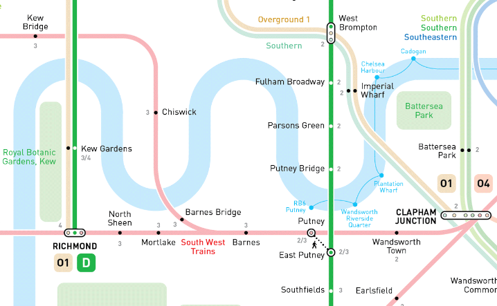
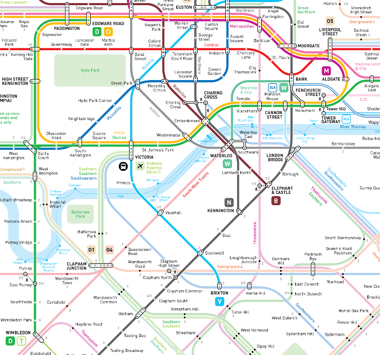
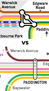 A key decision decision shows the commuter rail in varied pastel colours – much better than the visually noisy dashed lines on the official map, or an orange apocalypse. The map abounds with other visual pleasantries, such as zone indicators shown beside each station, rather than as arbitrarily shaped and ugly blobs of grey. Key walking links are shown with walking symbols – fancy that! – and stations with multiple lines are shown generally as straight lines and squares. The river’s bends form an attractive shape and key parks appear as rectangles with rounded corners. It’s all wonderfully organic looking and very pleasant to read. The Overground lines are split into different shades of Orange and numbered simply. River boat services are included. It all just works together. Jug has even planned ahead and Crossrail is ready to slip in in to the map in 2019.
Finally, it is time to move away from Beck and adopt this as London’s official tube/railway map.
Visit the full map (zoomable) here.

Map excerpted from the INAT website.
Pastels might look nice, but they are an absolute nightmare for colour blind people. Given how many colours are necessary, there’s no guarantee a colourblind person could distinguish them even if they are the bold and garish ones as used presently – but they have a much greater chance than with pastels!
cant open and download maps @ china