
Mapping London is just back from a holiday in New York City. Here is one last iconic map from the city which never sleeps.
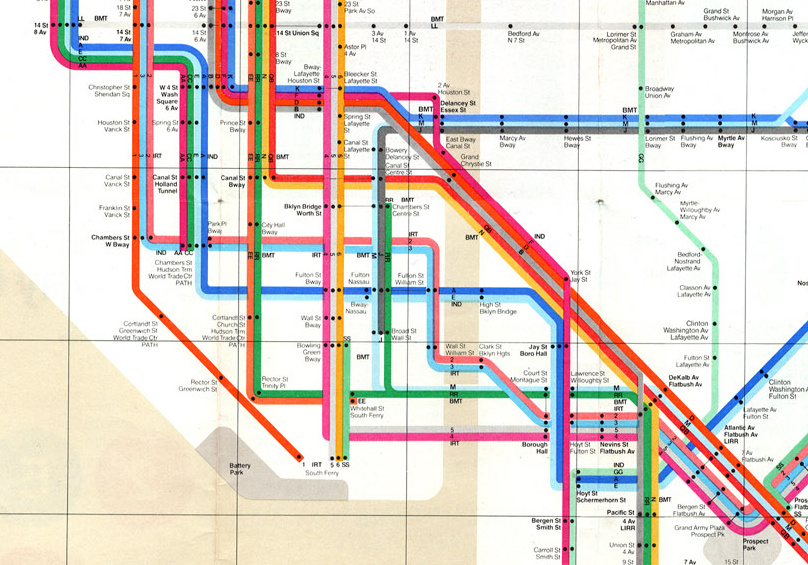
The late, great Massimo Vignelli redesigned New York City’s subway (metro) signage in the early 1970s. The one part of the design that proved too radical for New Yorkers at the time was a map of the system. Like the equally famous Harry Beck tube map for London, the map eschewed geographical accuracy, instead presenting the system in a more simplified and clear fashion, using straight lines, consistent corners and different scales, to convey route differences and connections. Although the MTA (which runs the subway in New York City) bowed to the critics and restored the old geographical map few years later as the standard network map, they have adopted an interactive version of Vignelli’s map on the “Weekender” subway disruptions/closures website. When zoomed in, affected stations blink to show closures.
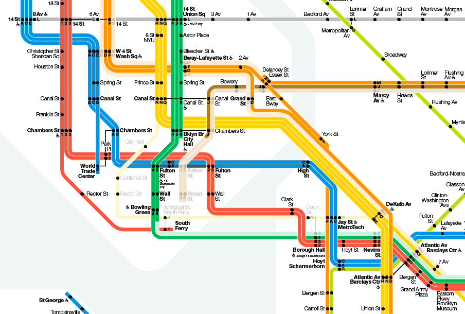
Vignelli himself redrew his 1970s map in 2012, further enhancing the minimalistic design and producing a version even closer to his design goals. It is this version that the Weekender website uses, and that we show here above.
Both the 1972 (extract below) and 2012 version of his map can currently be seen at MOMA (the Museum of Modern Art), along with examples of his station and line signage system, that have, unlike the map, remained as the official branding of the system.
Images from the MTA website and NYC Subway.
2 comments