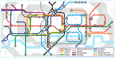
When we started the Mapping London one of our “ground rules” was not to turn it into a blog about Tube maps. On the 150th birthday of the London Underground, we are happy to make an exception. Here are some of our favourite maps and data visualisations about the World’s first underground railway.
First London Underground Spoof Map
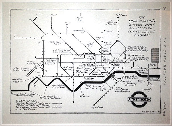
Before his famous diagram was widely accepted, Harry Beck himself tackled some of his critics head on (who thought it looked too much like a circuit diagram) by producing a version adopting many of the standard electrical components found on a circuit diagram. An aerial and earth appears, and the Bakerloo line becomes “Bakerlite”. The map appeared in London Transport’s internal staff magazine in 1933.
Tube Map Circuit Board
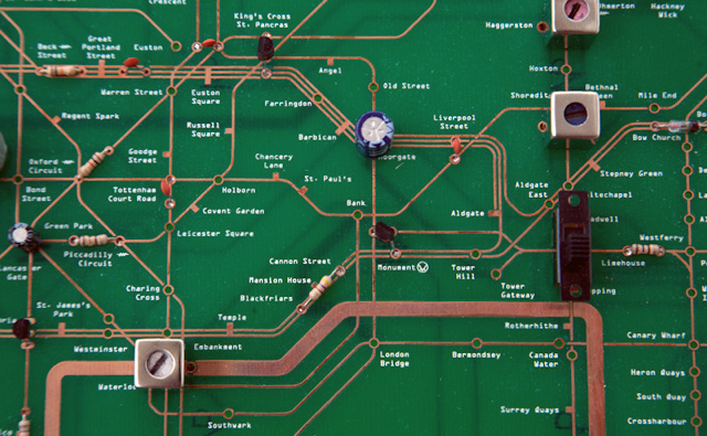
Perhaps inspired by the Beck circuit board map, Yuri Suzuki‘s has created a London Underground Circuit Map Radio.
The Fantastical World of MacDonald Gill
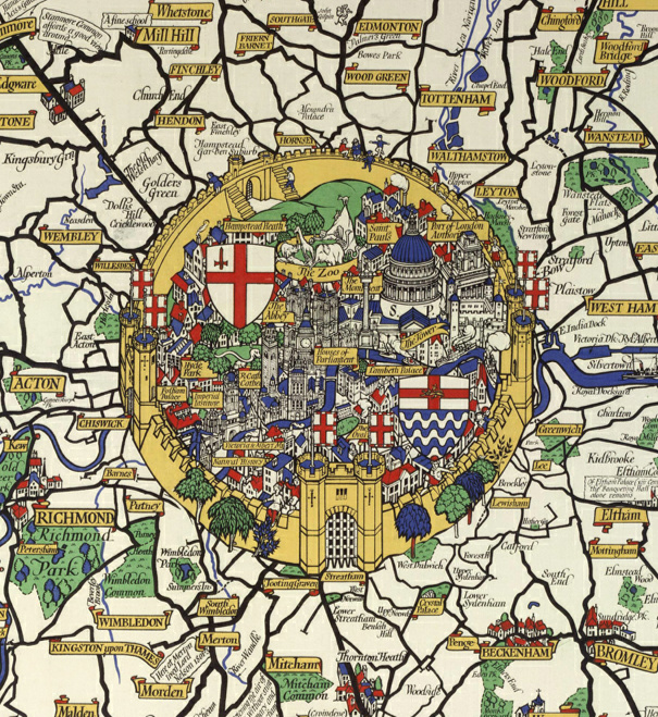
This is an extract of a map produced in 1928 for London Transport by Macdonald Gill. He produced many maps in this “flowery” style – a world away from the straight lines and diagrams of Beck that were to come just a few years later.
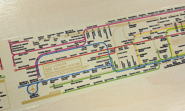
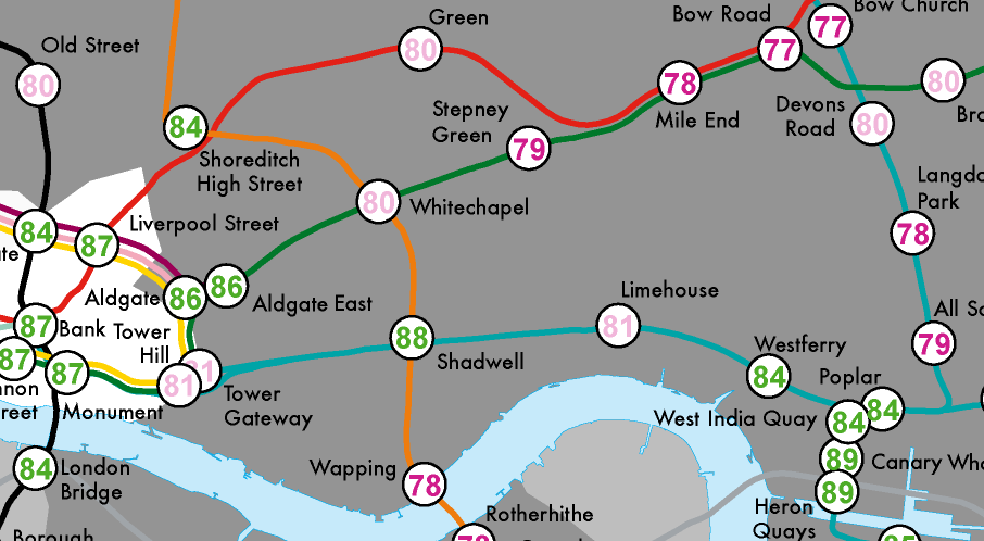
London Underground in Detail
The complexity of London’s tunnels and stations is revealed by Franklin Jarrier’s super detailed map.
Just How Far Can the Tube Take You?
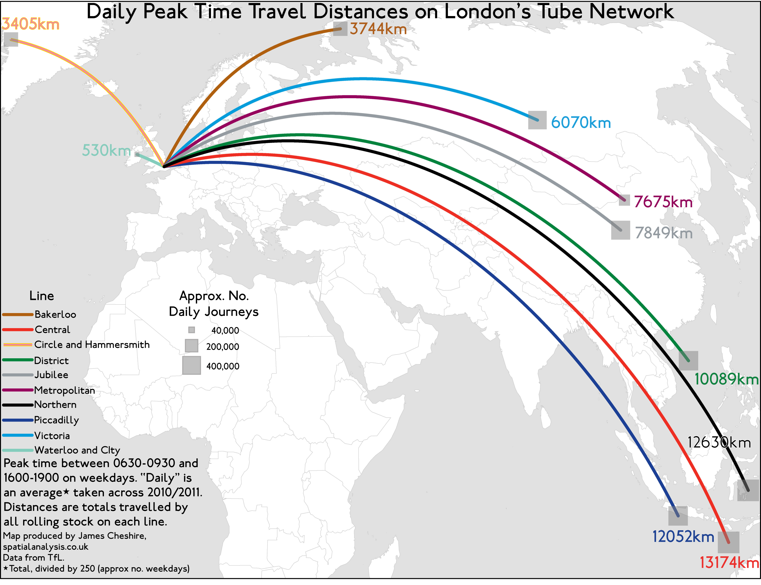
The scale of the London Underground network is hard to comprehend. The map above shows the total distances travelled by the Tube’s rolling stock in during the peak times alone!
A Week in the Life of the London Underground
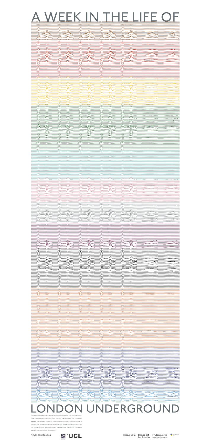
It is not just the distances travelled by the carriages that is remarkable, the billions of journeys completed each year could not have been anticipated by the Tube’s early pioneers. Jon Reades’ graphic above depicts the flows of passengers through every station (based on Oyster Card touch ins/outs) across the network in a typical week.
Pulse of the City
Jon has also used Oyster card data to produce this animation that has passengers pulsing through the Tube like blood in arteries.
Typographic Tube Map
Fadeout design have simplified the Tube map even further to create this great typographic map. The lines look like they are drawn in charcoal but they actually comprise the station names.
Tube Map Sticky Tape
A horrendous distortion perhaps, but an excellent way of wrapping gifts for London Underground enthusiasts.
Lives on the Line
Nearly all Londoner’s are familiar with the Underground network, so it offers a great way of increasing the relevance and impact of often abstract datasets. Here we use it to chart life expectancy.
Bring Back the Thames
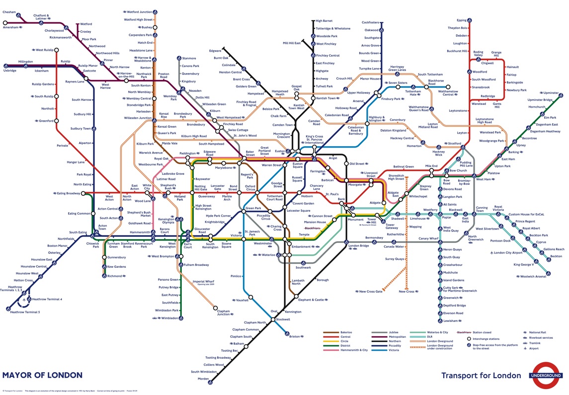
Back in 2009 the designers at TfL triggered public outcry by removing the Thames from the map. The successful campaign to put the Thames back, alongside other failed attempts make big changes in the map’s appearance, demonstrated Londoner’s love of the original Beck design and its crucial role as part of the Tube’s identity.
Google Doodle!

And finally, Google has replaced their normal logo with a special “Doodle” for today, celebrating the anniversary. The graphic is a stylised version of the iconic tube map, with the lines warped to form the letters (and colours) of the normal Google logo, but retaining much of the topological structure of the London tube network.
Look at : http://www.anagramtubemap.pwp.blueyonder.co.uk
Brilliant ! Congrats, London Tube. I prefer the circuit board one.
Dear Friends,
I must be the only person on earth who thinks these diagrams of transport systems are pretty close to useless. Everyone gushes about the wonderful design properties evinced by the alleged “maps.” It’s interesting.
So, I’m wandering around a big city, and all of a sudden realize I’m hungry and want to run back to my B&B to dress for dinner. Except that I don’t really know exactly where I am. And have forgotten the name of the metro/tube/subway station that’s near my lodgings. Whoa!
I see street signs: I’m at the intersection of Who Boulevard and Whatsis street. I pull out the metro/tube/subway “map.” Ummm…
Total Epic Fail. Am I the only one?
The best way to use them is to have a street map with the tube stations indicated – find which one you need to get to then pull out a tube map and plot the best route there from where you are. Boom, simple. Otherwise just use Google Maps…
Sorry, I think you might indeed be the only one… 🙂
to Bucky Edgett,
The London Transport Tube map is all about connectivity within the system and not about how to reach addresses above ground. A circuit diagram does just the same thing. And, as for forgetting the name of the station next to your lodgings, how silly of you…you should always take your suitcase with you wherever you go in London…
Hello,
The map of London Underground in Detail has moved to a new website, please update your bookmark to:
http://cartometro.com