
Most government statistics are mapped according to official geographical units such as wards or lower super output areas. Whilst such units are essential for data analysis and making decisions about, for example, government spending, they are hard for many people to relate to and they don’t particularly stand out on a map. This is why we tried a new method back in July to show life expectancy statistics in a fresh light by mapping them on to London Tube stations. The resulting “Lives on the Line” map has been our most successful yet with many people surprised at the extent of the variations in the data across London and also grateful for the way that it makes seemingly abstract statistics more easily accessible. To find out how we did it (and read some of the feedback) you can see here.
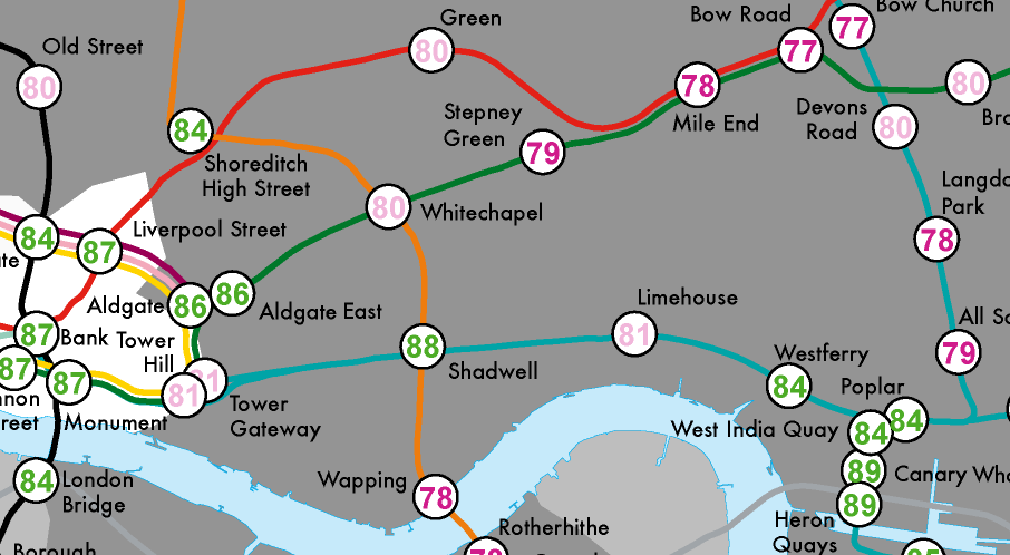
About the same time we were developing our map Mark Green, a PhD student from the University of Sheffield, had a similar idea to map levels of deprivation in London using an adaptation of Beck’s design. This map may be more familiar to people than the geographically accurate version we used for Lives on the Line, and by using the size of the station circles you can see the extent to which levels of deprivation in London vary as you move along each line. Mark hasn’t managed to squeeze on any station labels so you may need to compare the map to the real thing to get a better idea of what’s going on. Mark’s map nicely illustrates some of the differences between inner and outer London (bigger circles are more deprived areas) and also, to some extent, differences between east and west. To read more about the map see here (££).
Here is a small section of Mark’s map (we will bring you a fuller version as soon as we can):

You can obviously produce these sorts of maps for any data you want, so long as it has spatial information, but we think they are especially powerful for highlighting inequality in London and also raising the profile of many important government datasets that are now freely available.
This is really interesting – redefining municipal boundaries based on proximity to transit stations, hospital hubs or other central community services totally changes the interpretation of complex data… cool stuff!
As visually informative as it may seem, the map fails to identify the most unequal areas of London (the rich and poor living cheek by jowl). Examples include areas like: Pimlico, Notting Hill, Edgware Road etc… And ward level data is sometimes not enough because there are many housing associations inside wealthy wards. I would like to see a recreation of Charles Booth’s map-like he did in 1899…
This map is an amazing case study for me.
Not sure about the ’96’ life expectancy in Oxford Circus. A few years ago it was 83/84!
There are some stations which I disagree on, for example the 88 in Shadwell and quite a few of the inner London stations. In particular Pimlico and Edgware Road.
@ieshasmall https://t.co/2VM3R36Aa7