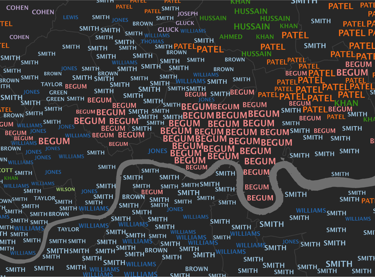
Inspired by the What’s in a Surname? map we helped make with the National Geographic, I have created 15 interactive typographic maps to show the most popular surnames across London. What they lack in cartographic brilliance, I hope they make up for in detail. There are 983 geographic units (Middle Super Output Areas) in each map and across all 15 there are 2379 individual surnames (15,000 surname labels in total). The font size for each surname label has been scaled to give an idea of the number of people who have that surname in each place. The surname frequencies come from the 2001 Electoral Roll and won’t contain everyone living in London but it is one of the best datasets available.
London is renowned for being a diverse city but this is barely reflected in the most prevalent surnames- only a few name origins can be discerned from the map. You have to look a little further down the surname rankings for this diversity to become apparent. The surnames shown on all 15 maps can be traced back to one of 38 origins; I have selected unique colours for 10 of the most popular. Surname origins were established using the Onomap classification tool. We are mapping the origins of the surnames, which are not necessarily the same as the origins of the people possessing them. Many people in London have adopted Anglicised surnames.
It is also clear from the maps that the same sorts of surnames tend to cluster together. This is because they often closely reflect the naming preferences of particular groups of people within an area. As you transition through to the less popular surnames things become a little more jumbled and the distinct patterns present in the first map become less distinct.
The final thing that stands out is how surname popularity decreases between the first and second most popular names and every subsequent change after that. You can see this by how quickly the text size reduces until almost all names are written in the smallest font sizes.
The more you study these maps the more interesting, and perhaps complex, they become. My final thoughts therefore appear a little contradictory. The first is that a surprising number of Londoners share the same name (especially with their immediate neighbours). The second is that despite the dominance of relatively few surnames at the top of the rankings, the further down the rankings you get the more you see of London’s population diversity. We are of course only mapping the top 15 surnames in each area of London- there are many thousands more. If you can’t find your surname on these maps, you can see where it is around the world here.
The maps were created as part of my ongoing PhD research using the Worldnames Database compiled by University College London’s Department of Geography. Thanks to Oliver O’Brien from CASA for putting the maps online. A high resolution print version of the map (previewed below) is available on request.


