London boasts over 300 different spoken languages – more than any other city in the world. The capital’s lingua franca, of course, remains English: 78%
More...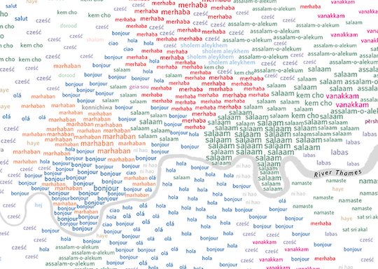
Highlighting the best London maps
London boasts over 300 different spoken languages – more than any other city in the world. The capital’s lingua franca, of course, remains English: 78%
More...
London has been home to many great cartographers and has been the subject of many stunning maps that depict all aspects of life in the city. Drawing
More...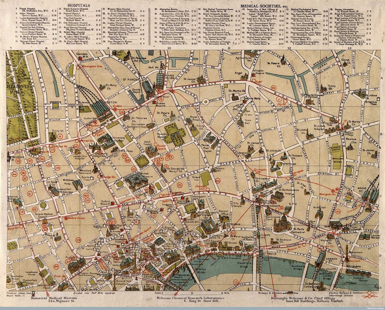
Published in 1913 (and available to download from the Wellcome Library) this series of intriguing maps depict London’s “sites of medical interest”. It looks like
More...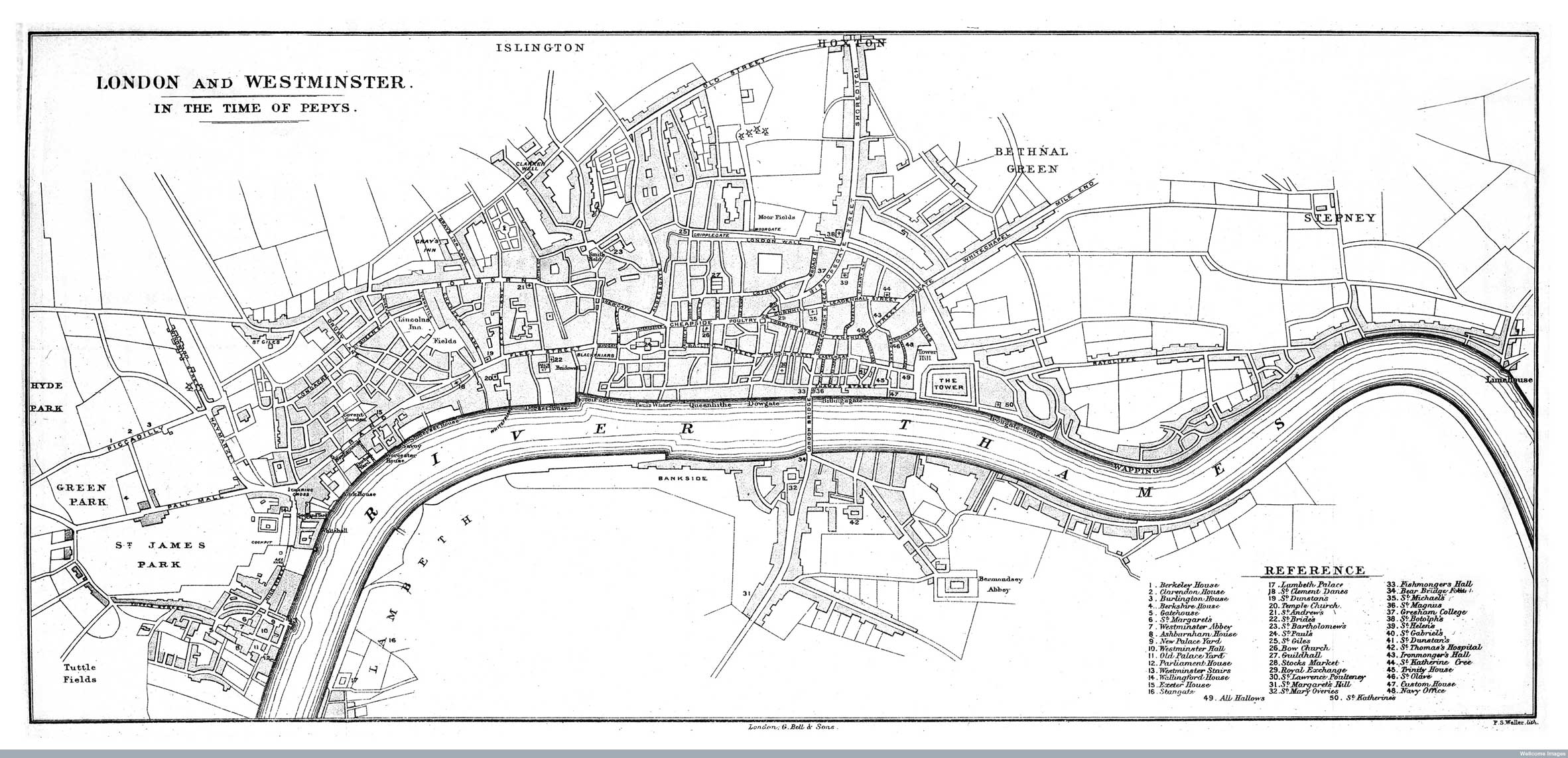
The Wellcome Image Library contains a number of interesting maps of London that are all free to use. I recently spotted a couple relating to
More...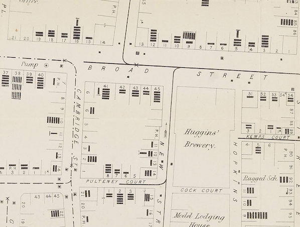
John Snow’s map of cholera has become one of the most iconic of an era when the importance of statistics and graphics were becoming recognised. The map
More...
With two rounds of Tube strikes set to upset your daily commute, here are a few maps to help make the most of not being
More...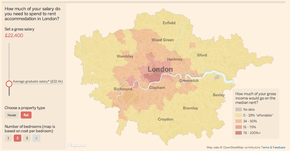
There is always interest in London’s astronomical rents and house prices. As with any global city, there is huge demand for somewhere to live in
More...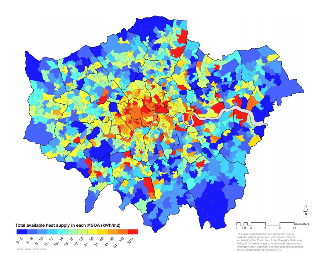
A huge amount of energy is wasted each year in London as heat escapes from our buildings in winter or is pumped out from
More...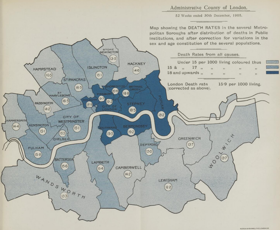
A great new resource has just been released by the Wellcome Library. They have meticulously scanned “Medical Officer of Health” reports for London between 1848 and
More...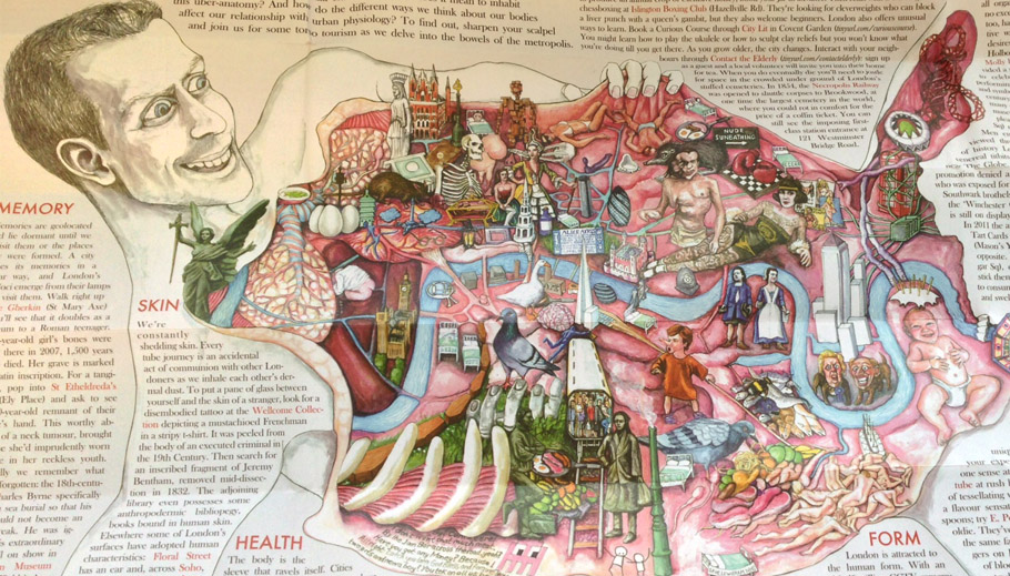
London dissected is the latest brilliant edition of the Curiocity maps series. For the princely sum of £2.50 you can purchase this gory interpretation of
More...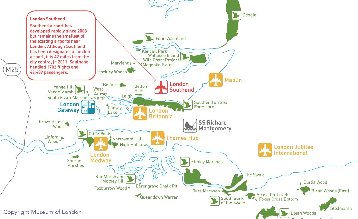
Almost all the maps we have featured to date have fallen neatly within the M25 but, of course, London’s influence extends well beyond this
More...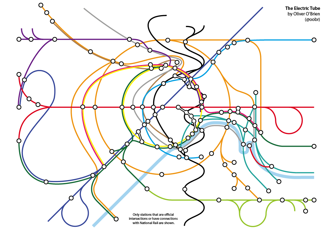
UCL has opened a “pop-up” shop called Launchbox in Box Park Shoreditch which is designed to showcase “the hottest new designs emerging from UCL’s creative scene”. Ollie and I
More...