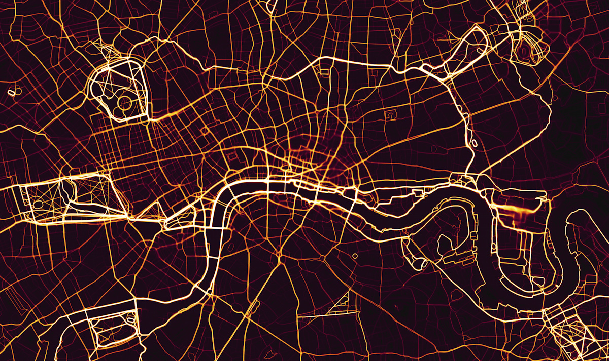
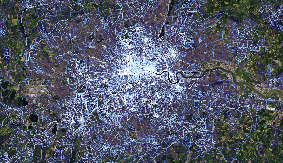
This stunning map reveals the athletic footprint of London. Strava have taken their huge volume of movement data, recorded by runners, cyclists and other data-enabled fitness peeps and created a heatmap of London (and indeed, the world).
Many people use Strava to record their cycle to work, whereas running to work is much rarer, and recreational running is much more likely so, in order to see an alternative, largely non-commuting flow map of London, we have here featured the running data. A street network is still seen, but the brightest lines are no longer the big road arteries of London – instead it is the park roads, athletics tracks, canal towpaths and the Thames footpaths. It shows a London reordered towards two feet rather than four (or two) wheels. The extract at top, centred over the London’s central area, shows four parks in each corner – Regent’s Park, Victoria Park, Greenwich Park and Battersea Park, as hotspots of activity, along with both sides of the Thames, the Regent’s Canal towpath, and Hyde Park. Two blurred areas – at Canary Wharf and the eastern part of the City of London – are likely a combination of a large number of runners and the GPS multipath-interference effect of the very tall, close together buildings in these areas.
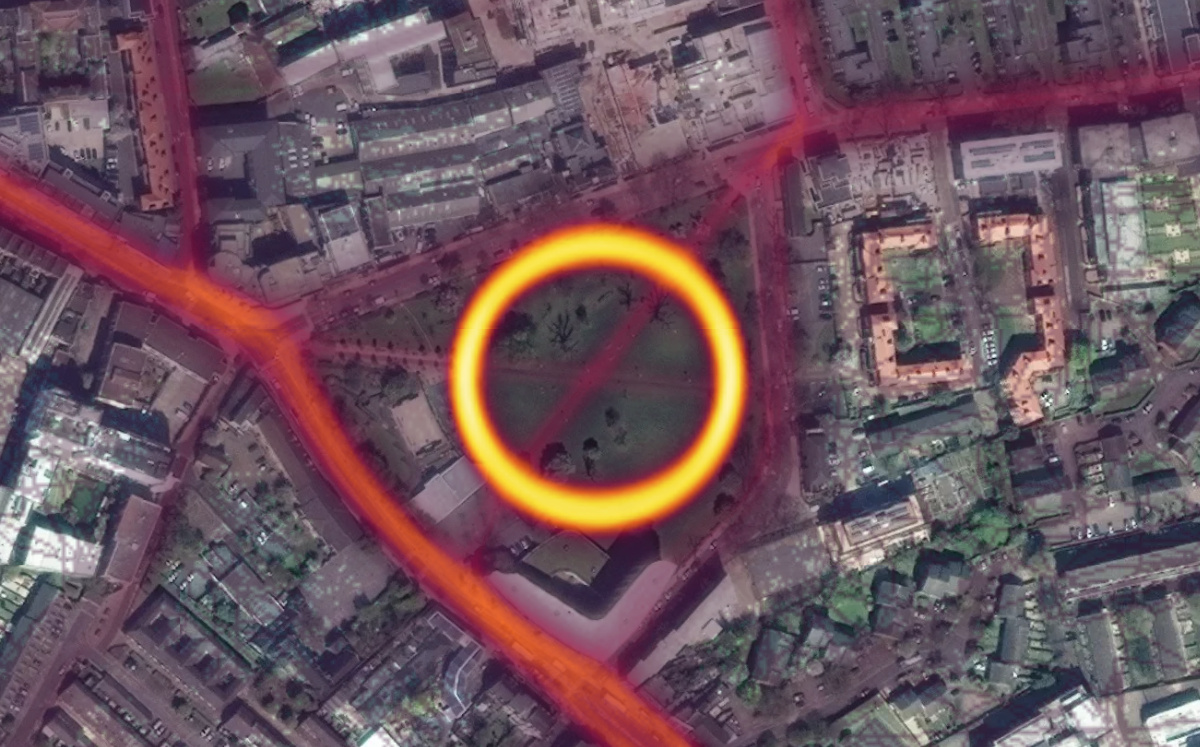
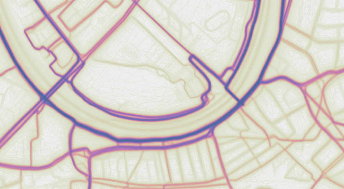
Looking more closely at certain areas, you can start to see the thousands of individual traces in each area, along with local “obstacles”:
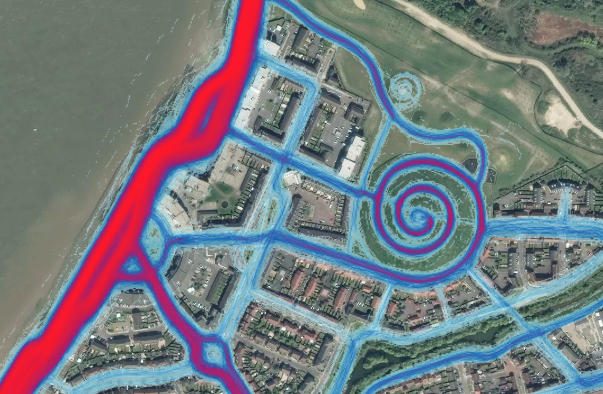
This obstacle, at Barnes Bridge in west London, is due to be fixed soon with a new underbridge:
We featured an earlier version of the map in 2013, back then it only include a month’s worth of data, whereas this latest map includes all the data up to September 2017 (except that marked as private, in user privacy zones or from opted out users) representing a billion plus seperate runs and cycles across the planet, and so likely well over a million in London. We also featured the Nike Plus app map which is a similar idea but with much less data. The unique thing about the latest Strava Labs heatmap is the volume of data, which, combined with some nice digital cartographical techniques, produces a comprehensive and impressively detailed map of London. The Strava blog entry details some of these techniques, which include auto-shifting routes from some mobile devices which tend to otherwise snap them to the nearest road centreline – which would not be ideal for a heatmap effect.
Strava has created a product, Strava Metro, to sell the underlying data to local councils and other bodies interested in getting good, detailed information on how pedestrians and cyclists use the existing street networks, and where they want to go, with a view to well targeted spending on new infrastructure. The Strava Labs visualisations like this, are a great way to reveal the quantity and detail of such information – a picture certainly says a thousands words here.

Map © Strava. Via Time Out.
RT @MapLondon: Strava Labs Heatmap of Runners:
https://t.co/NZYGF1jyCp https://t.co/1ivUNjQROf
RT @MapLondon: Strava Labs Heatmap of Runners:
https://t.co/NZYGF1jyCp https://t.co/1ivUNjQROf
RT @TheMapAddict: Strava Labs Heatmap of Runners https://t.co/EP5nO8IQ8o | #GIS #mapping
This is so Cool, shows heatmap of runners in London. https://t.co/djPv1K1c9t https://t.co/0o2466FX17
#94 of #125geotips Via @oobr (follow all be does too) – use Strava or @OSleisure apps to track your routes and cont… https://t.co/KiE4tbMNNa
Strava Labs Heatmap of Runners. https://t.co/YzNMgOMdgE via @MapLondon #Coolmaps