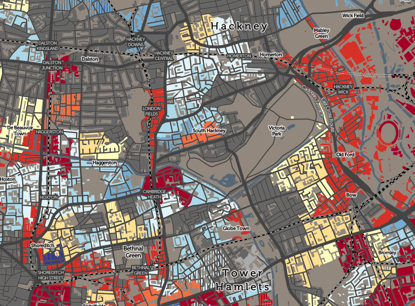

The Valuation Office Agency publish some interesting open data sets from time-to-time. One that caught my eye recently was a breakdown of counts of residential buildings in each small area (LSOA, around 700 houses) by the decade that they were built in. The data is not perfect for mapping – pre-1900 is grouped together into a single category, and within each area there can be groups of houses from multiple decades, but mapping the data is worthwile as it show a distinct pattern. I’ve chosen to map the modal decade, that is, the one within which the most number of houses in each area were built. Where another decade comes a close second, I’ve shown the “runner up” colour in vertical stripes. For many areas, this works well, however there are other places which have a rich distribution of house ages, where the modal decade is not actually that useful. So yes – if I’ve mapped your house “wrong”, that is why! There will be a large cluster of differently-aged houses nearby which will be the cause.
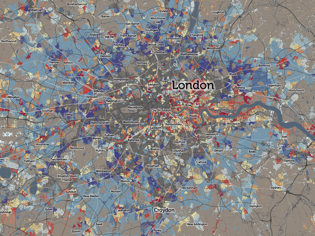
In London’s case, the large size of the pre-1900 city (dark grey) is apparent, with it dominating Zones 1-4, with only limited infill occuring within this area since. A notable exception is the Docklands area – residential building either side of the Thames in east London has gradually displaced industry through the twentieth century and new developments (shown as orange and red) continue to appear in this region all the time.
London’s “Metroland” to the north-west (blue) can be clearly seen, with the building of the Metropolitan line along here clearly inducing a huge housebuilding program alongside it (helped in no small part by the railway company owning some of the land). Zones 5-6 also appear as concentric rings of newer housing, until a post-WW2 halt, caused by the imposition of London’s Green Belt, suddenly stops London spreading outwards. Satellite communities well out from the city, and infill (yellow, orange and red), has been the main activity ever since, with recent construction surge in the very centre of London caused by the recent fashion to live (where possible/affordable!) back in the centre (the deepest red colours). This last pattern is repeated in almost every city thoughout and England/Wales, for which the live map extends.
Find out more about this map and the related maps I also produced for the CDRC, on my blog, or view the map for yourself. The map is on the CDRC Maps platform, part of the new Consumer Data Research Centre.
Contains Ordnance Survey and Valuation Office Agency data, released under the terms of the Open Government Licence.
RT @MapLondon: When was your neighbourhood built? A new map of house ages from VOA data (red=very new): https://t.co/z0MsZs1vNr https://t.c…
When was your Neighbourhood Built? @MapLondon https://t.co/9HsErPtLyy