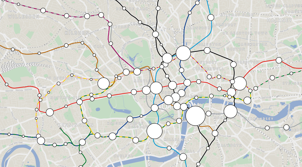

London Tube Data Map takes ten years worth of passenger entry/exit counts for stations on the London Underground network, and sizes the circle representing each station according to the numbers. You can compare changes between years, and filter the data for certain times of the day, to see the flow into central London in the morning rush-hour.
You can also see passenger journeys, this dataset shows where passengers exit the network, for a selected entry station. Warren Street is selected as an example. Click on a station circle to change the starting location. In most cases, passengers generally don’t change between lines, but exit along the same line they entered.
As part of this work, I’ve released, as open data, the tube lines and station locations, as GitHub Gist files. The data is based on OpenStreetMap, appropriately simplified and enumerated to have one stroke per tube network line. The files are intended for cartographic rather than topological purposes although the lines and stations should coincide.
See also More information about the map, and Tube line and station locations.
Data from TfL Developers Area – station passenger counts and RODS.