[Update – additional article on Middlesex University]
I was talking to the UCL cartographer recently and he mentioned that there aren’t many dedicated cartographers left at universities these days. A traditional task of the university cartographer is putting the campus map together, so I thought I would take a look at the different campus maps that the London universities make available, to see how they compare and whether some are suffering from the lack of professional cartographical input.
I focused on the “print” versions here, typically available on each university’s website as a downloadable PDF, rather the online/interactive version which is often Google Maps-based. I looked at the map for each university’s main campus, and only picked some of the larger universities in London – there are many more, scattered throughout the metropolis.
Five of the best
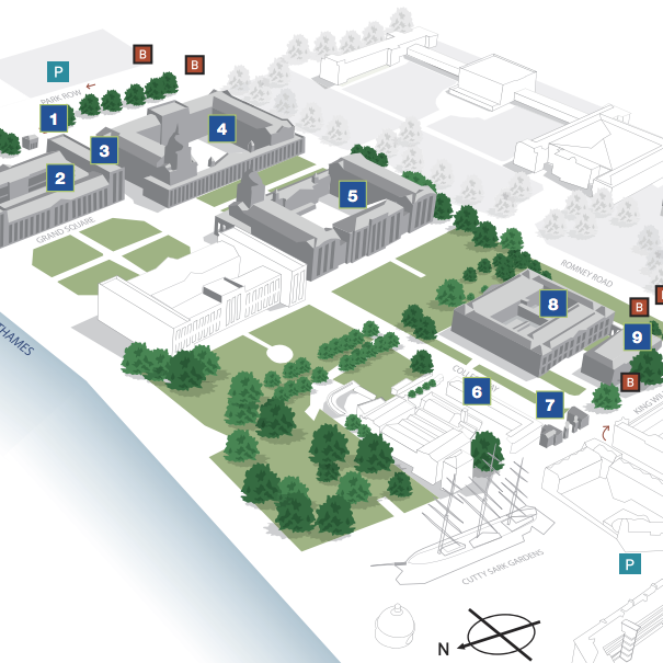
Greenwich

As befitting the university with the largest undergraduate population in London, Greenwich’s has had some care taken with its design – it’s polished and very attractive. It is in 3D, which is normally bad, but it is spaced out and simplified enough for the effect to work. Long labels are generally kept off the map and in the key.
UEL
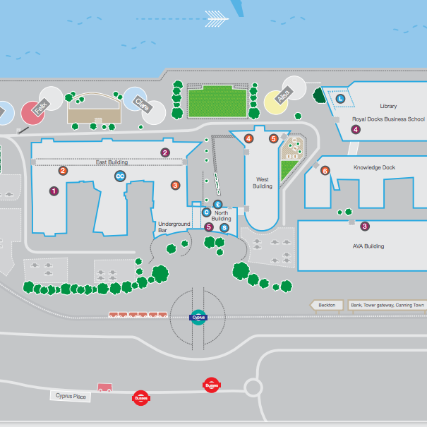
UEL’s map is rather eye-catching. It’s pleasant to look at and there’s some nice quirks, such as a rowing boat on the water. The DLR station and bus stop logos are very definitely unofficial though! (N.B. north points down).
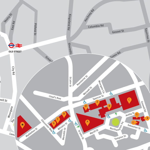
UCL
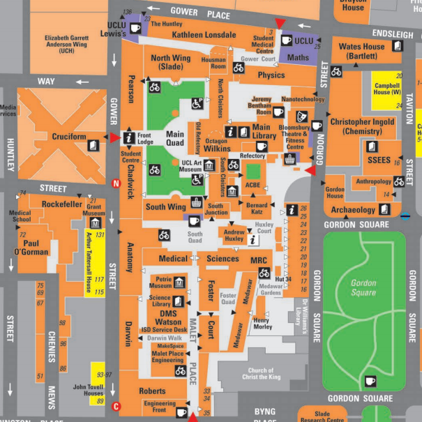
UCL’s (above) has a distinctive design with good use of colour. It looks great in print, although unfortunately the PDF version is a raster rather than a vector. It does have a slightly overwhelming number of labels though – with the heavy font further emphasising them. Disclaimer: The author works at UCL.
Imperial
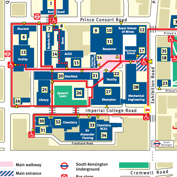
Imperial’s is also clear, although quite heavy on the red lines. The TfL roundels look rather unofficial though (this could probably be said for most of the maps studied here.)
City
City’s map is simple but attractive, with a good use of colour.
Five that could be better
Kingston
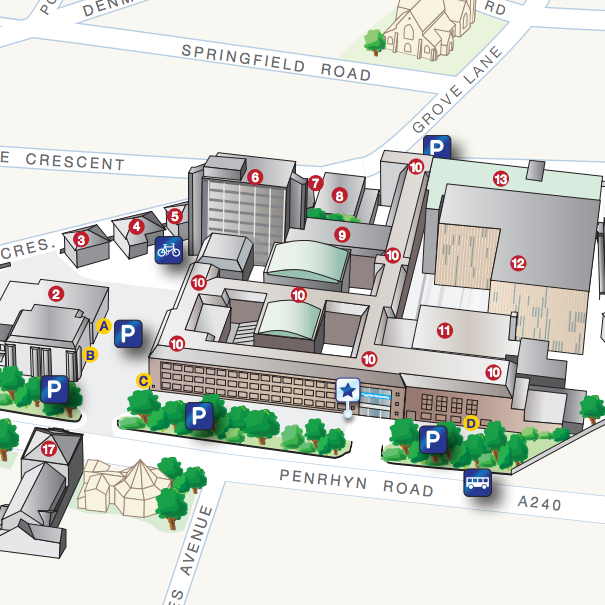
Kingston’s is presented in isometric perpsective (pseudo-3D.) It’s reasonably clear to look at although the perspective makes it difficult to see quads and routes through the campus. The symbols also are rather ugly too.
LSBU
London South Bank University’s map is simple – too simple. It just shows zones rather than building outlines. It’s also, for some reason, using the London Bus symbol for the tube stations.
King’s
King’s has a bright, clear design, but is not particularly detailed. Having so many different colours for the buildings also is a bit overwhelming. It’s rather hard to find on the university’s website. However it is a vector PDF, so looks great on screen.
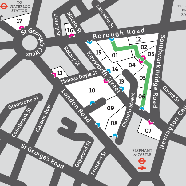
LSE
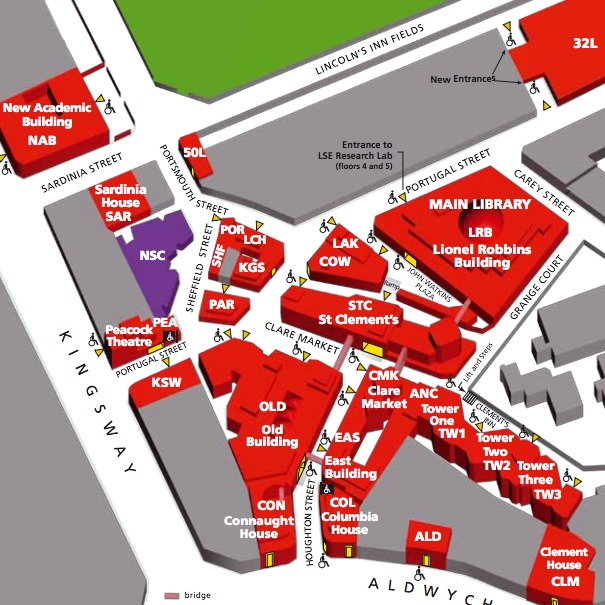
LSE’s could be a lot better. It is presented in pseudo-3D, but this adds little to the legibility, and the white text and excessive use of acronyms is unattractive.
London Met
London Met’s is not great at all. Very little detail and very small scale. The use of purple is overbearing. The Docklands logo used is at least 18 years out of date!
Westminster
Westminster University doesn’t seem to have campus maps online. I could only find this old relic…
All of the maps which are featured here are copyright of their respective universities.