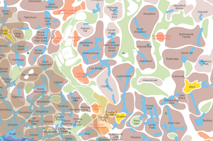

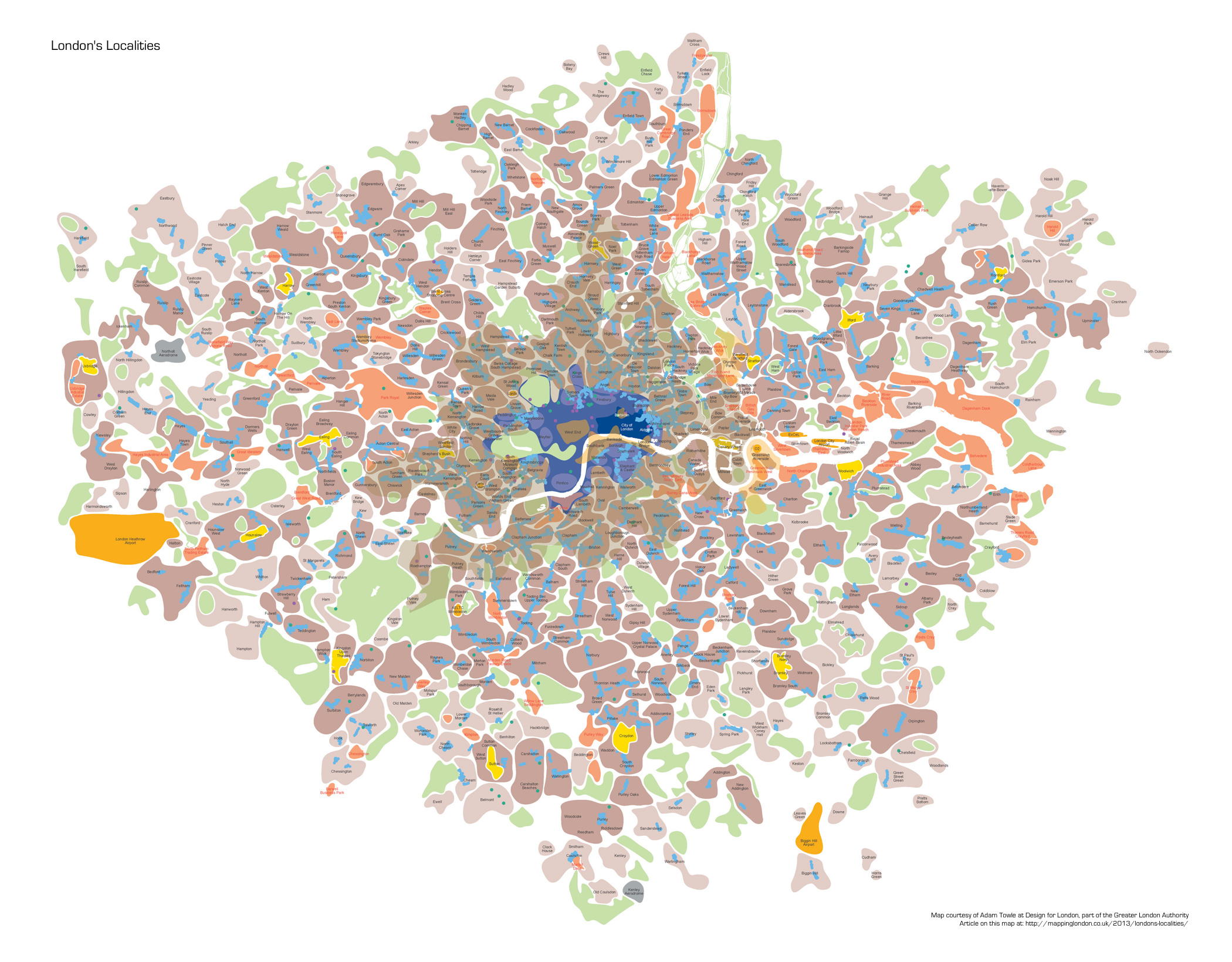
The above extract (click for full-size version) is from a map that we’ve wanted to feature for a long time, ever since an fascinating talk was given at UCL CASA by Adam Towle, who included this map which was created by himself and others in the Design for London team at the Greater London Authority overseen by Mark Brearley, now guest professor at The Cass, Aldgate.
It is a map quite probably inspired by the Map of London Social and Functional Analysis 1943.
There is something wonderfully organic about a map of a city that is made up of circles, ovals and other assorted lozenge shapes, instead of the normal straight lines and distinct corners of network or boundary maps. The use of curves, and “buffer” of white space, also serves to reinforce that the boundaries are not rigid – they don’t run along a road or river, but rather their location is only approximate. The inherent imprecision of showing localities in this way helps “blur” any perceived sharp delineations.
The map is mainly focused on London’s localities outside of the central “Zone 1” area. High streets are shown as lines of blue dots. Places identified for potential significant development are shaded pink. Major shopping and leisure destinations (as distinct from the high streets) are shown in yellow and orange respectively. London’s patchwork of large green spaces stand out. Purple dots are centres of higher/further education [Thanks @gooneruk for working this out] and green dots show the locations of hospitals.
Defining distinct localities in London can be contentious – to people on the ground who consider themselves to be in an adjacent one or one that is not shown on the map, to elected officials and local government as administrative boundaries (in London, boroughs and wards) don’t necessarily line up the localities identified here, and to those who feel London is too complex and interleaved to be abstracted into a series of rigidly defined and spaced areas. The complexity of defining localities, places, areas or neighbourhoods in a particular part of London is nicely illustrated in this graphic by Euan Mills – the full dissertation, which is linked from that page, is well worth a read.
Bearing this in mind, the map is not intended to be a definitive snapshot of London’s socio-geographical structure but simply an aid to help understand London’s localities at a glance. It is a particular interpretation of how London, and Londoners, identify themselves, and other interpretations can be just as valid.
There is, of course, one political boundary still implicitly on the map – that of London itself – nearby localities beyond the GLA boundary are not shown. To be fair, every map has to have an edge somewhere. The different kinds of London boundaries – social, physical, political, administrative – are discussed in this old blog post.
A version of the map appeared in the Richard Rogers Retrospective exhibition that was showing recently at the Royal Academy. A full-size version of the map is available by clicking on the small version below.
Thanks very much to Adam Towle of the Greater London Authority for sending this map through to us and allowing it to be published here.
That lovely 1943 map of London neighbourhoods got an update to cover all of Greater London. https://t.co/8iLeNwXw5j
RT @respros: That lovely 1943 map of London neighbourhoods got an update to cover all of Greater London. https://t.co/8iLeNwXw5j
RT @respros: That lovely 1943 map of London neighbourhoods got an update to cover all of Greater London. https://t.co/8iLeNwXw5j
For fans of mapping and/or London. https://t.co/BwmmrbcHNv
London’s Localities https://t.co/Tsi6F8OfNm
London’s Localities https://t.co/A3ycE9pWOs https://t.co/CRJSlsIkTk
Ref.. https://t.co/MnF3zvFnqu