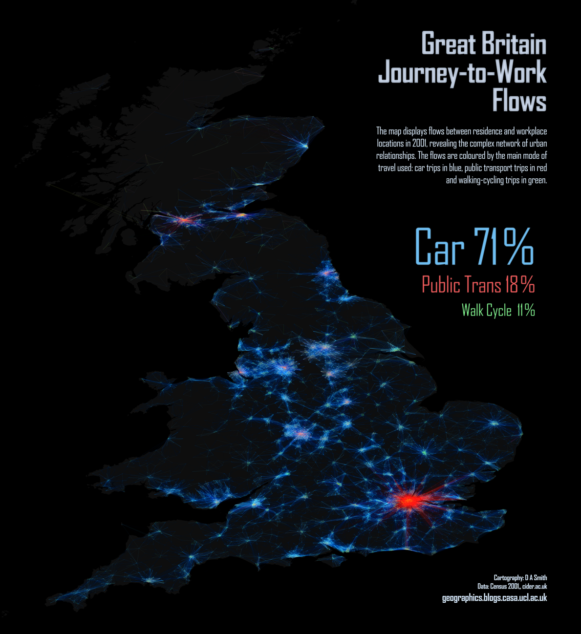
Duncan Smith from UCL CASA has produced some great maps of commuter flows. Each line represents the routes people follow to work (as a straight line from origin to destination) and whilst the map above covers nearly the all of southern Britain it shows just how dominant London is and just how far people are willing to travel to work there. I was surprised to see the volume of people flowing from Brighton (even if it is know as “London-On-Sea”) and also how far into East Anglia people are willing to live whilst still working in London. The map above, however, doesn’t show how people get to work. To do this Duncan has coloured the lines according to the mode of transport to produce the map below.
As Duncan says:
“The map really highlights how different London is in terms of its extensive regional public transport network, with the other major English conurbations like the West Midlands, Manchester and West Yorkshire being highly car dominant in comparison. The variation in public transport levels could be argued to relate to London’s massive size, yet the Scottish cities of Glasgow and Edinburgh perform well in public transport terms, despite being smaller than England’s northern cities. Active travel modes of walking and cycling are generally minimal. The cities that do relatively well are the “cathedral cities” like Cambridge and York, with a few surprises like Hull.”


Hi, these maps are nice. What software did you to produce this quality map.
Hi, we did not produce these maps, we are just featuring them. I would recommend you contact the map’s creator.