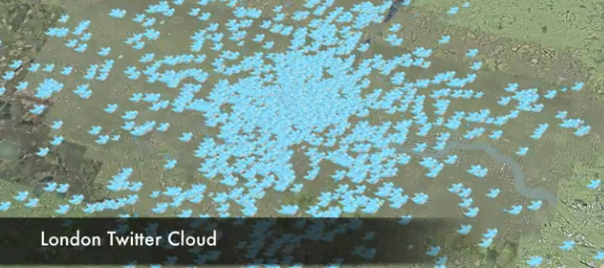
This is another great map animation from our friends in CASA. It is a year old now (almost to the day) but it remains one of the most engaging Twitter animations I have seen for the city. It shows a sample of all the geo-located tweets sent over a London weekend. I like it because it shows the individual tweets (rather than groupings) and highlights the fine geographic scales at which these things can be mapped. Look out for the tweets from Heathrow’s runway!
The data for this were collected using the technology behind Steven Gray‘s Tweet-o-Meter and animated by Digital Urban and Urbantick.
