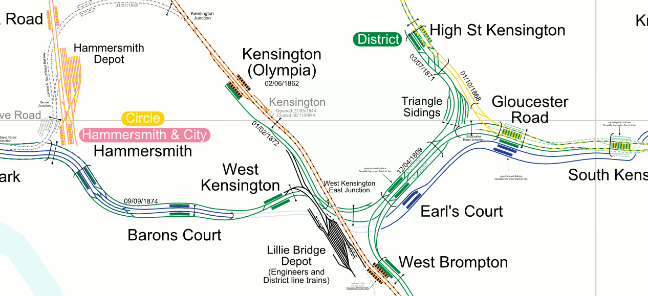
The world is not short of London underground network maps, there is something very appealing about the mix of lines, curves, dashes and circles, all shown across a distinctive set of colours.
I am particularly impressed with the London carto.metro map, produced by Franklin Jarrier last month, which I came across via IanVisits. It’s a little unwieldy to read, as it’s so large, but that’s because all the detail in it is shown in its correct geographic location and to scale – not just the tube lines and stations, but individual station platforms, siding tracks, and dates that different sections of lines were closed and opened. It’s also nicely up-to-date, showing the London Overground line that opened late last year, as well as the DLR extension to Stratford International station that is opening imminently. The most recent update was at the beginning of March. There is also a PDF and PNG version available.
The map is copyright Franklin JARRIER, the extract is reproduced here with permission.


Map updated 🙂 tram and more added !
http://carto.metro.free.fr/metro-tram-london/